Modal (25 min)
Completion requirements
01 Getting Started
This tutorial focuses on Native Modals. There are two kinds of modals:
- Native Modals
- Custom Modals
02 How to Add a Modal?
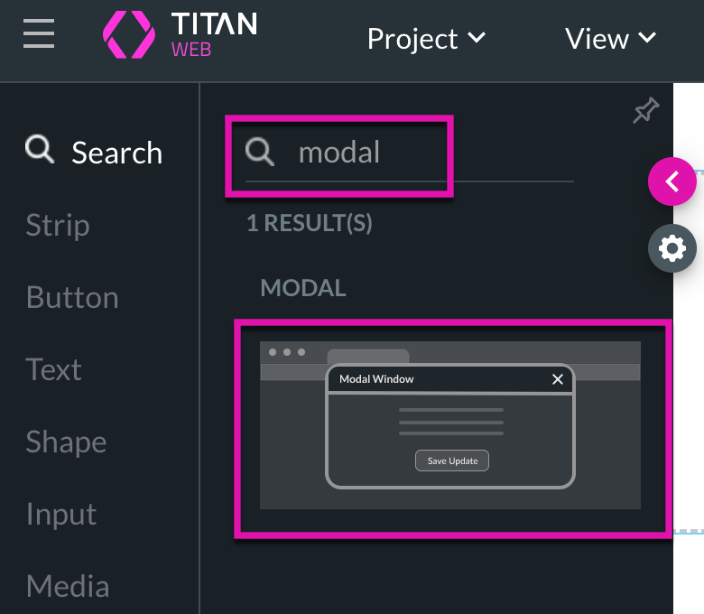
1. Search for a modal in the element list and drag it into your web project.
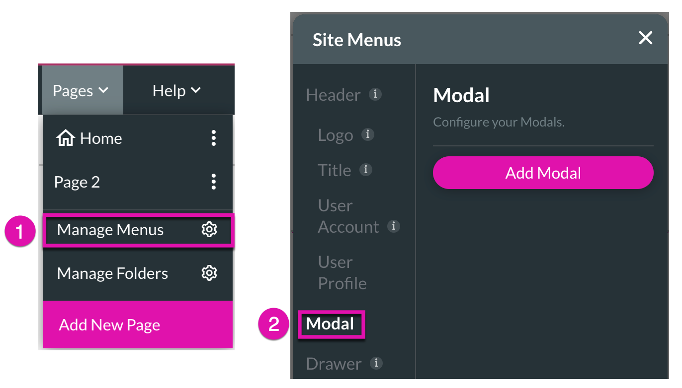
2. Alternatively, you can add a modal from the Pages tab in the Menu. Click the Manage Menus Gear icon and navigate to the Modal option.
3. Click the Add Modal button to add a modal to your project.
2. Alternatively, you can add a modal from the Pages tab in the Menu. Click the Manage Menus Gear icon and navigate to the Modal option.
3. Click the Add Modal button to add a modal to your project.
03 Modal Visibility
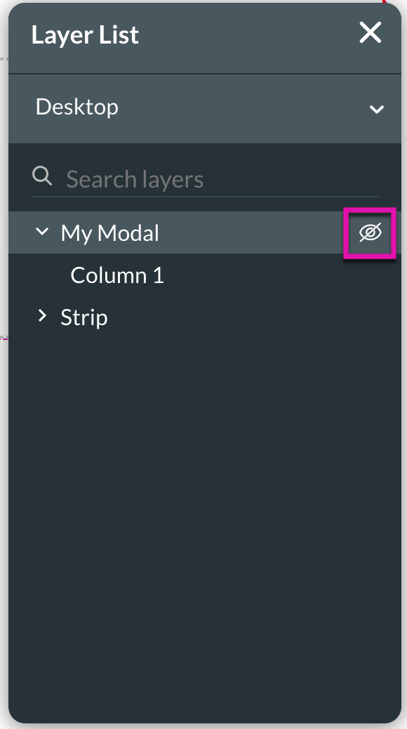
1. Ensure that your Layer List is active so that you can easily hide/show your modals while working on your web projects with the eye icon.
04 Rename a Modal
It is important to rename your modal as it is helpful for mapping.
1. right-click on the modal you want to rename in the layer list—the sub-menu displays.
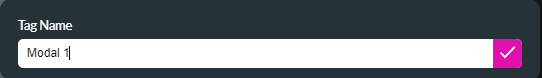
2. Select rename. The Tag Name window opens.
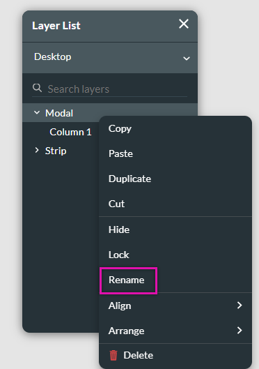
3. Type in your modal name and click the check icon.
1. right-click on the modal you want to rename in the layer list—the sub-menu displays.
2. Select rename. The Tag Name window opens.
3. Type in your modal name and click the check icon.
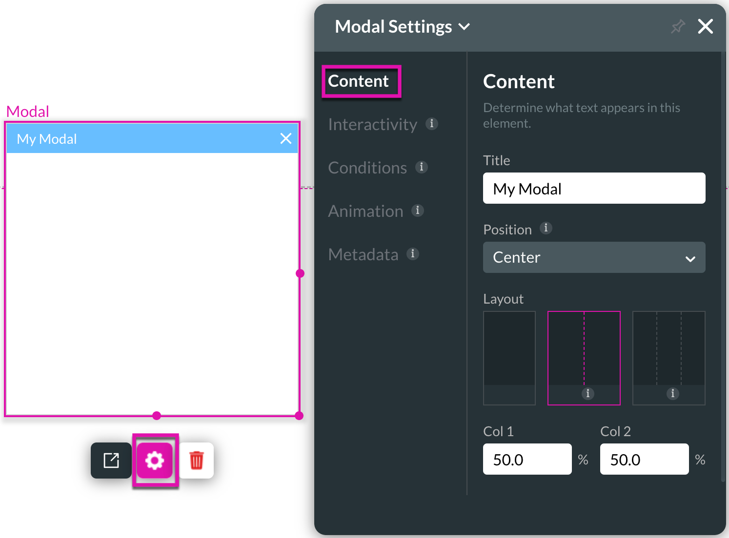
05 Modal Settings Menu
Under Modal Settings, you can choose a title or change the position and layout of a modal's content.
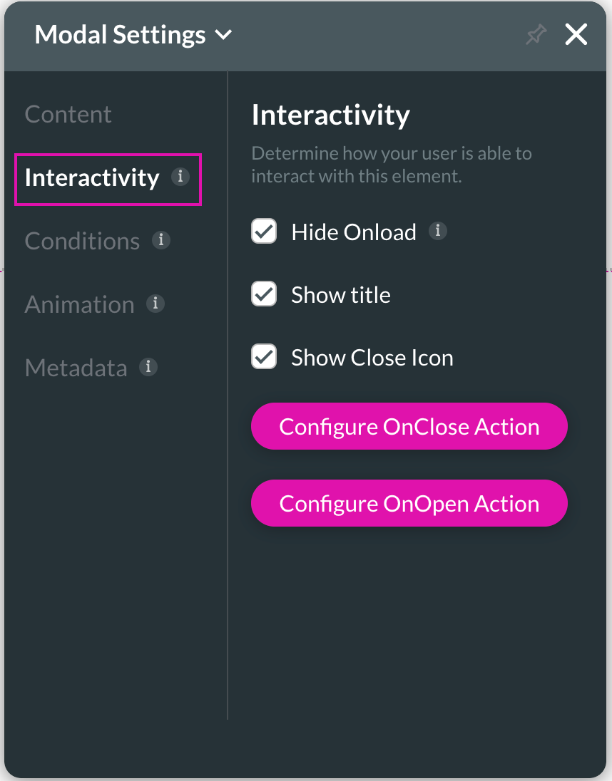
You can uncheck the default "hide on load" action for modal interactivity, choose to show or hide the title and close the icon.
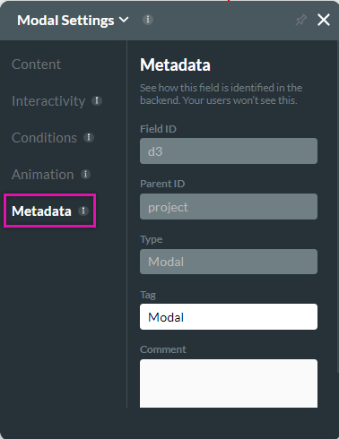
You can give your modal a unique identifier using the tag field for the modal metadata. This is useful when it comes to mapping your modals.
You can uncheck the default "hide on load" action for modal interactivity, choose to show or hide the title and close the icon.
- The Hide Onload checkbox ensures that your modal is hidden when you load a project unless a button calls it.
- Selecting the Show Title checkbox will ensure the title of your modal is visible.
- Use the Configure OnClose Action button to set up an action that runs whenever the modal is closed.
- Use the Configure OnOpen Action button to set up an action that runs whenever the modal is triggered.
You can give your modal a unique identifier using the tag field for the modal metadata. This is useful when it comes to mapping your modals.
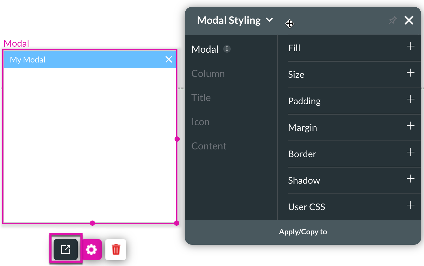
06 Styling your Modal
You can control every style aspect for modals with Titan through the Modal Styling panel.
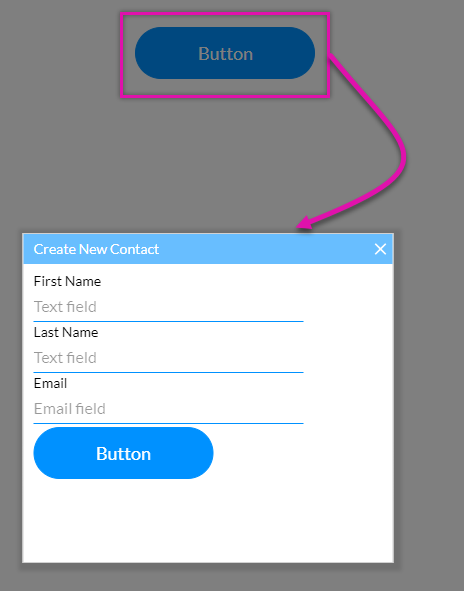
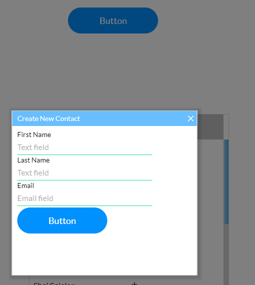
You can also place multiple elements into a modal. The below modal has text, textarea, and email fields with a button.
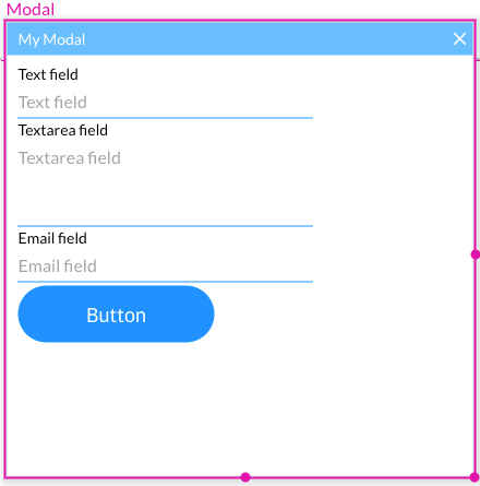
You can also place multiple elements into a modal. The below modal has text, textarea, and email fields with a button.
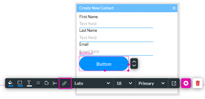
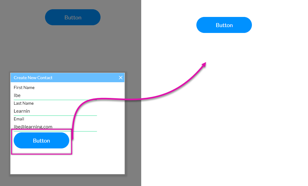
07 Creating a Push from your Modal
This Modal will be used to create a new contact in Salesforce. A button was inserted into the Modal so the push could be invoked.
You can configure any Salesforce action to run for your Modal.
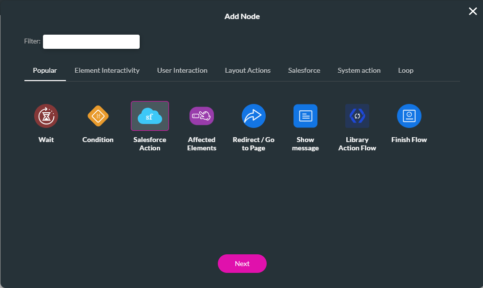
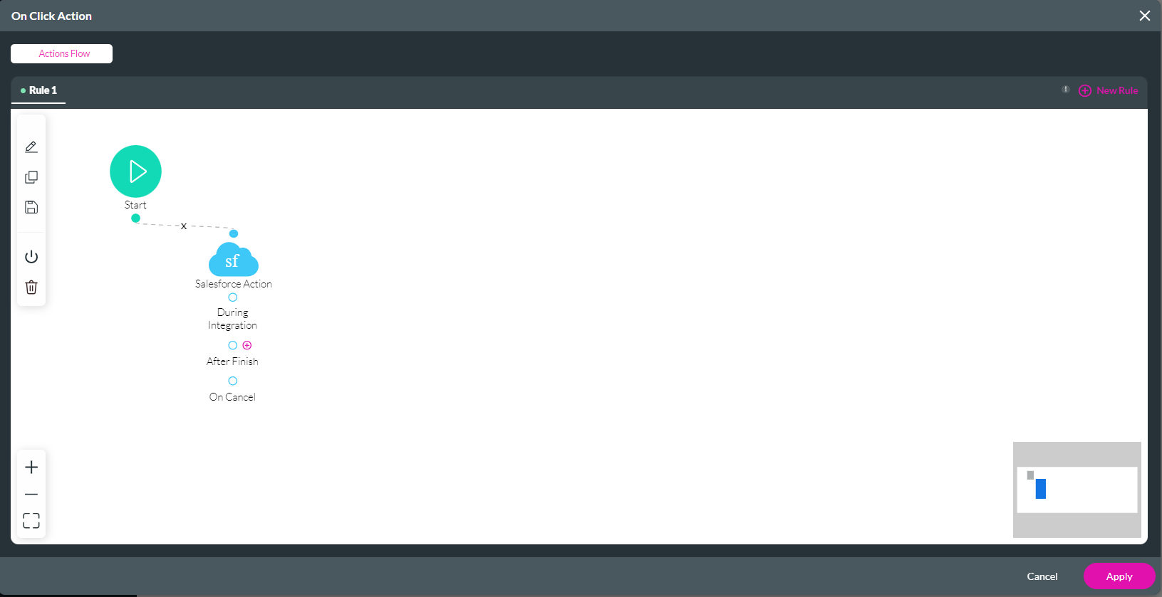
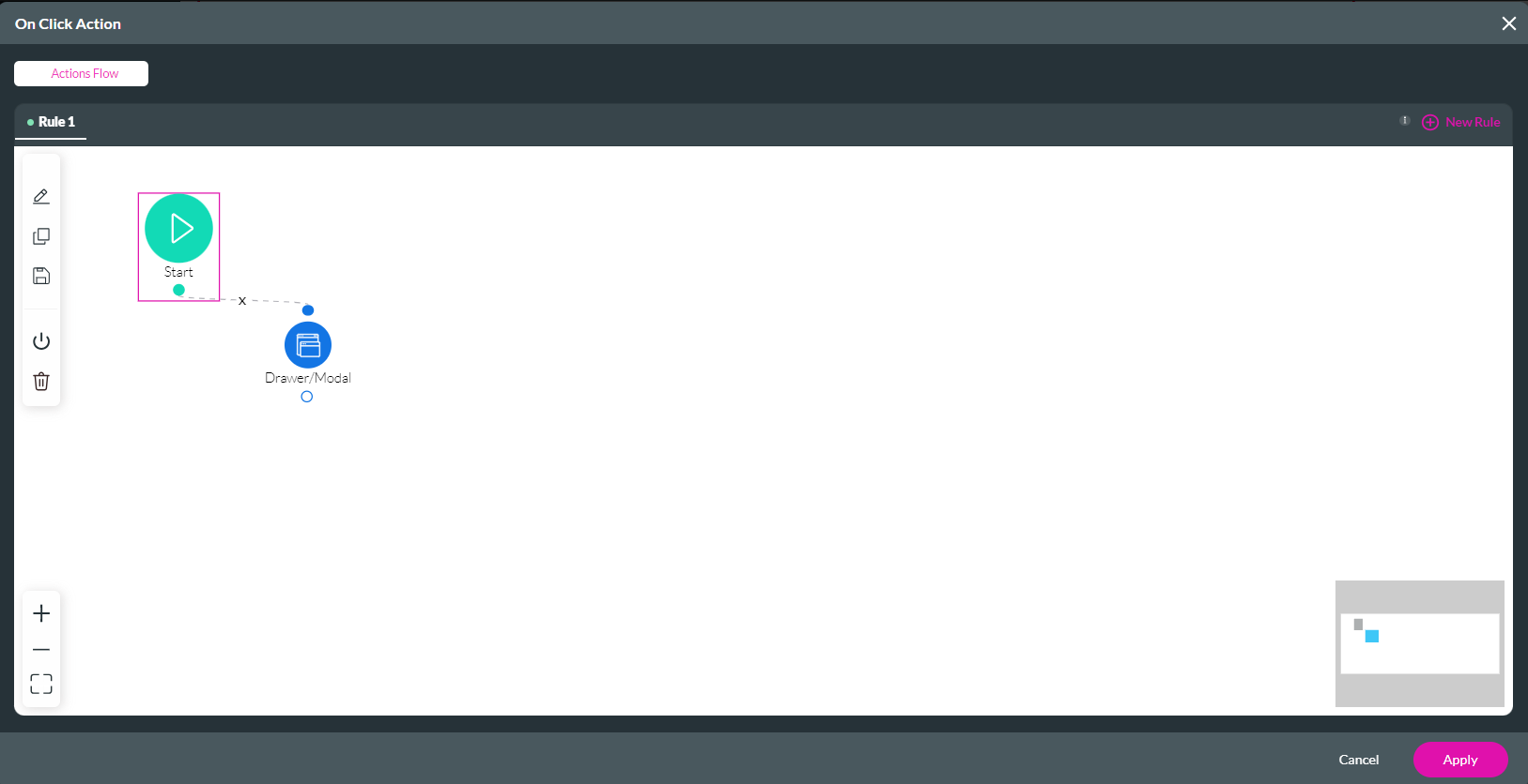
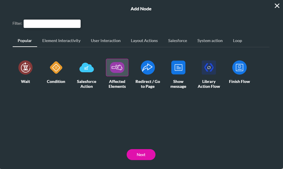
1. Click on the button and select the link icon to create an On Click Action. The On Click action screen opens.
2. Click the Start + icon. The Add Node screen opens.
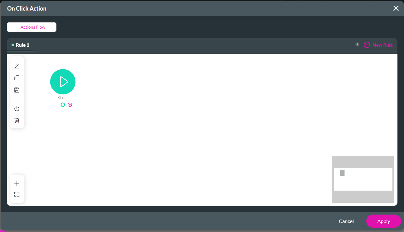
3. Choose the Salesforce Action option and click Next.
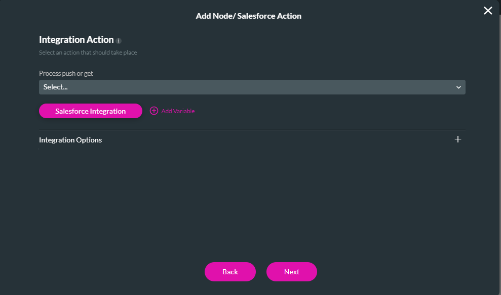
4. Click on the Salesforce Integration button to create a new Salesforce push.
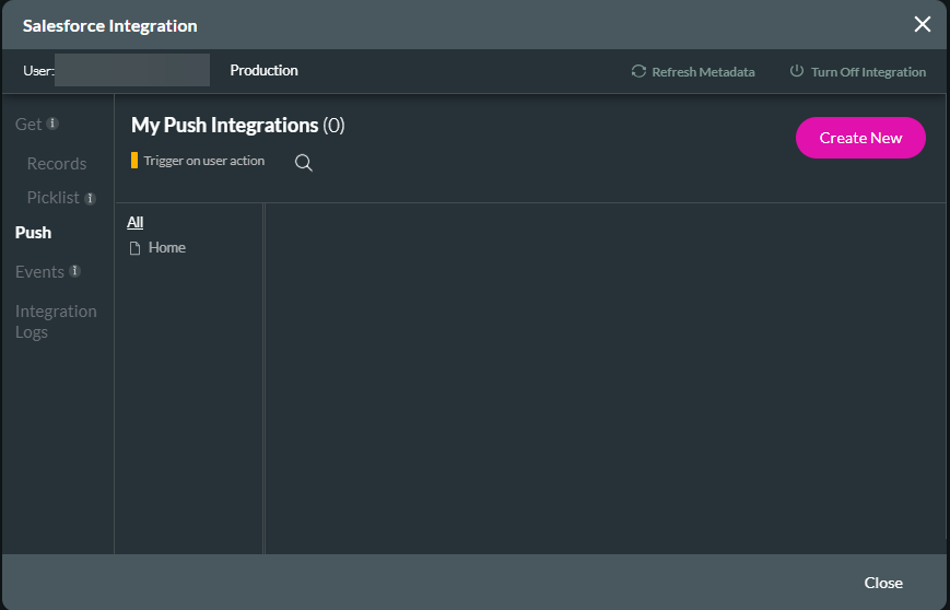
5. Click on the Push tab and click Create New.
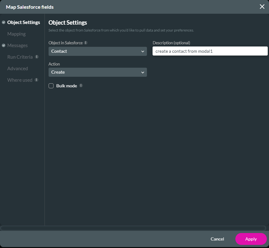
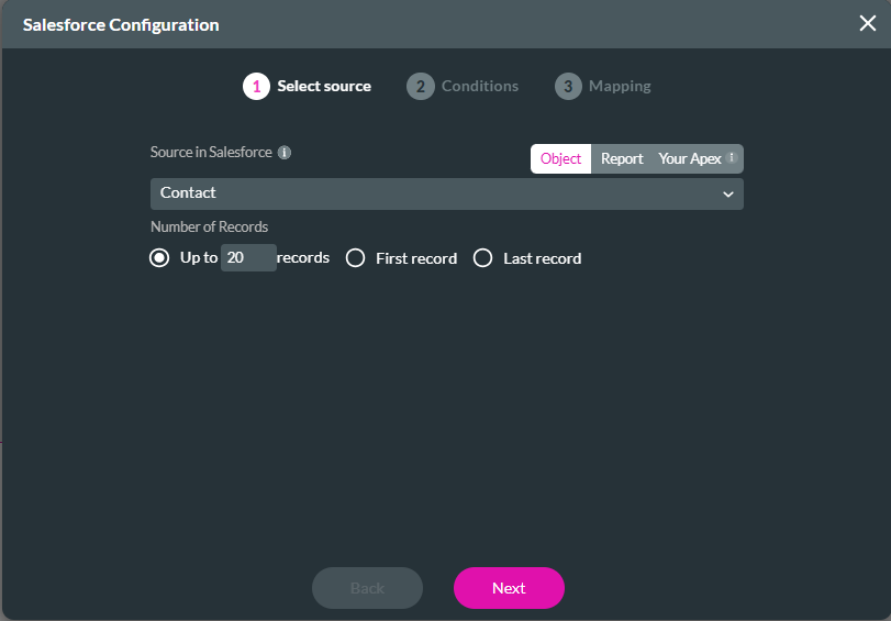
6. In the Object Settings tab, use the dropdowns to configure the object in Salesforce. For example, this Modal will create a new contact in Salesforce.
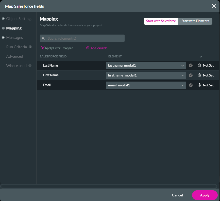
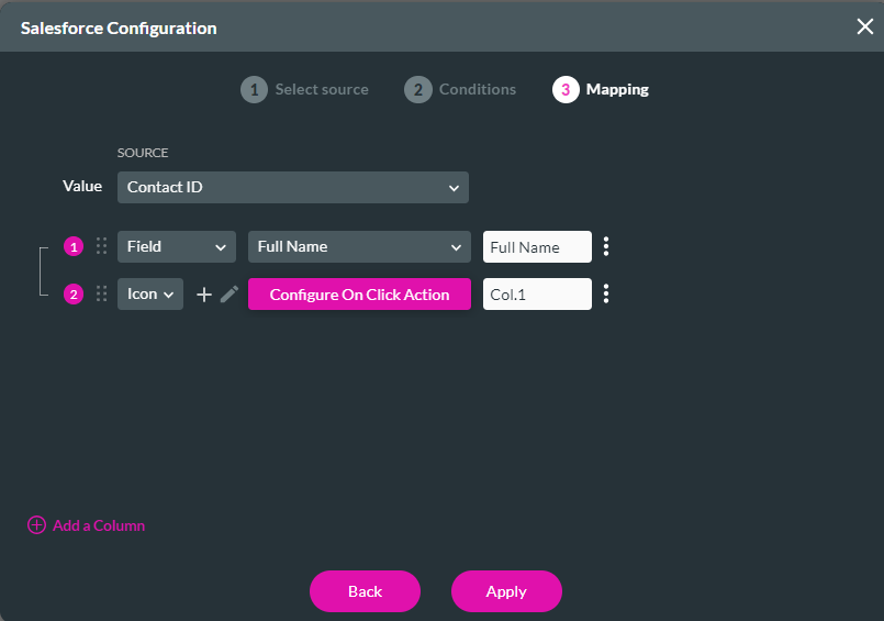
7. Click on the mapping tab. Use the dropdowns to map Salesforce fields to the modal elements. Click Apply.
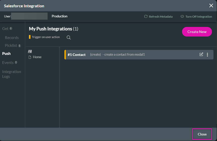
8. Click Close to navigate back to the Integration Action Screen.
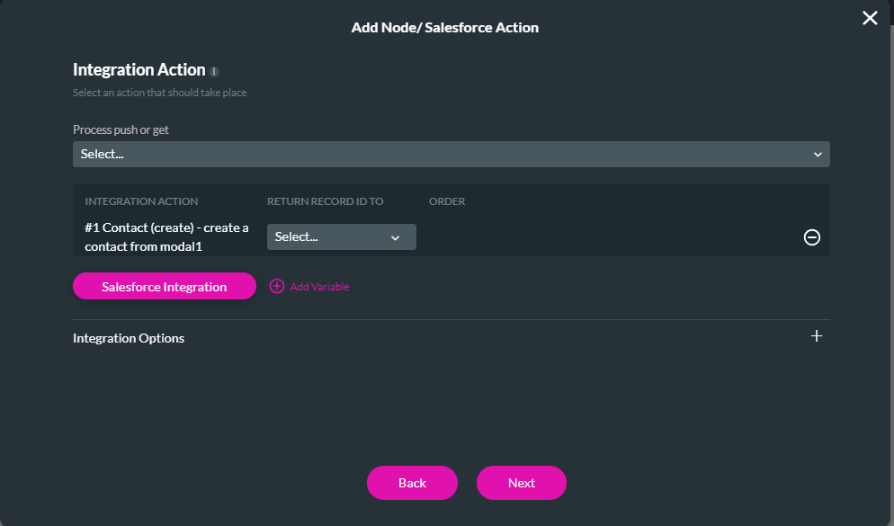
9. Use the Process Push or Get dropdown to select the created Salesforce push.
10. Create a tag for the action and click Insert.
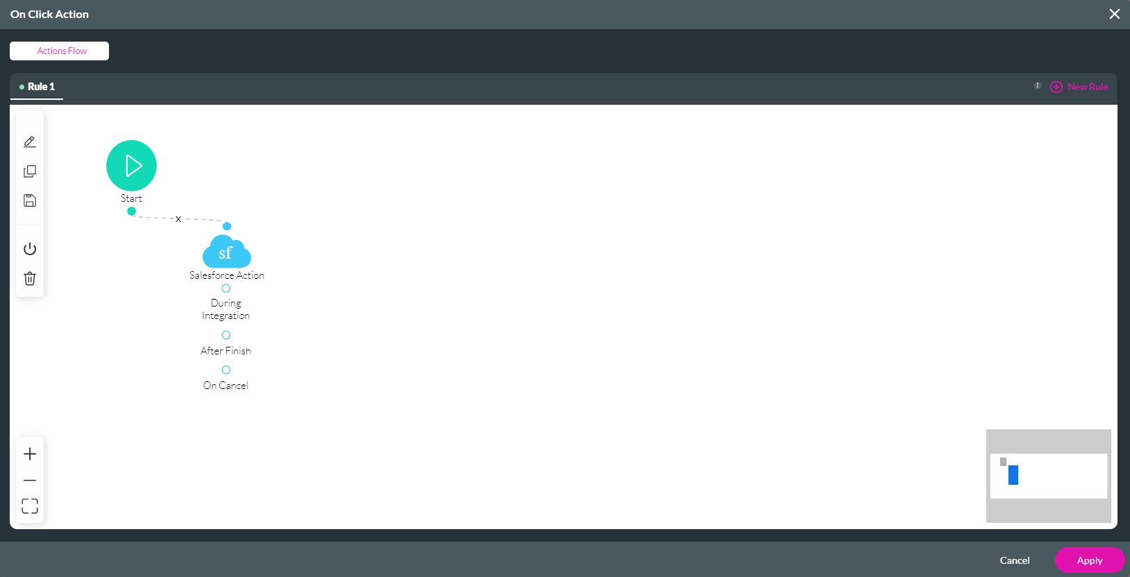
11. Review your node in the On Click Action window and click Apply.
You can configure any Salesforce action to run for your Modal.
1. Click on the button and select the link icon to create an On Click Action. The On Click action screen opens.
2. Click the Start + icon. The Add Node screen opens.
3. Choose the Salesforce Action option and click Next.
4. Click on the Salesforce Integration button to create a new Salesforce push.
5. Click on the Push tab and click Create New.
6. In the Object Settings tab, use the dropdowns to configure the object in Salesforce. For example, this Modal will create a new contact in Salesforce.
7. Click on the mapping tab. Use the dropdowns to map Salesforce fields to the modal elements. Click Apply.
8. Click Close to navigate back to the Integration Action Screen.
9. Use the Process Push or Get dropdown to select the created Salesforce push.
10. Create a tag for the action and click Insert.
11. Review your node in the On Click Action window and click Apply.
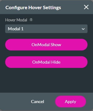
08 What are Hover Modals?
You can insert hover modals that display to users when they hover over a field.
1. Navigate to your element settings and click the Interactivity tab.
2. Enable the Hover Modal function and click the gear icon. The Configure Hover Settings window opens.
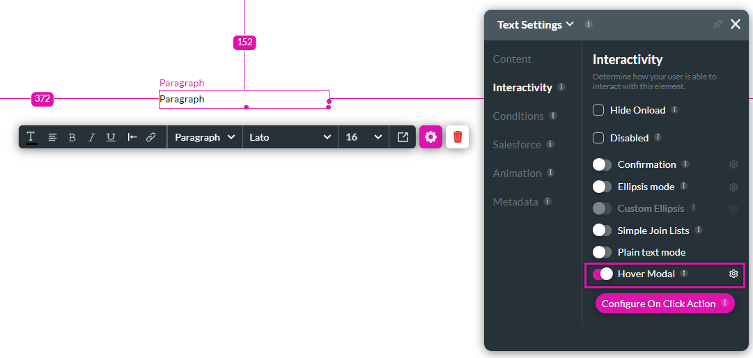
3. Use the dropdown to select which modal to display.
4. Create an action flow by using the OnModal Show and OnModal Hide options.
5. Click Apply.
1. Navigate to your element settings and click the Interactivity tab.
2. Enable the Hover Modal function and click the gear icon. The Configure Hover Settings window opens.
3. Use the dropdown to select which modal to display.
4. Create an action flow by using the OnModal Show and OnModal Hide options.
5. Click Apply.
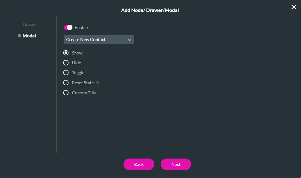
09 To Show your Modal
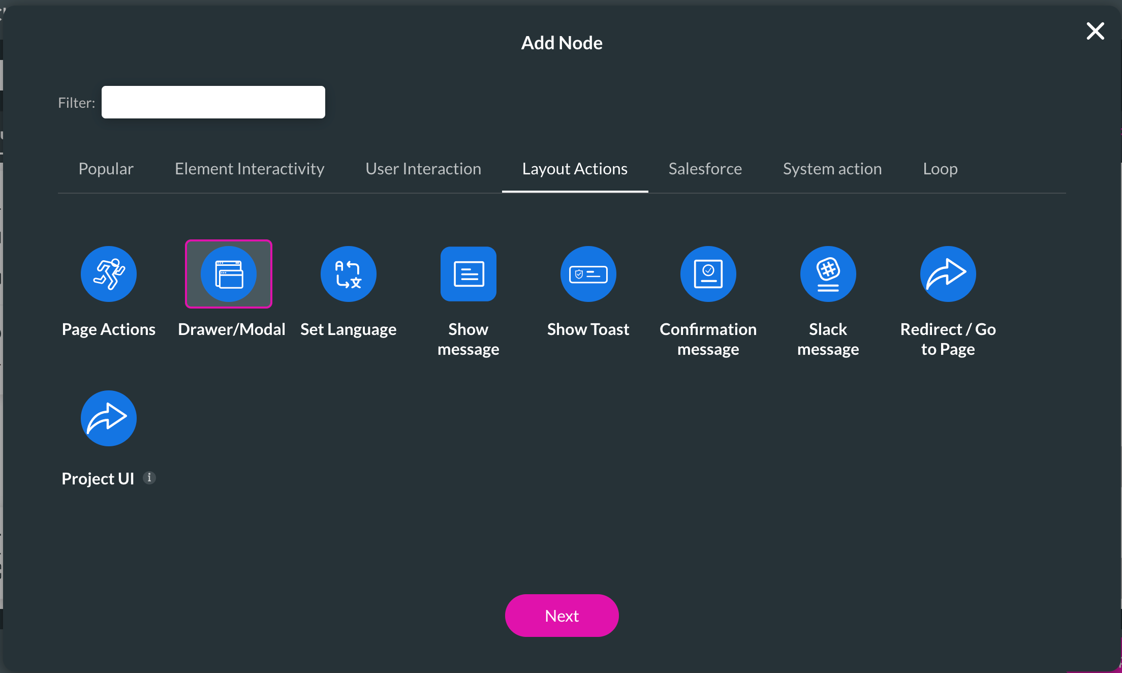
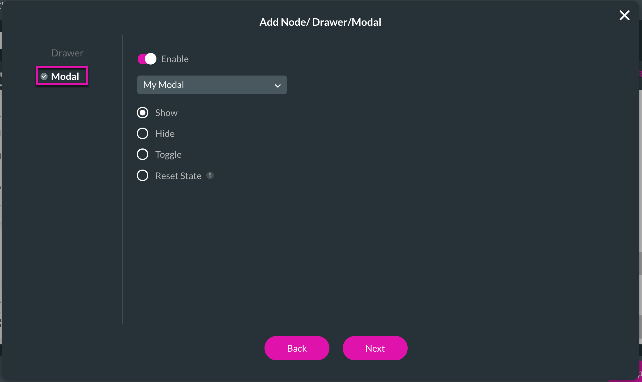
1. Add an On Click Action to a button of your choice by selecting the Drawer/Modal interactivity.
2. Click on the Modal tab And ensure the Enable toggle switch is on.
3. Select your modal and choose the Show radio button.
Save and preview your project. When you click your button, the modal is displayed.
2. Click on the Modal tab And ensure the Enable toggle switch is on.
3. Select your modal and choose the Show radio button.
Save and preview your project. When you click your button, the modal is displayed.
10 To Hide your Modal
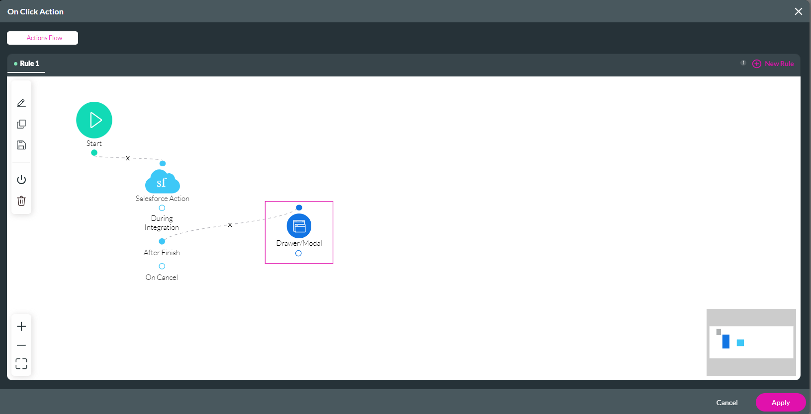
1. Navigate to the On Click Action created for the modal button.
2. Click the After Finish + icon.
3. Click the Drawer/Modal option.

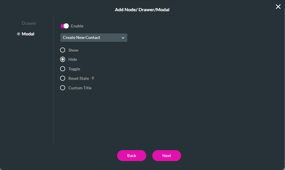
4. Click the Modal tab and ensure the Enable toggle switch is on.
5. Use the drop-down to select the modal and click the Hide radio button. Click Next.
6. Add a tag and click insert.
7. The node is added to the On Click Action window. Click Apply.
Save and preview your project. Once you click on the modal button, the modal closes.
If you click the modal project button again, the modal data will be saved, and you will not have to fill in the details again. Use the same steps above to add a new On Click Action to clear the data after the user submits their contact details. When configuring the action for the modal, select Reset State.

2. Click the After Finish + icon.
3. Click the Drawer/Modal option.
4. Click the Modal tab and ensure the Enable toggle switch is on.
5. Use the drop-down to select the modal and click the Hide radio button. Click Next.
6. Add a tag and click insert.
7. The node is added to the On Click Action window. Click Apply.
Save and preview your project. Once you click on the modal button, the modal closes.
If you click the modal project button again, the modal data will be saved, and you will not have to fill in the details again. Use the same steps above to add a new On Click Action to clear the data after the user submits their contact details. When configuring the action for the modal, select Reset State.
11 Using Modals with Power Table
- Insert and Configure a Power Table
- Link the Modal to Table Interactivity
12 Insert and Configure a Power Table
1. Add a power table to your project. The Salesforce Configuration window opens.
2. Select the source in Salesforce—for example, Contact. Click Next.
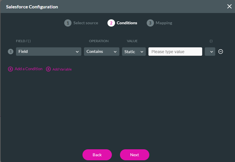
3. Configure Conditions for your power table. For this example, no conditions were required. Click Next.
4. Configure the Power table mapping. For this example, we are adding field mapping and adding an icon. The Icon will be used to configure the modal. Click the Configure on Click Action Icon. The On Click Action screen opens.
5. Click the Start + Icon. The Add Node screen opens.
6. Select Drawer/Modal and click Next.
7. Configure the Modal to show and click Next.
8. Add a tag and click Insert.
The node is added to the On Click Action Screen.
9. Click Apply.
10. Once your Mapping Configuration is complete, click Apply. The configured table displays in your project.
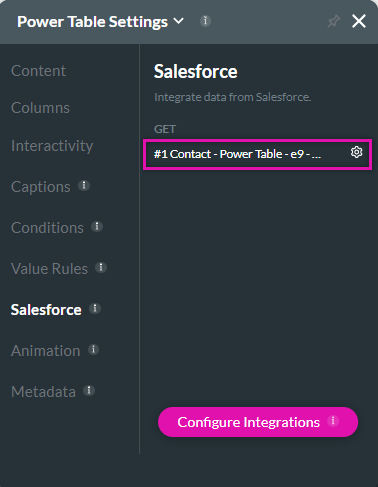
11. Navigate to the Power Table element settings menu and click the Salesforce tab. Click the Gear Icon next to the Get. The Map Salesforce Fields screen opens.
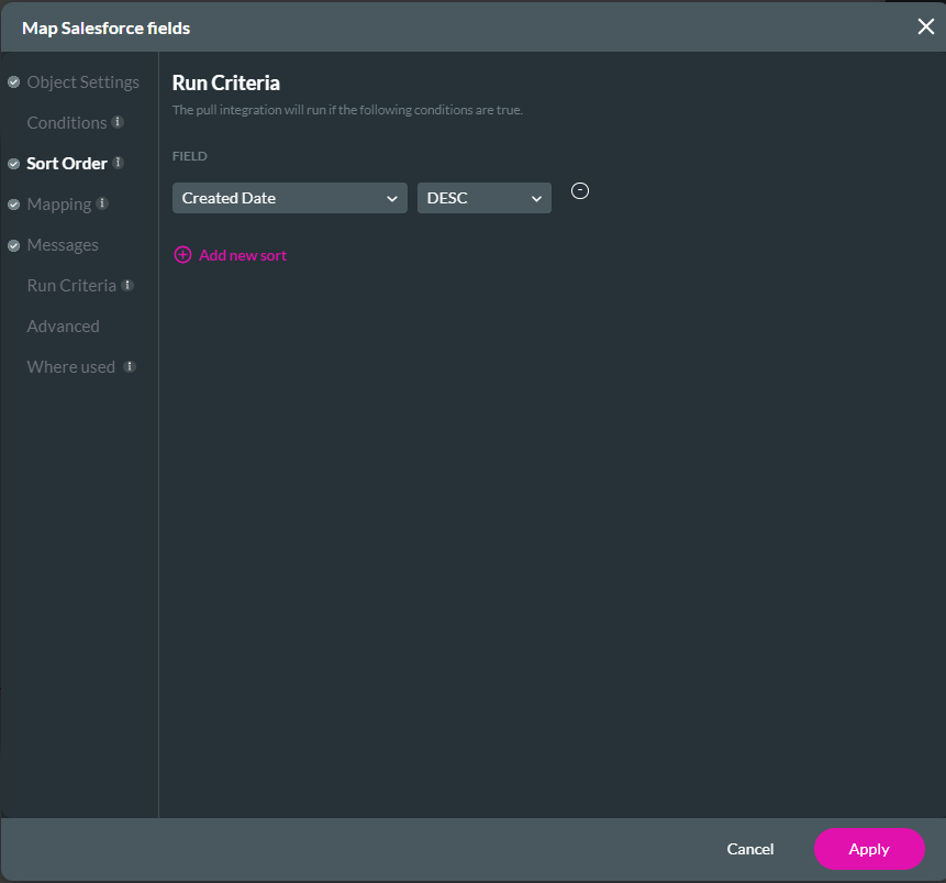
12. Click the Sort Order Tab. Use the drop-down menus to configure how the fields must display, for example, by the Created Date. Click Apply.
2. Select the source in Salesforce—for example, Contact. Click Next.
3. Configure Conditions for your power table. For this example, no conditions were required. Click Next.
4. Configure the Power table mapping. For this example, we are adding field mapping and adding an icon. The Icon will be used to configure the modal. Click the Configure on Click Action Icon. The On Click Action screen opens.
5. Click the Start + Icon. The Add Node screen opens.
6. Select Drawer/Modal and click Next.
7. Configure the Modal to show and click Next.
8. Add a tag and click Insert.
The node is added to the On Click Action Screen.
9. Click Apply.
10. Once your Mapping Configuration is complete, click Apply. The configured table displays in your project.
11. Navigate to the Power Table element settings menu and click the Salesforce tab. Click the Gear Icon next to the Get. The Map Salesforce Fields screen opens.
12. Click the Sort Order Tab. Use the drop-down menus to configure how the fields must display, for example, by the Created Date. Click Apply.
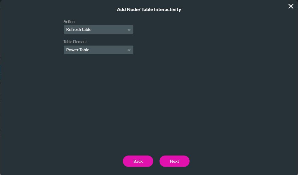
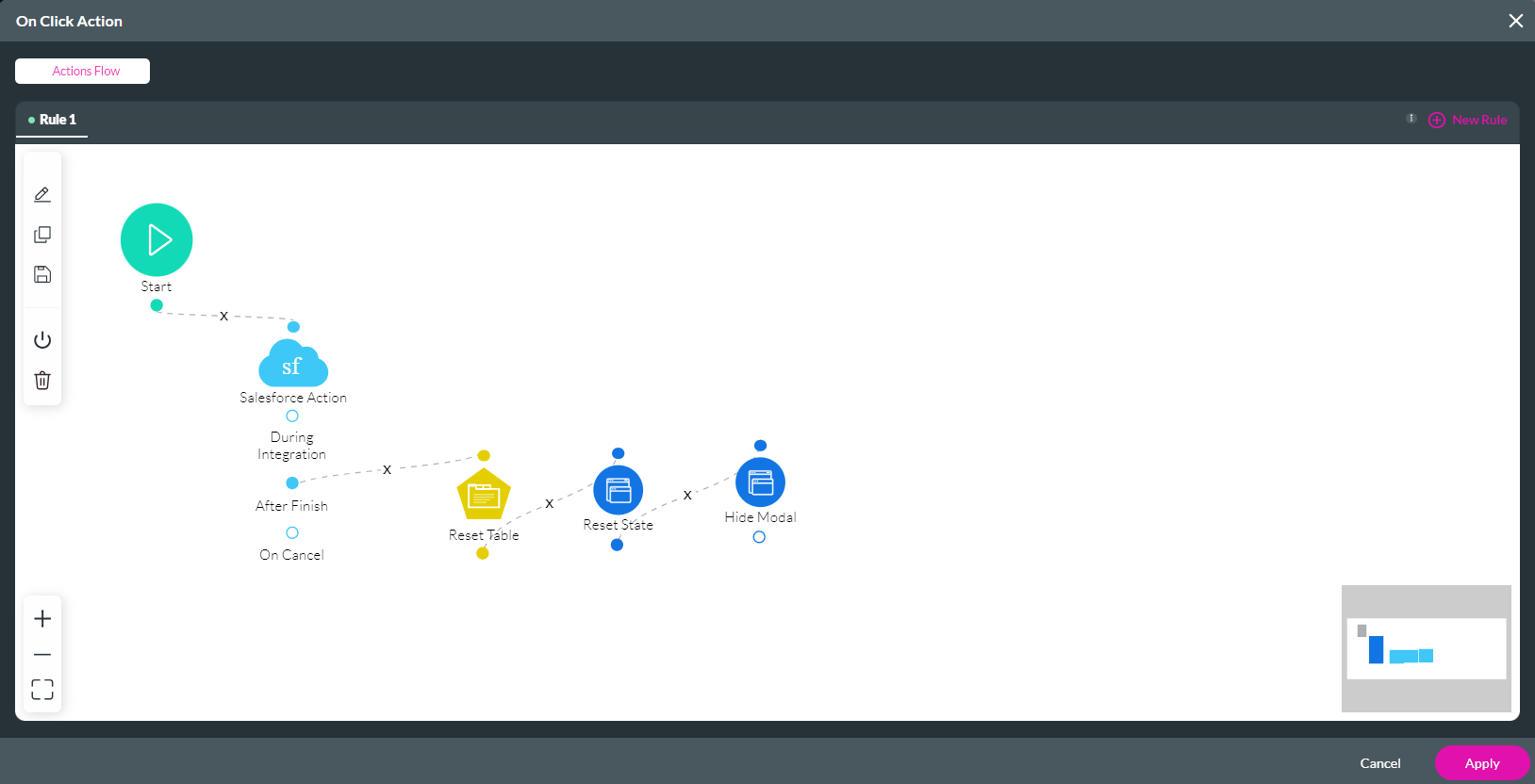
13 Link the Modal to Table Interactivity
When the button is clicked, the modal refreshes the table. Navigate to the modal button on the Click Action screen.
1. Click the On Finish + icon.
2. Select Table Interactivity and click Next.
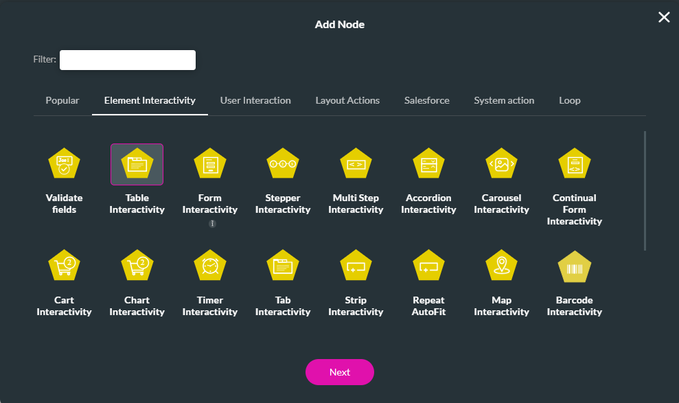
3. Use the drop downs to choose the Action and Table Element. Click Next.
4. Add a tag and click Insert.
5. Use your cursor to connect the nodes. The nodes will run in the order they are connected. Click Apply.
Save and preview the project. Click on the button to display the modal. When you complete the fields in the modal and click the button, the contact will be created and added to your power table.
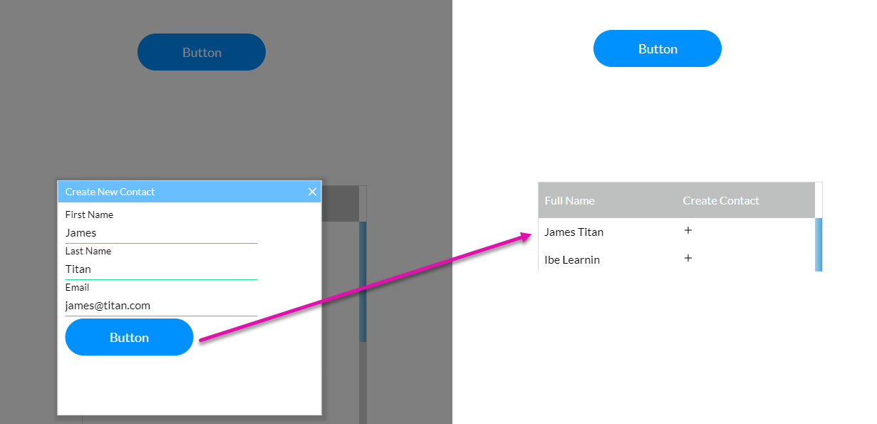
If you click the button again, the modal fields will be empty due to the reset state configuration.
1. Click the On Finish + icon.
2. Select Table Interactivity and click Next.
3. Use the drop downs to choose the Action and Table Element. Click Next.
4. Add a tag and click Insert.
5. Use your cursor to connect the nodes. The nodes will run in the order they are connected. Click Apply.
Save and preview the project. Click on the button to display the modal. When you complete the fields in the modal and click the button, the contact will be created and added to your power table.
If you click the button again, the modal fields will be empty due to the reset state configuration.
14 Using the Same Modal on Different Elements and Pages
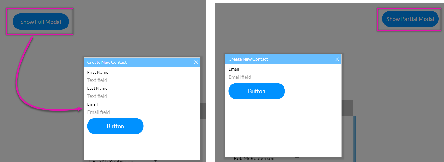
You can choose to use the exact modal for multiple elements. By affecting different elements inside the modal, you can show and hide specific elements.
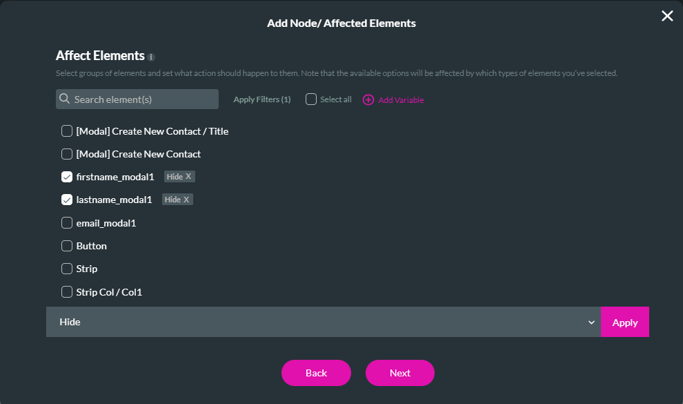
Select the Affected Elements option when adding the node for the other element.
You can choose which elements to show or hide.
Depending on the button pushed, the modal will display differently.
Select the Affected Elements option when adding the node for the other element.
You can choose which elements to show or hide.
Depending on the button pushed, the modal will display differently.