Logic and Interactivity (12 min)
Completion requirements
01 Getting Started
This tutorial covers logic and interactivity for the form element.
02 Hiding a Form Element
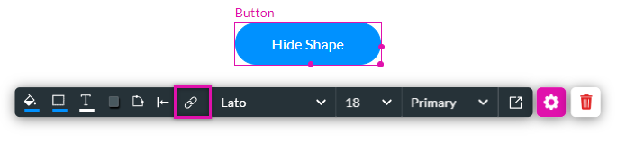
One of the main benefits of using a form is its resizing capabilities. A shape was inserted into the form, and a button with Hide was added. Follow the steps to configure the shape to hide when a user clicks the button.
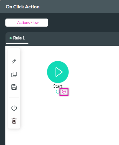
1. Click on the button to display the menu and select the link icon. The On Click Action screen opens.
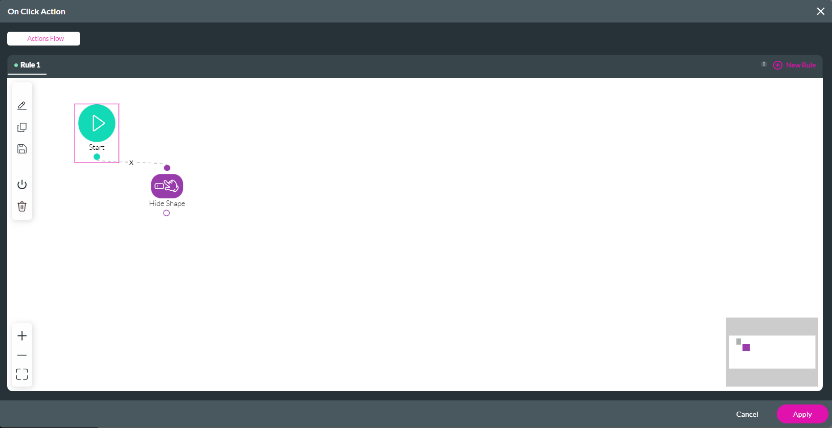
2. Click on the + icon next to Start.
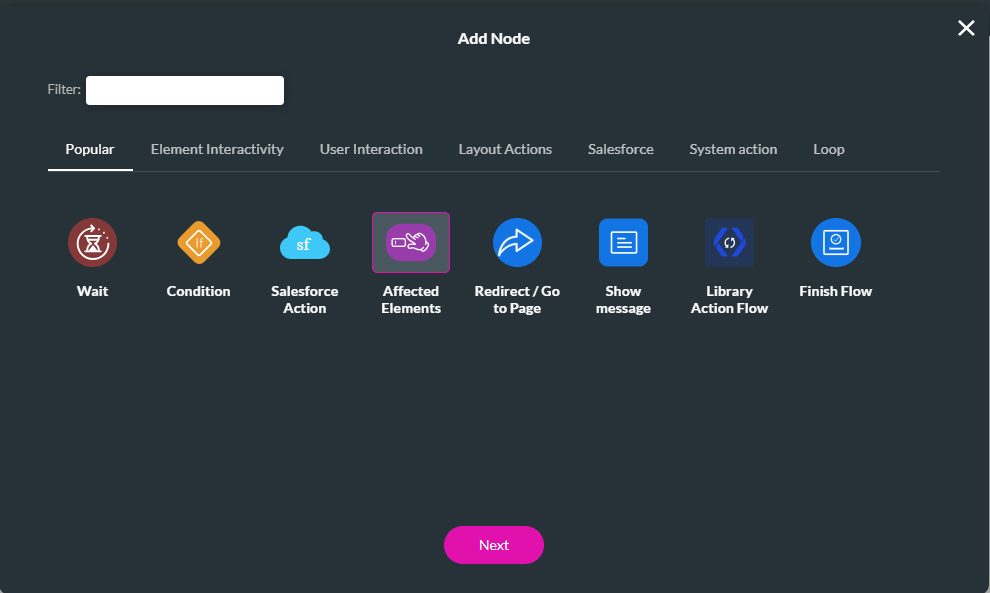
3. Select the Affected Elements option and click next.
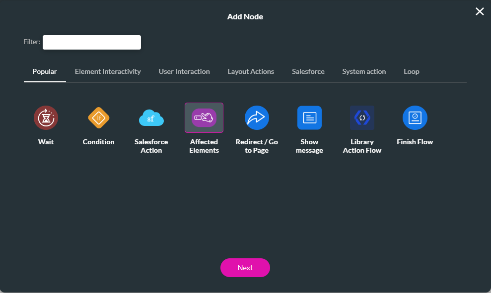
4. Select the Element you want to add an action to. For example, the Shape element.
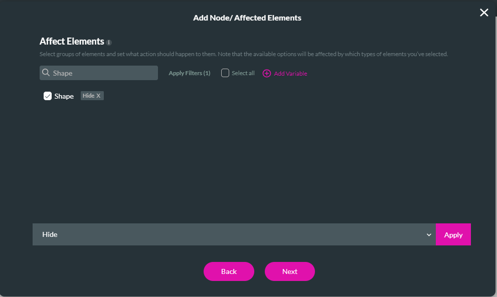
5. Choose the action for the element and click apply. For example, the shape must hide. Click Next.
6. Add a tag for the node and click Insert.
The node is added to the screen.
7. Click Apply.
8. Save and Preview the project.
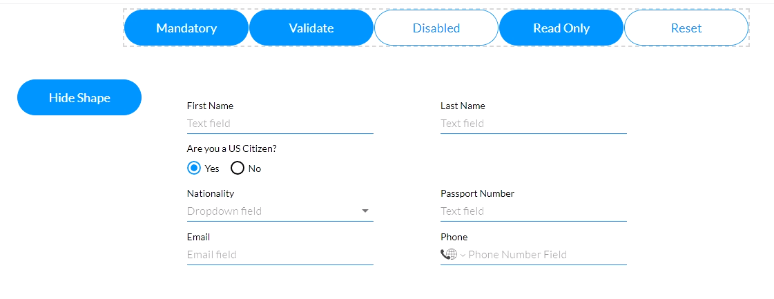
When a user clicks the hide shape button, the shape will be removed from the form.
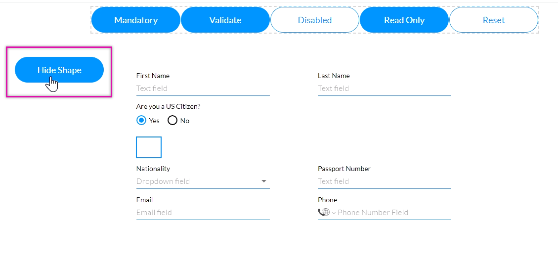
The form will automatically adjust to remove the content instead of leaving a blank space.
1. Click on the button to display the menu and select the link icon. The On Click Action screen opens.
2. Click on the + icon next to Start.
3. Select the Affected Elements option and click next.
4. Select the Element you want to add an action to. For example, the Shape element.
5. Choose the action for the element and click apply. For example, the shape must hide. Click Next.
6. Add a tag for the node and click Insert.
The node is added to the screen.
7. Click Apply.
8. Save and Preview the project.
When a user clicks the hide shape button, the shape will be removed from the form.
The form will automatically adjust to remove the content instead of leaving a blank space.
03 Hiding a Form Row
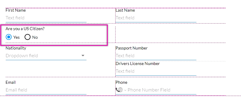
You can hide an entire form row depending on the user's input. For example, the row below must be hidden if the user is a US citizen.
The form rows have been renamed to assist when creating conditions. The steps to rename rows were covered in the previous lesson.
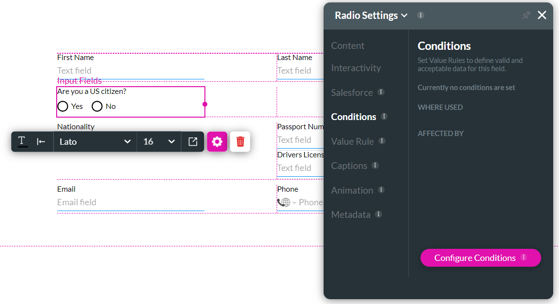
1. Click on the Element gear icon. The Element Settings window opens.
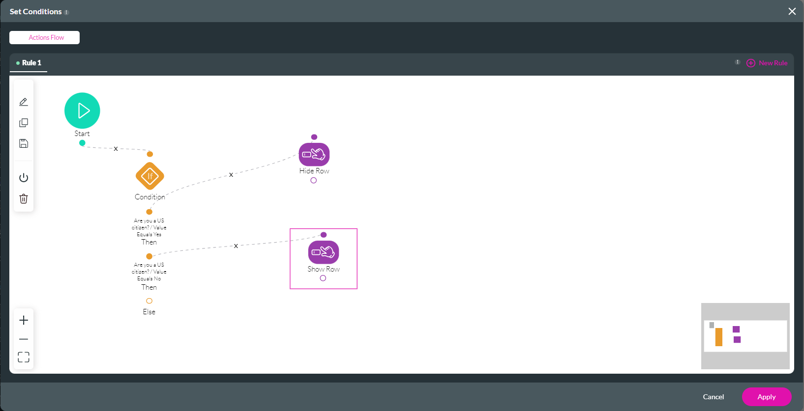
2. Select the Conditions tab and click the Configure Conditions button. The Set Conditions screen opens.
3. Click on the condition. The Set Conditions screen opens.
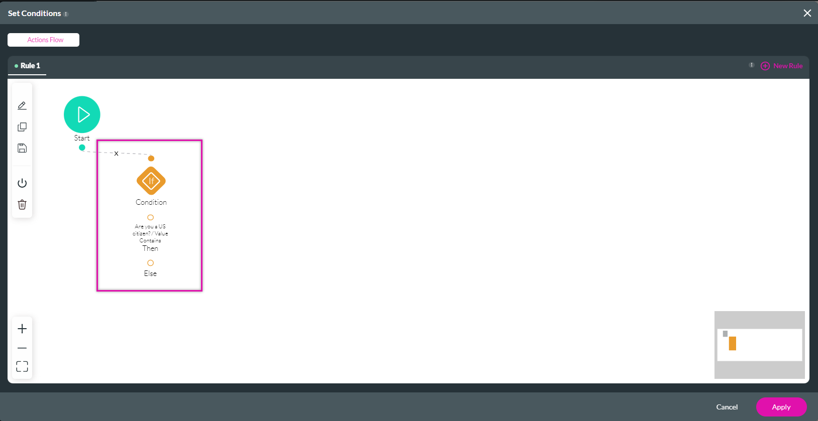
4. Create two rules, one for a yes and one for a no. Click Next.
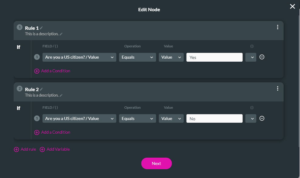
5. Add a tag for the condition and click Save.
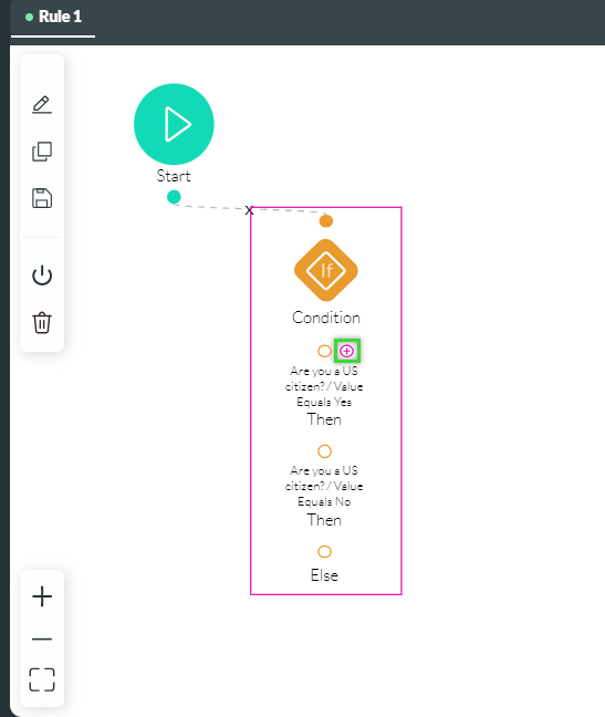
To configure the action if the answer is yes:
1. Click the + icon next to the Value Equals Yes condition.
2. Choose Affected Elements and click Next.
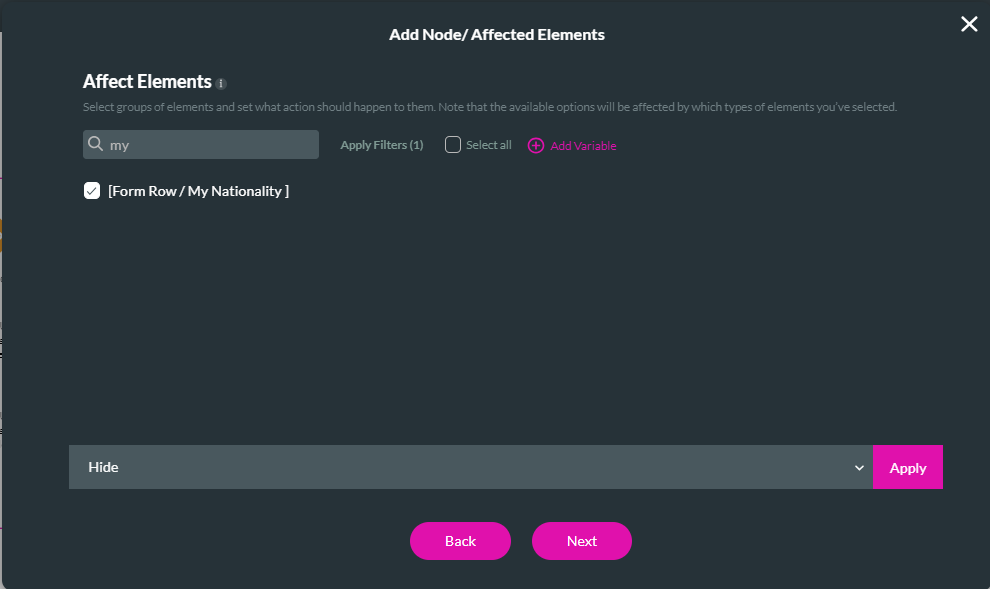
3. Select the row from the list of elements. By renaming your rows, finding the correct row is easy.
4. Choose an action to apply to the row, such as hiding, and click Apply. Then click Next.
5. Type in a tag and click Insert.
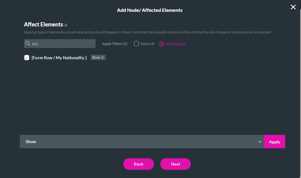
Repeat the same steps for the Value Equals. There is no condition, but the action is set to show.
The Set Conditions screen should now have two affected element nodes: one to show the row and one to hide it.
6. Click Apply.
7. Save and Preview the project.
The entire form is displayed if a user indicates they are not US citizens.
If the user clicks yes, the below row is hidden, and the form is resized.
The form rows have been renamed to assist when creating conditions. The steps to rename rows were covered in the previous lesson.
1. Click on the Element gear icon. The Element Settings window opens.
2. Select the Conditions tab and click the Configure Conditions button. The Set Conditions screen opens.
3. Click on the condition. The Set Conditions screen opens.
4. Create two rules, one for a yes and one for a no. Click Next.
5. Add a tag for the condition and click Save.
To configure the action if the answer is yes:
1. Click the + icon next to the Value Equals Yes condition.
2. Choose Affected Elements and click Next.
3. Select the row from the list of elements. By renaming your rows, finding the correct row is easy.
4. Choose an action to apply to the row, such as hiding, and click Apply. Then click Next.
5. Type in a tag and click Insert.
Repeat the same steps for the Value Equals. There is no condition, but the action is set to show.
The Set Conditions screen should now have two affected element nodes: one to show the row and one to hide it.
6. Click Apply.
7. Save and Preview the project.
The entire form is displayed if a user indicates they are not US citizens.
If the user clicks yes, the below row is hidden, and the form is resized.
04 Replacing One Element with Another
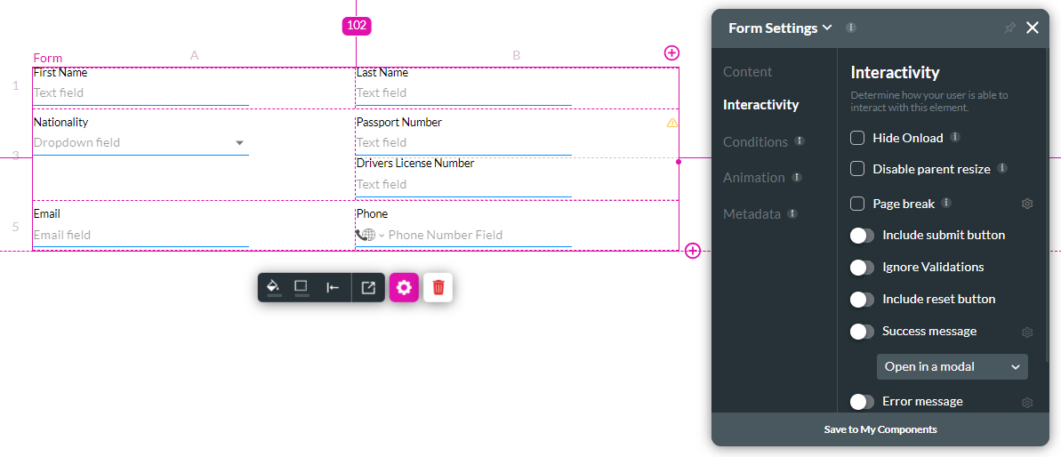
Depending on the previous answer provided, you can set logic to display a different element. Two elements have been inserted into the same cell; this should not be done unless you create conditional logic to display one element or another, depending on the previous data provided.
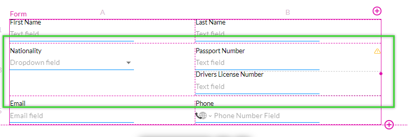
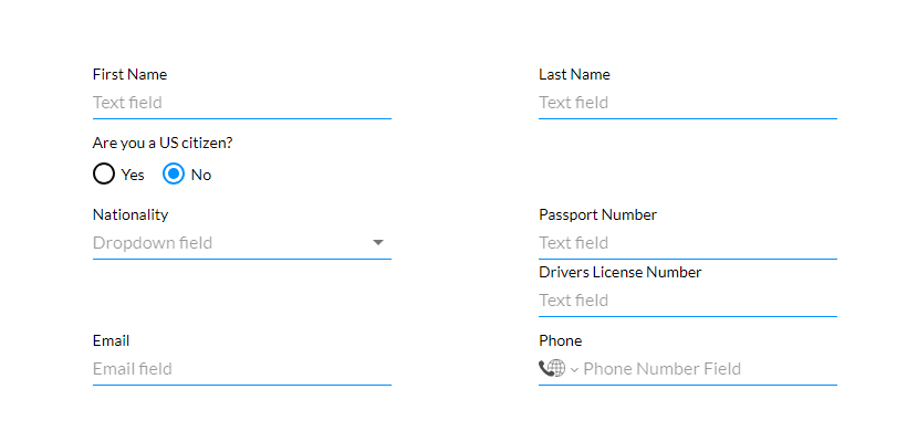
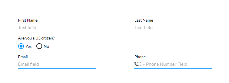
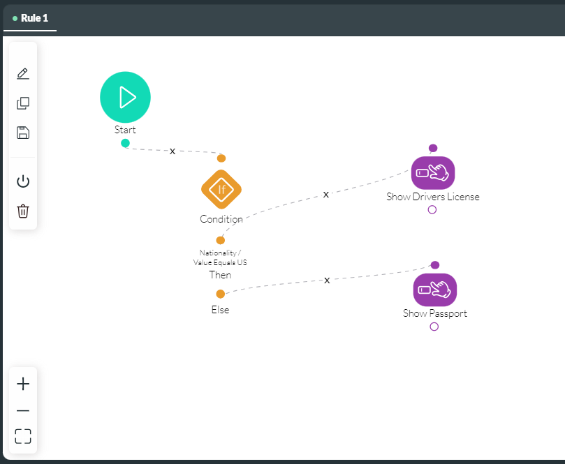
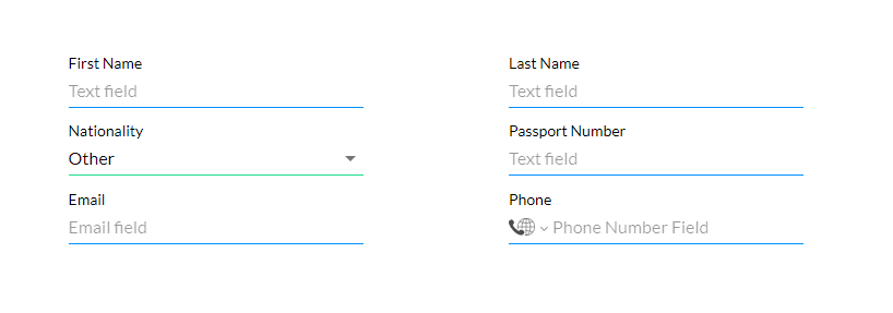
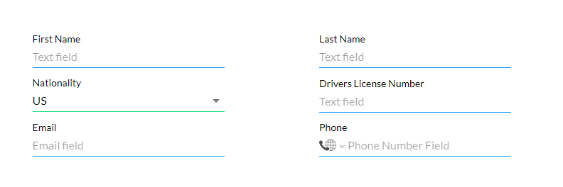
A condition has been configured on the nationality element to display a specific element depending on what option the user selects. If the user is a US citizen, the driver's license field will display; the passport field will display if the user is not a US citizen.
Let's review how this displays to the user.
The passport number field displays if the user chooses a nationality other than the US.
If the user selects the US option, the driver's license field displays.
05 Form Interactivity
1. Navigate to the Form settings window and click the Interactivity tab.
You can choose to:
You can choose to:
- Hide your form when the page is loading.
- Disable the parent resize function so that when the form is moved on the canvas, the strip does not automatically resize.
- Add page breaks.
- Include a submit button.
- Ignore validations.
- Include a reset button that will reset all the field values on the form.
- Add success and error messages.
- Enable the partial render option, which can improve user experience by rendering only part of a very long form.
06 Adding a Page Break
1. Enable the Page break function to include page breaks for your form. This is useful if your form consists of multiple rows.
2. Click the gear icon to configure the form page break settings.
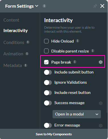
You can configure:
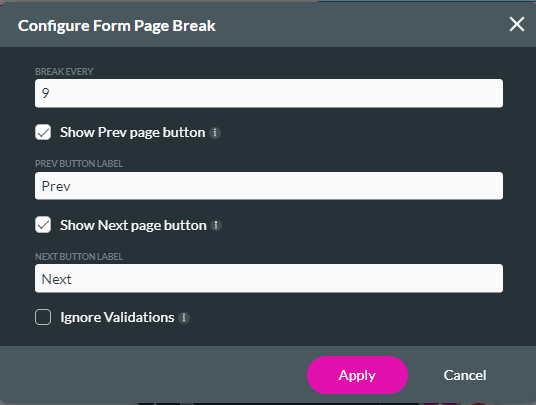
2. Click the gear icon to configure the form page break settings.
You can configure:
- Break every: This is how many rows are displayed per form page.
- Previous Button Label: Add your label for the previous button. You can choose to hide this button.
- Next Button Label: Add your label for the next button. You can choose to hide this button.
- Ignore Validations: The user can submit the content even if the input isn’t valid.
07 Including a Submit Button
1. Enable the submit button function.
2. Change the button text by typing in the button text field.
3. Click the Configure Submit action to configure an action flow.
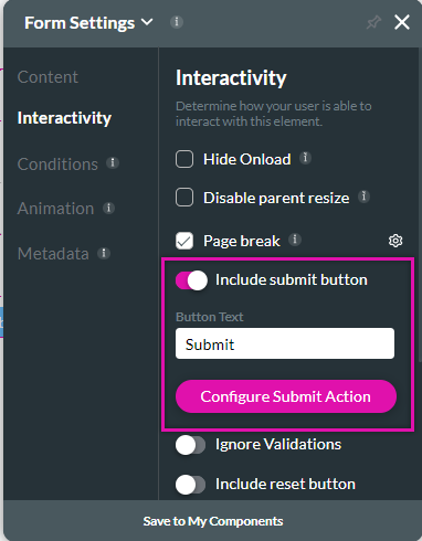
You can also insert a button manually and add the configuration. Using a custom button includes more styling options.
2. Change the button text by typing in the button text field.
3. Click the Configure Submit action to configure an action flow.
You can also insert a button manually and add the configuration. Using a custom button includes more styling options.
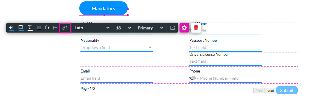
08 Affecting Elements Inside the Form
Inserting an interactive element outside of a form, such as a button, can affect elements inside the form.
1. Insert a button outside your form element and click the link icon.
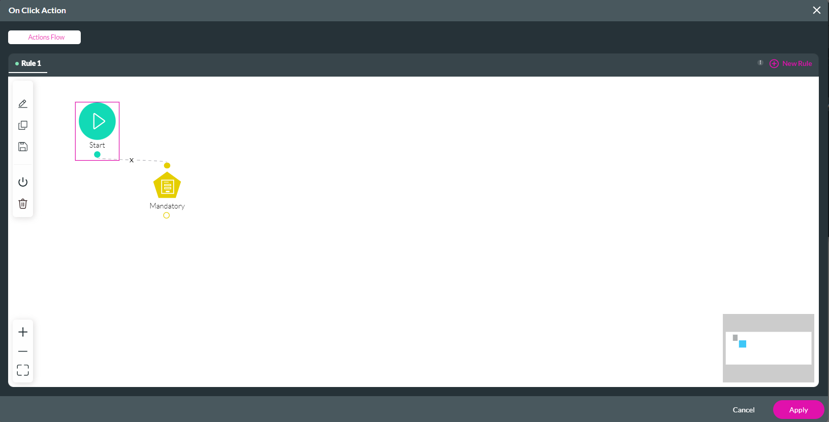
2. Click the Start + icon. The Add Node screen opens.
3. Select the Form Interactivity option and click Next.
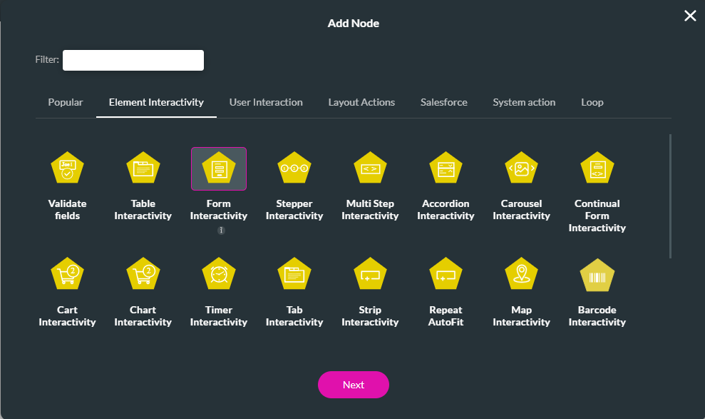
4. Choose the form interactivity options. Click Next.
5. Add a tag and click Insert.
The node is added to the on-click action screen.
6. Click Apply.
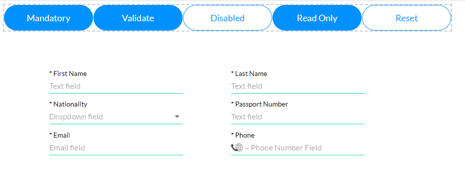
You can follow the same steps for a variety of form interactivity options. This includes a validate function, turning off all fields, making fields read-only, and resetting all field values.
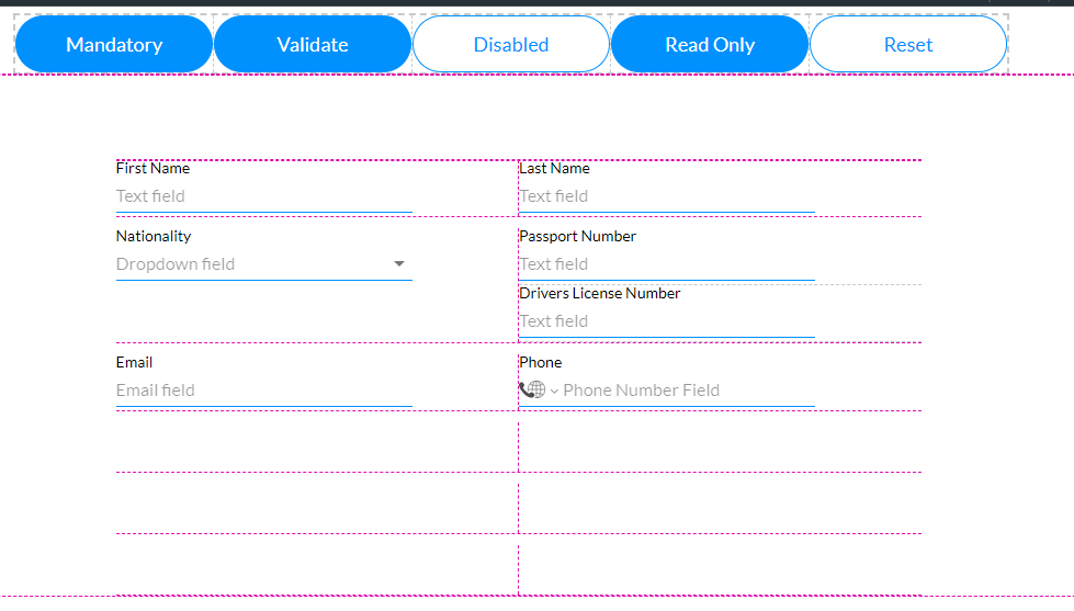
The form is affected when the user clicks on each button. For example, clicking the mandatory button automatically makes each field mandatory.
1. Insert a button outside your form element and click the link icon.
2. Click the Start + icon. The Add Node screen opens.
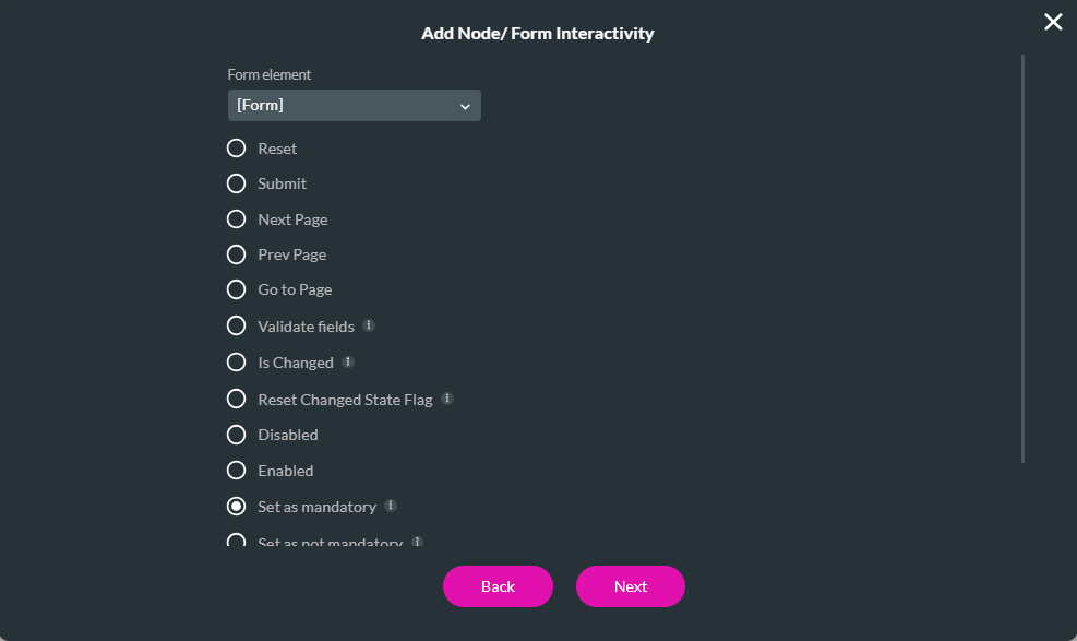
3. Select the Form Interactivity option and click Next.
4. Choose the form interactivity options. Click Next.
- Reset
- Submit
- Next Page
- Prev Page
- Go to Page
- Validate Fields
- Is Changed
- Reset Changed State Flag
- Disabled Enable
- Set as Mandatory - This was selected for our example.
- Set as not mandatory
- Read Only Form
- Editable Form
5. Add a tag and click Insert.
The node is added to the on-click action screen.
6. Click Apply.
You can follow the same steps for a variety of form interactivity options. This includes a validate function, turning off all fields, making fields read-only, and resetting all field values.
The form is affected when the user clicks on each button. For example, clicking the mandatory button automatically makes each field mandatory.