Interactivity & Features (10 min)
Completion requirements
01 Getting Started
In this lesson, we will look at the features and interactivity of multi-step containers. We will focus on the stepper container and make some remarks on accordion, tab, and multi-step containers.
We will review how to add steps and conditional steps, which will only appear conditionally. We will look at how to trigger conditions based on steps and how to run actions based on the user's current step. We will highlight how to do validations, turn off the name click, and use dot styles for mobile devices. We will discuss how to hide the default controls on the containers and use custom buttons.
We will review how to add steps and conditional steps, which will only appear conditionally. We will look at how to trigger conditions based on steps and how to run actions based on the user's current step. We will highlight how to do validations, turn off the name click, and use dot styles for mobile devices. We will discuss how to hide the default controls on the containers and use custom buttons.
02 Quick Overview
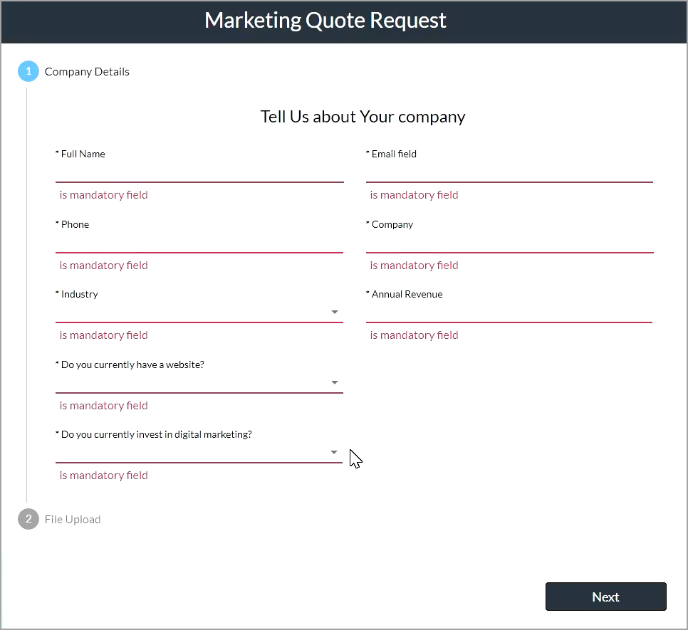
If a stepper has mandatory fields, the user cannot proceed to the next step if these fields are not completed. This functionality can be removed, and we will show you how later.
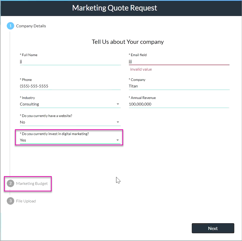
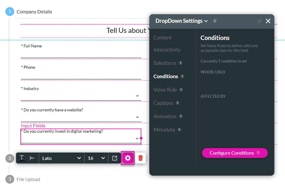
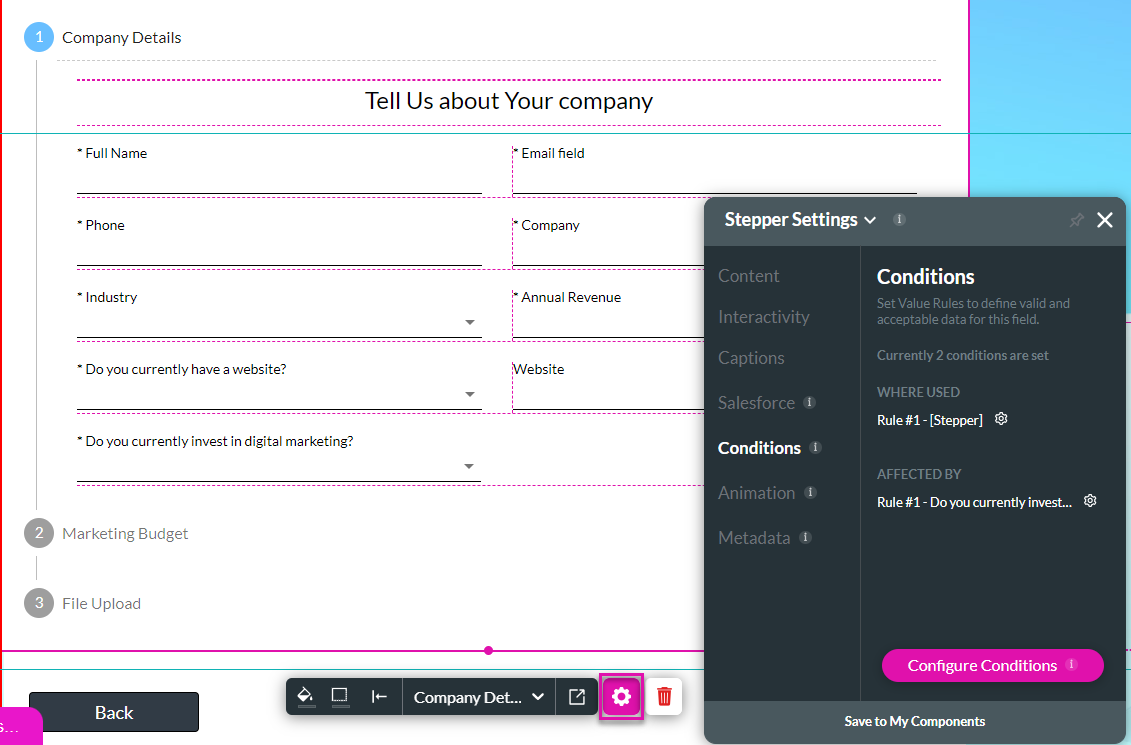
Steps can be hidden or shown depending on the answer to a question. In this example, if the user selects “Yes” on the “Do you currently invest in digital marketing?” question, the Marketing Budget step is added. Steps can be shown according to conditions.
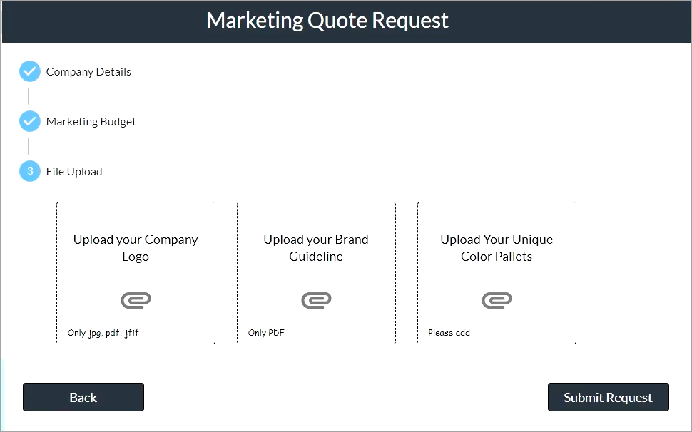
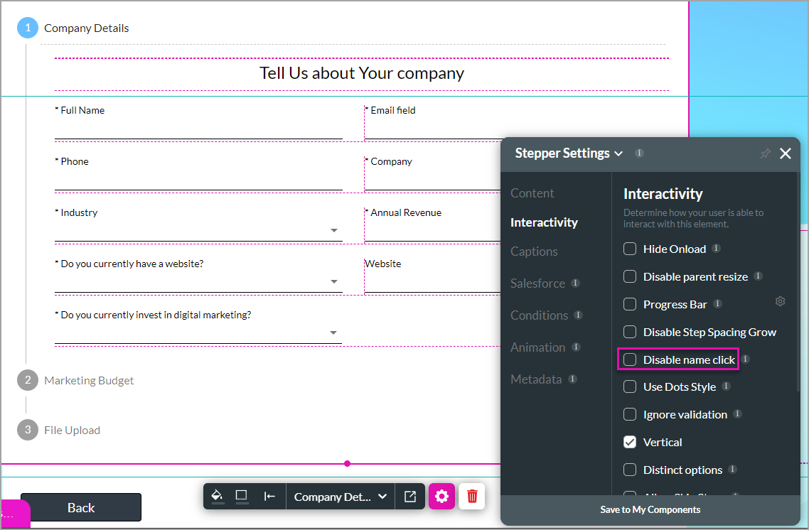
If the user tries to click on the name of the step (Marketing Budget), nothing happens as the Name Click was disabled. The user has to click the Next button to proceed to the Marketing budget step. You can change this if you want.

Please note that the buttons on the last step differ from those in previous steps. We can conditionally hide and show buttons on a step. If you don’t want to use the default controls, you can add custom buttons.
Steps can be hidden or shown depending on the answer to a question. In this example, if the user selects “Yes” on the “Do you currently invest in digital marketing?” question, the Marketing Budget step is added. Steps can be shown according to conditions.
If the user tries to click on the name of the step (Marketing Budget), nothing happens as the Name Click was disabled. The user has to click the Next button to proceed to the Marketing budget step. You can change this if you want.
Please note that the buttons on the last step differ from those in previous steps. We can conditionally hide and show buttons on a step. If you don’t want to use the default controls, you can add custom buttons.
03 Add Steps to the Stepper
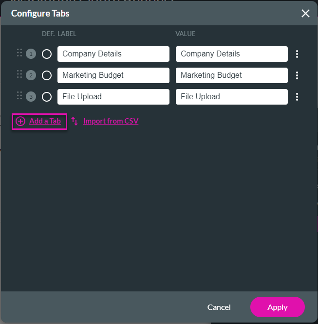
You can easily add more steps to a stepper.
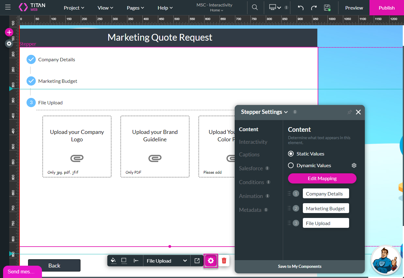
1. Select the stepper container and click the Gear icon. The Settings screen opens.
2. Click the Edit Mapping button to add Static steps.
3. Click the Add a Tab option and type a label and value in the fields before clicking the Apply button.
1. Select the stepper container and click the Gear icon. The Settings screen opens.
2. Click the Edit Mapping button to add Static steps.
3. Click the Add a Tab option and type a label and value in the fields before clicking the Apply button.
04 Hide and Show Steps Conditionally
We configured a condition on the “Do you currently invest in digital marketing?” field. Let’s show you how we did it.
1. Select the field and click the Gear icon. The Settings screen opens.
2. Under Conditions, click the Configure Conditions button.
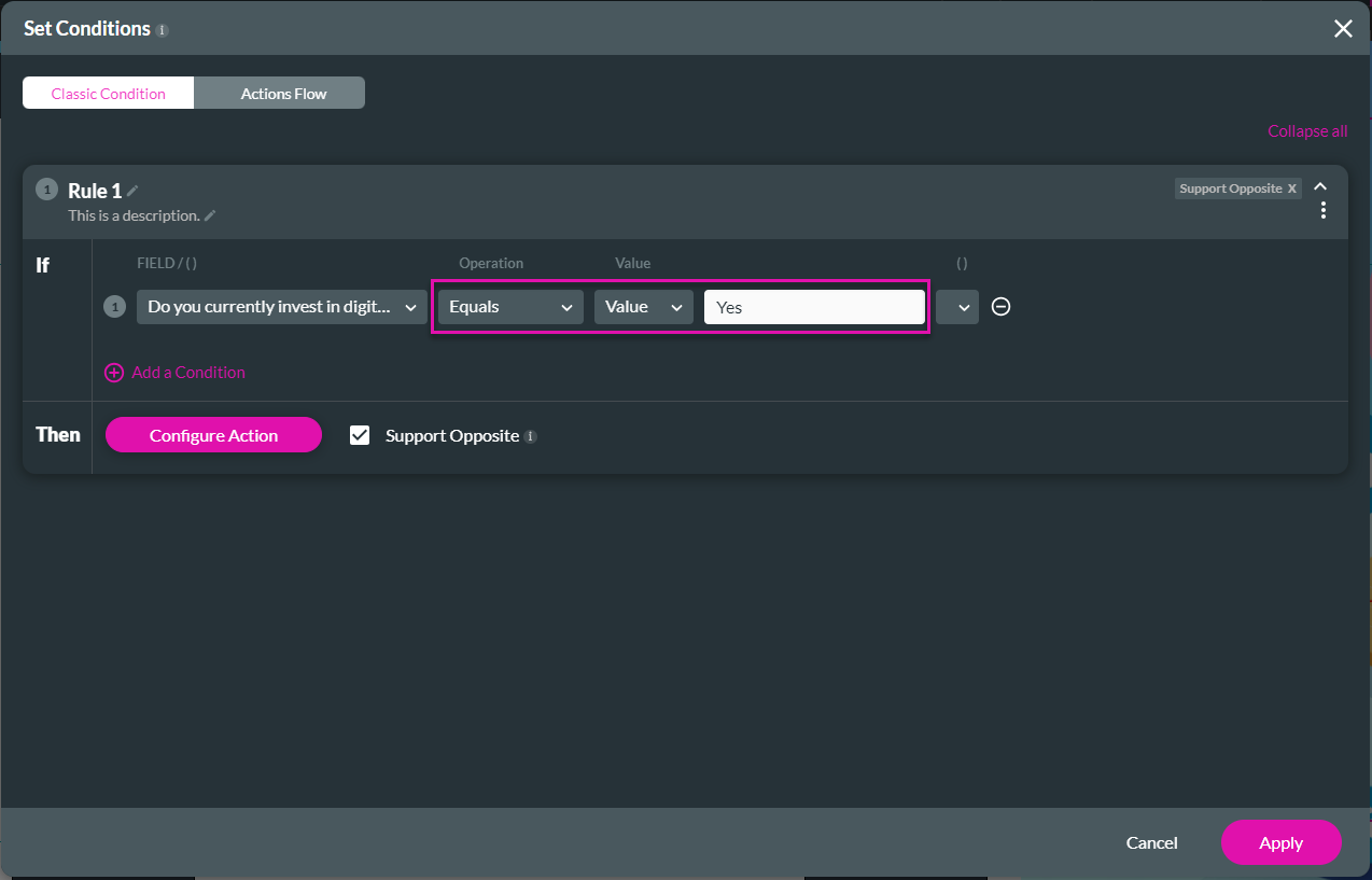
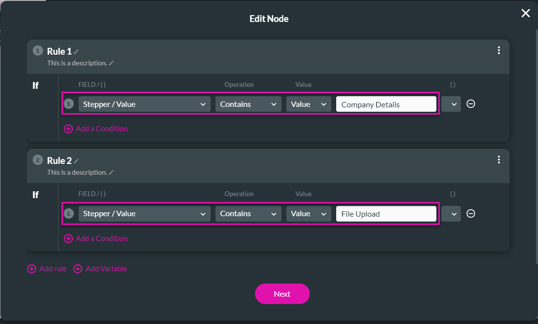
3. Select the field (Do you currently invest in digital marketing?) from the drop-down list and configure the condition.
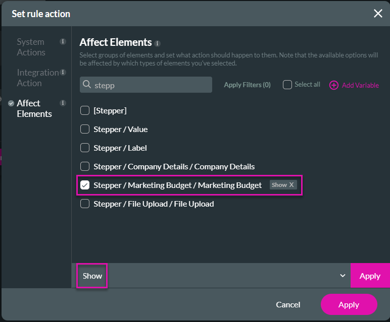
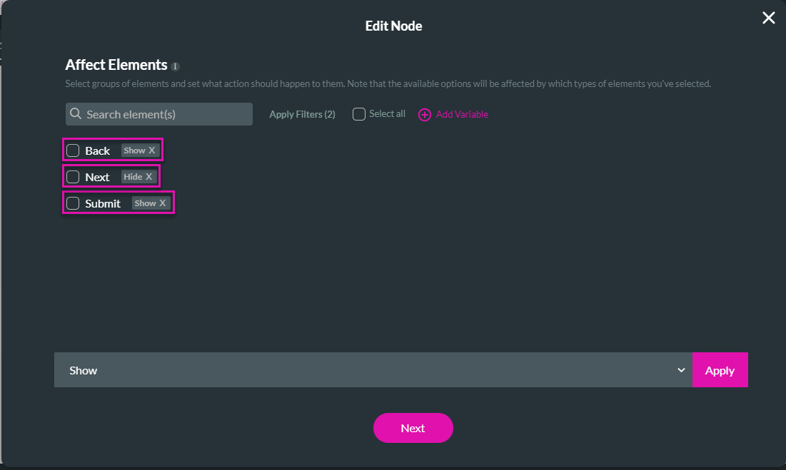
5. Search the Affect Elements option for the Stepper Marketing Budget.
6. Click the checkbox.
7. Select the Show option from the drop-down list and click the Apply button.
8. Click the Apply button to close the Set Rule action screen.
9. Click the Apply button on the Set Conditions screen.
1. Select the field and click the Gear icon. The Settings screen opens.
2. Under Conditions, click the Configure Conditions button.
3. Select the field (Do you currently invest in digital marketing?) from the drop-down list and configure the condition.
- Equals Value Yes
5. Search the Affect Elements option for the Stepper Marketing Budget.
6. Click the checkbox.
7. Select the Show option from the drop-down list and click the Apply button.
8. Click the Apply button to close the Set Rule action screen.
9. Click the Apply button on the Set Conditions screen.
05 Add Conditions Based on the Value of a Step
1. Select the stepper container and click the Gear icon. The Settings screen opens.
2. Click the Conditions option.
3. Configure the condition.
We configured the following:
1. Two rules:
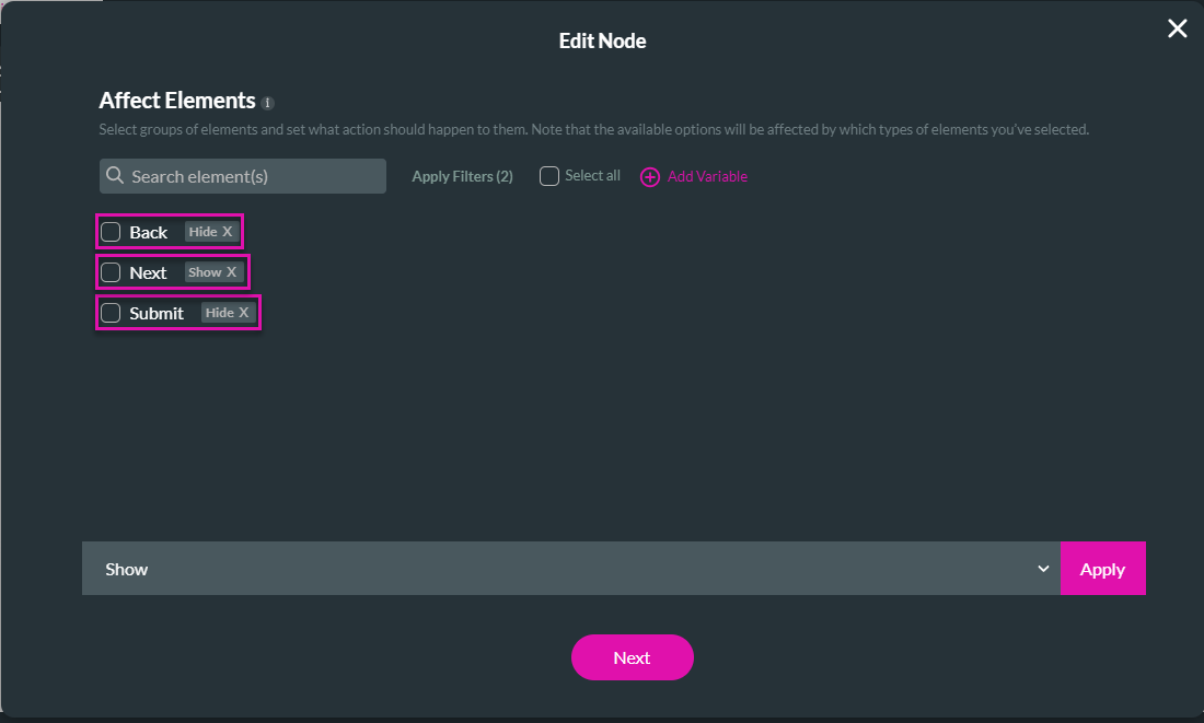
2. An Affect Element node:
It looks as follows:
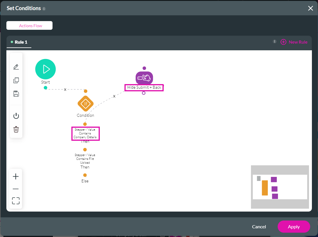
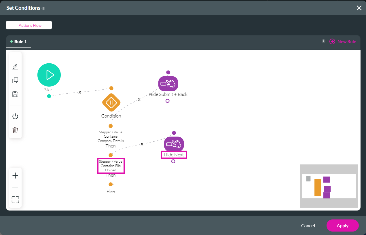
We then added an Affected Elements node that states the following:
If the Stepper Value Contains File Upload, Hide the Next button and Show the Back and Submit buttons.
The Actions Flow now looks as follows:
We then added an Affected Node on the Else as follows:

Now the Actions Flow looks as follows:
2. Click the Conditions option.
3. Configure the condition.
We configured the following:
1. Two rules:
- If the Stepper Value Contains the Value Company Details
- If the Stepper Value Contains the Value File Upload
2. An Affect Element node:
- Hide the Back button
- Show the Next button
- Hide the Submit button
It looks as follows:
We then added an Affected Elements node that states the following:
If the Stepper Value Contains File Upload, Hide the Next button and Show the Back and Submit buttons.
The Actions Flow now looks as follows:
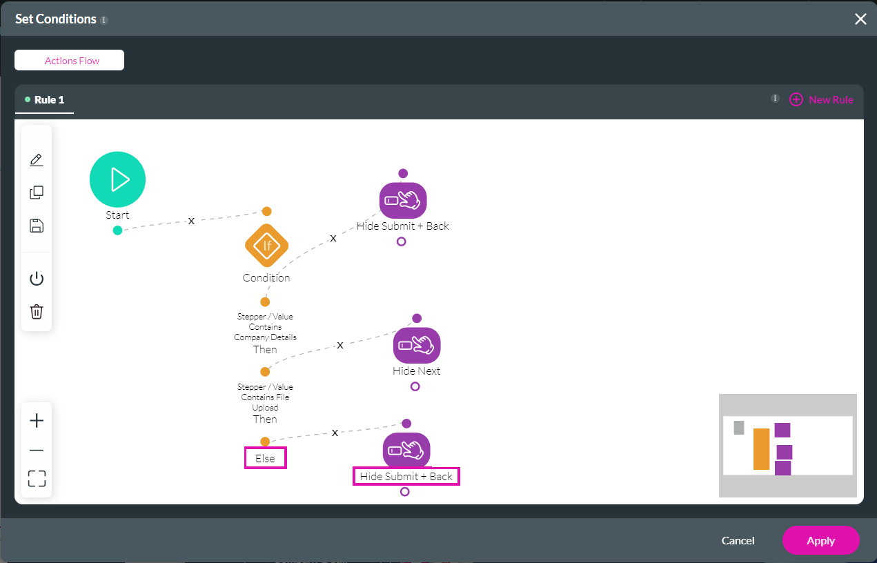
We then added an Affected Node on the Else as follows:
- Else Hide the Submit and Back buttons and Show the Next button.
Now the Actions Flow looks as follows:
06 Add Interactivity on the Stepper
There are many options under Interactivity, but we will only focus on a few.
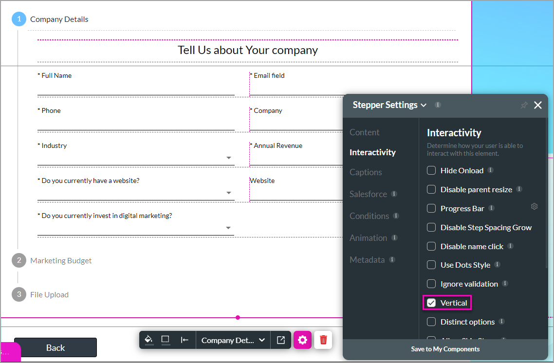
1. Select the stepper container and click the Gear icon.
2. Click Interactivity to view all the available options. In this example, the Vertical checkbox is checked; therefore, the stepper container is shown vertically. Uncheck the option to show the stepper horizontally.
3. Click the Ignore validation checkbox to ignore any validations on fields. For instance, if we select Ignore validations in this stepper, the mandatory fields will not be validated, and a user can go to the next step without filling in the mandatory fields.

4. Click the Disable Name Click checkbox to prevent the user from jumping around in the stepper by clicking the name of a step. If this option is on, the user must click the Next button to move to the next step.
1. Select the stepper container and click the Gear icon.
2. Click Interactivity to view all the available options. In this example, the Vertical checkbox is checked; therefore, the stepper container is shown vertically. Uncheck the option to show the stepper horizontally.
3. Click the Ignore validation checkbox to ignore any validations on fields. For instance, if we select Ignore validations in this stepper, the mandatory fields will not be validated, and a user can go to the next step without filling in the mandatory fields.
- This option is available for steppers and multi-step containers but not for tabs and accordions, as they are not used for linear processes.
4. Click the Disable Name Click checkbox to prevent the user from jumping around in the stepper by clicking the name of a step. If this option is on, the user must click the Next button to move to the next step.
- This option is available for steppers and multi-step containers but not for tabs and accordions.
07 Use the Dot Style
This option is helpful for mobile device layouts, but you can use it for any device.
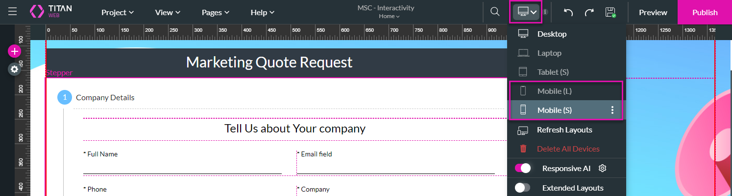
We used the Device drop-down list and selected one of the Mobile options.
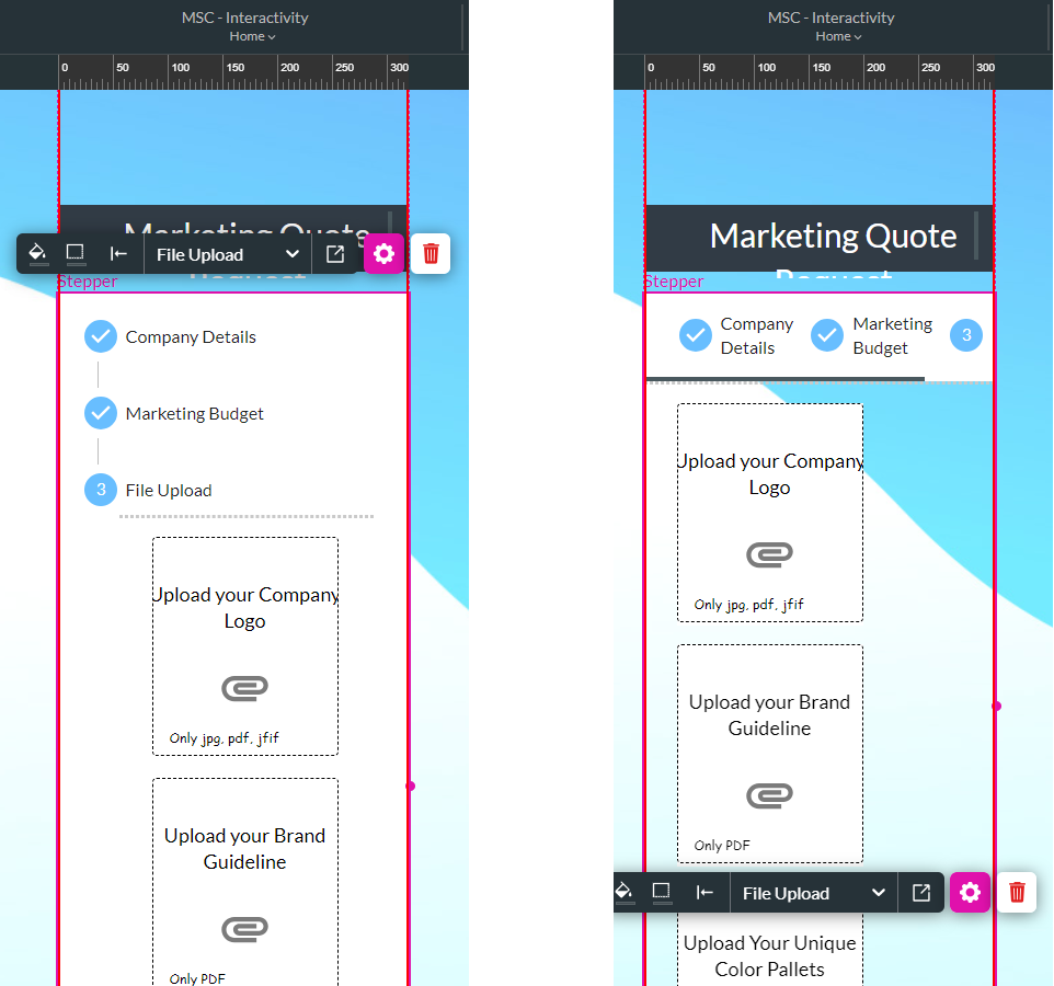
You can see the vertical layout on the left and the horizontal layout on the right. The different steps on the horizontal layout are impossible to see unless the user scrolls to the right.
To mitigate this, you can use the Dot style.
1. Select the stepper container and click the Gear icon.
2. Under Interactivity, click the Use Dot Style checkbox.
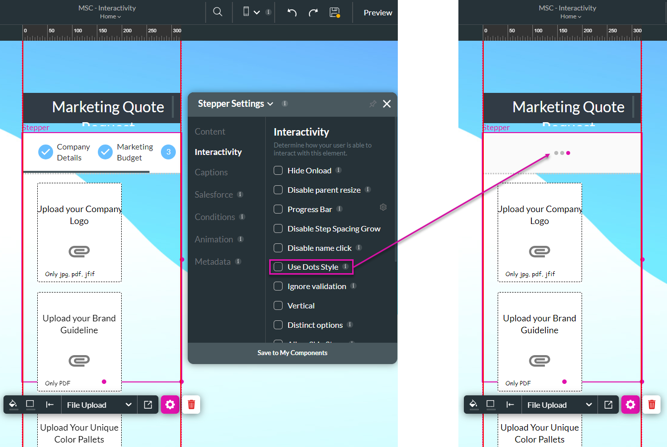
The dot style hides the step labels and replaces them with dots. The number of dots corresponds to the number of steps.
We used the Device drop-down list and selected one of the Mobile options.
You can see the vertical layout on the left and the horizontal layout on the right. The different steps on the horizontal layout are impossible to see unless the user scrolls to the right.
To mitigate this, you can use the Dot style.
1. Select the stepper container and click the Gear icon.
2. Under Interactivity, click the Use Dot Style checkbox.
- This option can be used on any device size.
The dot style hides the step labels and replaces them with dots. The number of dots corresponds to the number of steps.
08 Hide the Default Controls and Use Custom Buttons
You can hide the default stepper controls and use custom buttons. If the Hide Controls checkbox is not checked, you will see the default buttons on the stepper.
All the Titan multi-step containers have default controls.
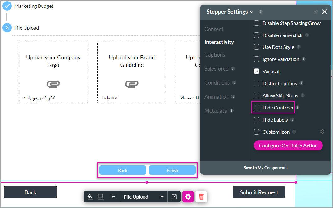
Running any actions on the default Back and Next buttons is impossible.
For more customization and custom styling, do the following:
1. Click the Hide Controls checkbox.
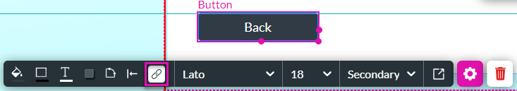
2. Add button elements where necessary.
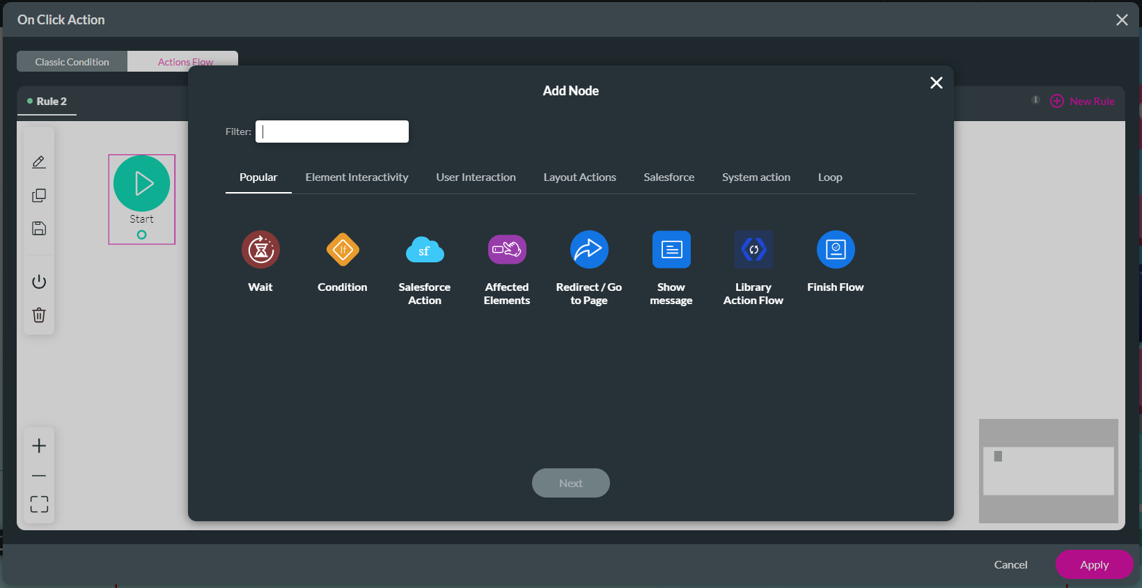
3. Click the button element’s Gear icon and click the On Click Action icon.
4. Hover with the mouse pointer on the Start node and click the + icon. The Add Node screen opens.
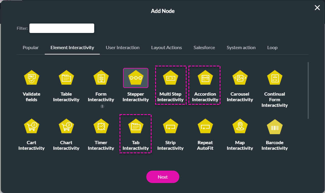
5. Select the Element Interactivity tab and, in our example, the Stepper Interactivity.
7. Use the drop-down list to select the stepper.
8. Use the radio button to select an option:
9. Click the Next button.
10. Add a descriptive tag and click the Insert button. The interactivity is added to the action flow.
11. Click the Apply button.
These were a few of the standard functionalities of multi-step containers.
All the Titan multi-step containers have default controls.
Running any actions on the default Back and Next buttons is impossible.
For more customization and custom styling, do the following:
1. Click the Hide Controls checkbox.
2. Add button elements where necessary.
3. Click the button element’s Gear icon and click the On Click Action icon.
4. Hover with the mouse pointer on the Start node and click the + icon. The Add Node screen opens.
5. Select the Element Interactivity tab and, in our example, the Stepper Interactivity.
- Alternatively, you can choose the applicable option for your container type:
- Multi Step Interactivity
- Accordion Interactivity
- Tab Interactivity
7. Use the drop-down list to select the stepper.
8. Use the radio button to select an option:
- Reset: reset the value in the container.
- Prev Step: go to the previous Step
- Next Step: go to the next Step
- Go to Step: go to a specific step. A field is added, and you can add a static or field value.
- Finish: trigger a finish action.
- Scroll to
- None
- Top
- Bottom
9. Click the Next button.
10. Add a descriptive tag and click the Insert button. The interactivity is added to the action flow.
11. Click the Apply button.
These were a few of the standard functionalities of multi-step containers.