Autofit Container (9 min)
Completion requirements
01 Getting Started
We will examine when and why you would use an autofit container, how to align the elements in the autofit container, how to create spacing between the elements, and how to remove the autofit container’s border. We will also show you how to move the elements around, set the direction of the elements, auto-resize the height of the autofit container, and why that is important.
Autofit containers can be found under Containers:
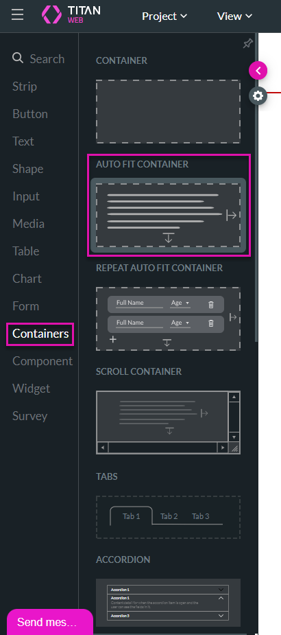
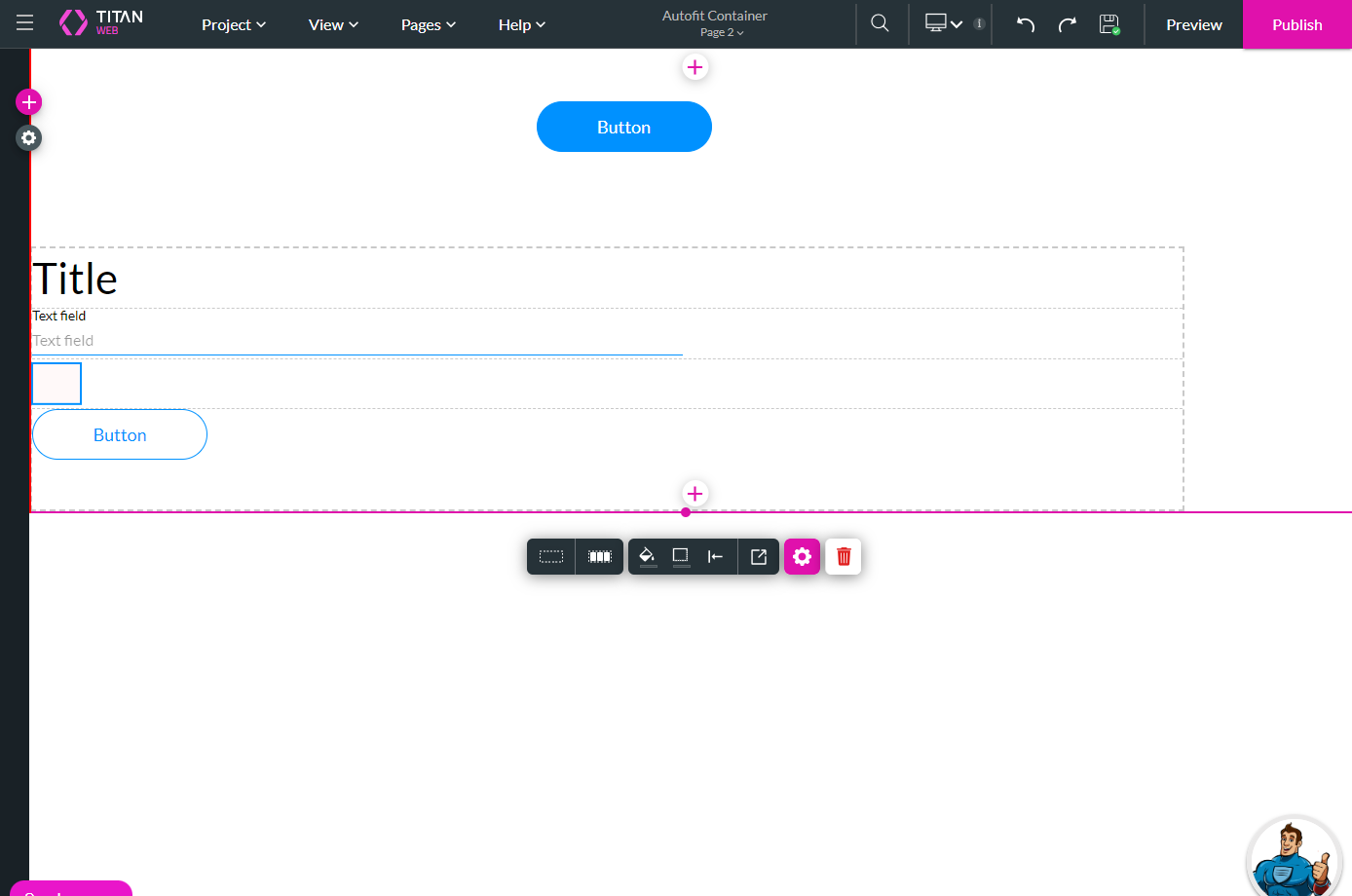
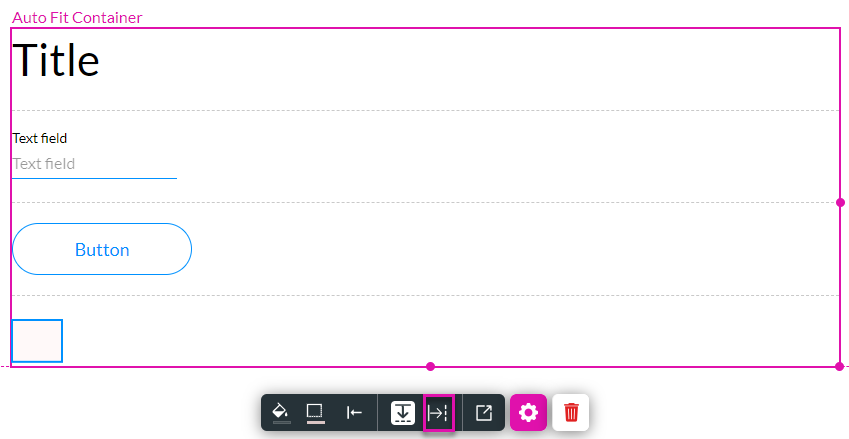
Autofit containers create a structure where the elements are, by default, placed one below the other. It helps with different resizing issues that might affect the form.
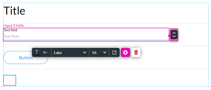
In this lesson, we added the following elements to the autofit container:
Autofit containers can be found under Containers:
Autofit containers create a structure where the elements are, by default, placed one below the other. It helps with different resizing issues that might affect the form.
In this lesson, we added the following elements to the autofit container:
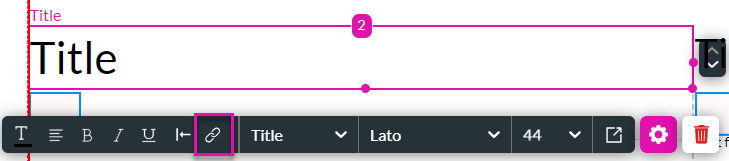
- Title
- Text field
- Button
- Shape
02 When and Why Should You Use an Autofit Container?
Suppose you have dynamic fields that change size according to the contents, or you must hide elements in certain circumstances, or you need to present your contents on different device sizes. In that case, an autofit container is a convenient element to use.
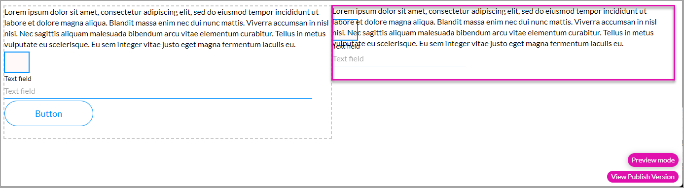
03 Use with a Salesforce Get
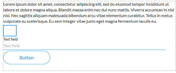
In this section, you will see how the contents of a title element can affect the size of the autofit container.
We set up a Salesforce Get that will run on load.
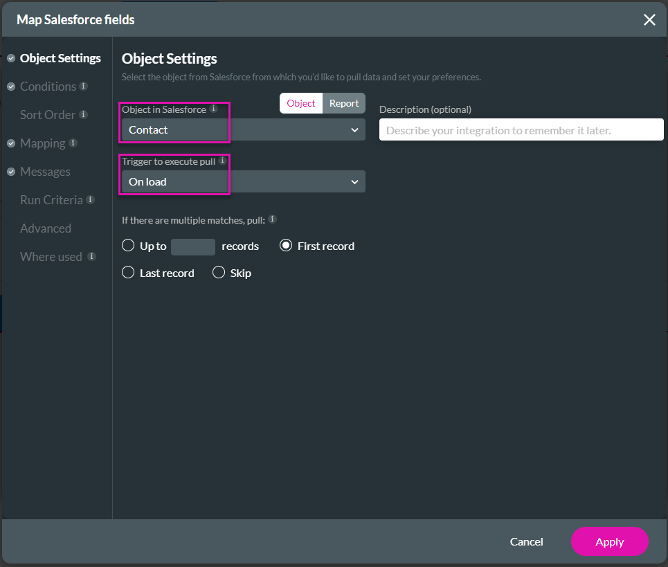
It will populate the Title with a contact description.
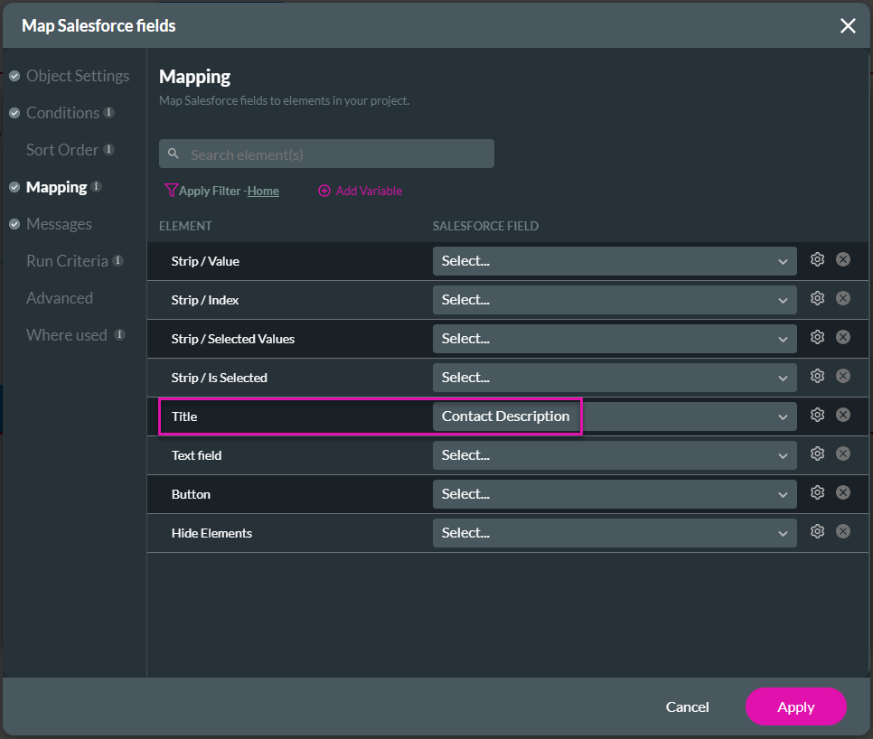
The contact description is very long, and if it isn’t in an autofit container, the text will be displayed over other elements as they will not move.
The elements in the autofit container move to accommodate the dynamic description in the title element.
On the right (not an autofit container), you can see that the dynamic content covers the shape and part of the text field element. In contrast, the elements in the autofit container moved (on the left), and the dynamic contact description is visible, regardless of the length of the content.
We set up a Salesforce Get that will run on load.
It will populate the Title with a contact description.
The contact description is very long, and if it isn’t in an autofit container, the text will be displayed over other elements as they will not move.
The elements in the autofit container move to accommodate the dynamic description in the title element.
On the right (not an autofit container), you can see that the dynamic content covers the shape and part of the text field element. In contrast, the elements in the autofit container moved (on the left), and the dynamic contact description is visible, regardless of the length of the content.
04 Use with an On-Click Action
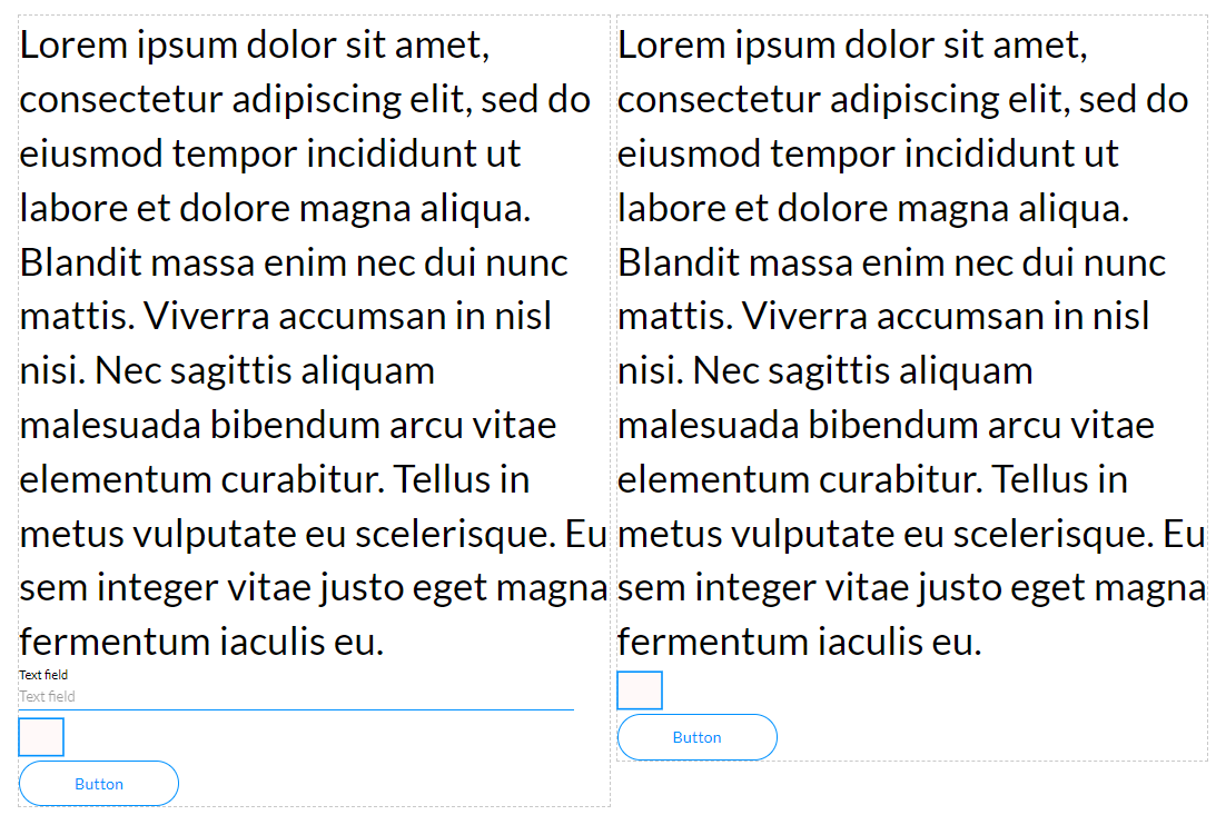
We configured an on-click action for the Title that will also affect the size of the autofit container.
1. Click the On Click Action icon of the Title element.
2. Hover with your mouse pointer over the Start and click the + icon.
3. Click the Affected Elements option and click the Next button.
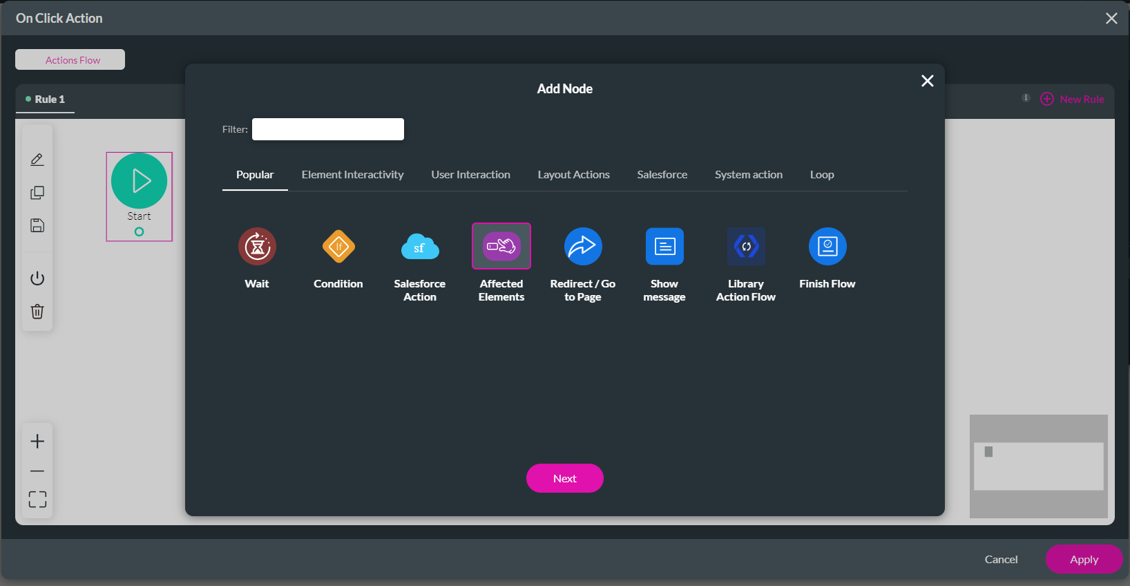
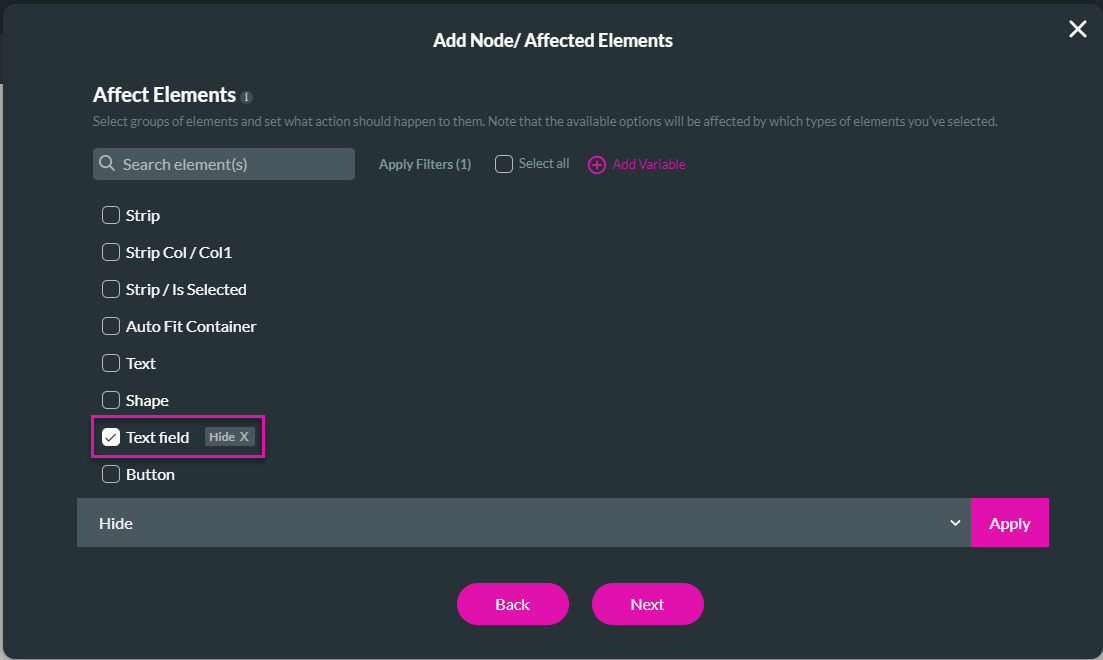
4. Hide the text field and click the Next button.
5. If necessary, add a tag and click the Insert button. The Affected Elements node is added to the Actions Flow.
6. Click the Apply button.
7. Save and Preview the project.
When the Title is clicked, the text field element is hidden, and the shape and button element move up, as seen on the right. The elements in the autofit container automatically resize to fit the container. If the hidden elements were to be shown again, the autofit container would resize to fit all the elements.
1. Click the On Click Action icon of the Title element.
2. Hover with your mouse pointer over the Start and click the + icon.
3. Click the Affected Elements option and click the Next button.
4. Hide the text field and click the Next button.
5. If necessary, add a tag and click the Insert button. The Affected Elements node is added to the Actions Flow.
6. Click the Apply button.
7. Save and Preview the project.
When the Title is clicked, the text field element is hidden, and the shape and button element move up, as seen on the right. The elements in the autofit container automatically resize to fit the container. If the hidden elements were to be shown again, the autofit container would resize to fit all the elements.
05 Use with Different Device Types
When working with different device types, the contents of the autofit container automatically resize to fit the selected device type.
Compare the desktop layout …
… with the small mobile device layout:
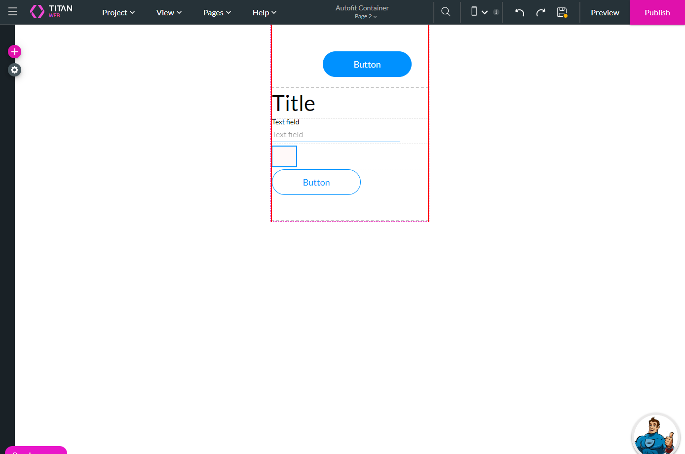
Compare the desktop layout …
… with the small mobile device layout:
06 Align Elements in the Autofit would Resize
We can align the elements individually.
1. Select the element (like the button) and click the Alignment icon.
2. Select an option, for instance, center.
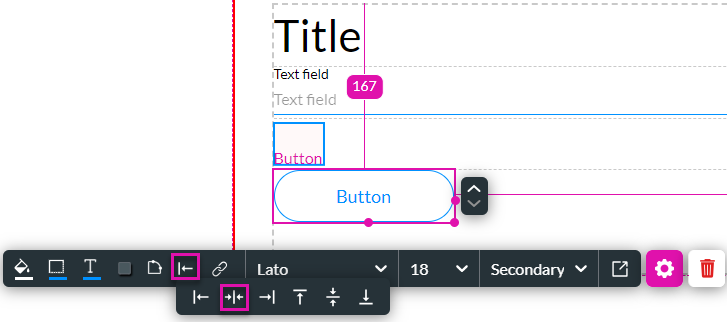
The button element is moved to the center of the autofit container.
You can not manually move the element if required; you can use the margin to set the location manually.
1. Select the element (like the button) and click the Alignment icon.
2. Select an option, for instance, center.
The button element is moved to the center of the autofit container.
You can not manually move the element if required; you can use the margin to set the location manually.
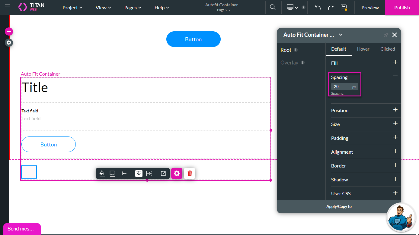
07 Add Spacing between Elements
You can move the elements further from one another.
1. Select the autofit container and click the Styling icon.
2. Click the Spacing option.
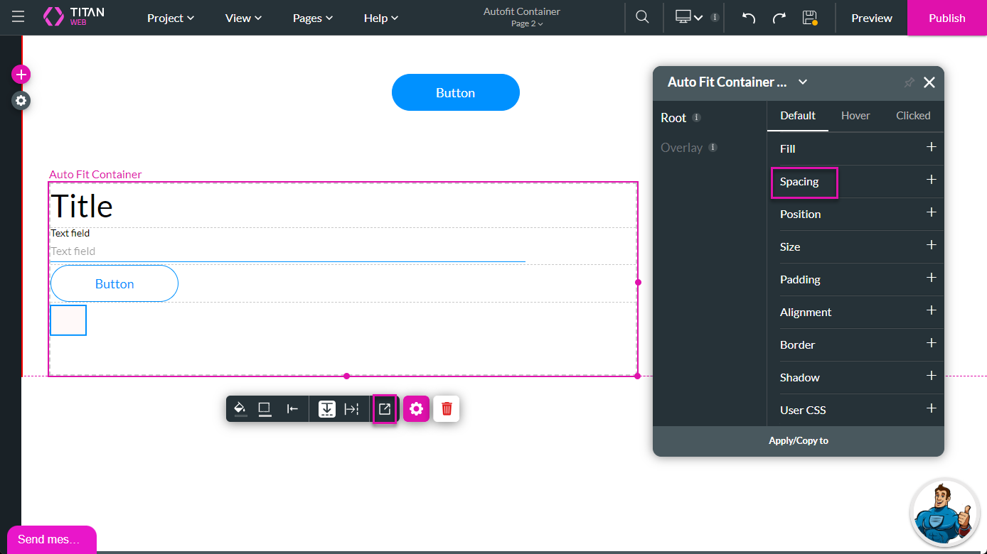
3. Add spacing in the field. The elements move accordingly.
1. Select the autofit container and click the Styling icon.
2. Click the Spacing option.
3. Add spacing in the field. The elements move accordingly.
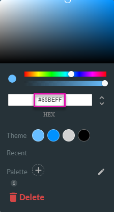
08 Remove the Border
The autofit container has a border by default, which is visible in the preview as a dotted line.
1. Select the autofit container and click the border icon. The color palette opens.
2. Change the color to white (top left corner of the color palette) or clear the code from the color field to remove any color.
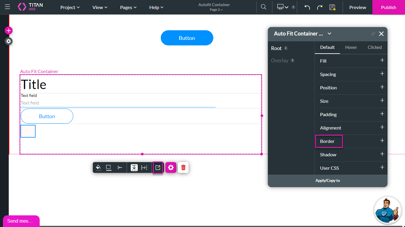
3. Alternatively, select the autofit container and click the Styling icon.
4. Click the Border option.
5. Set the border weight to zero.
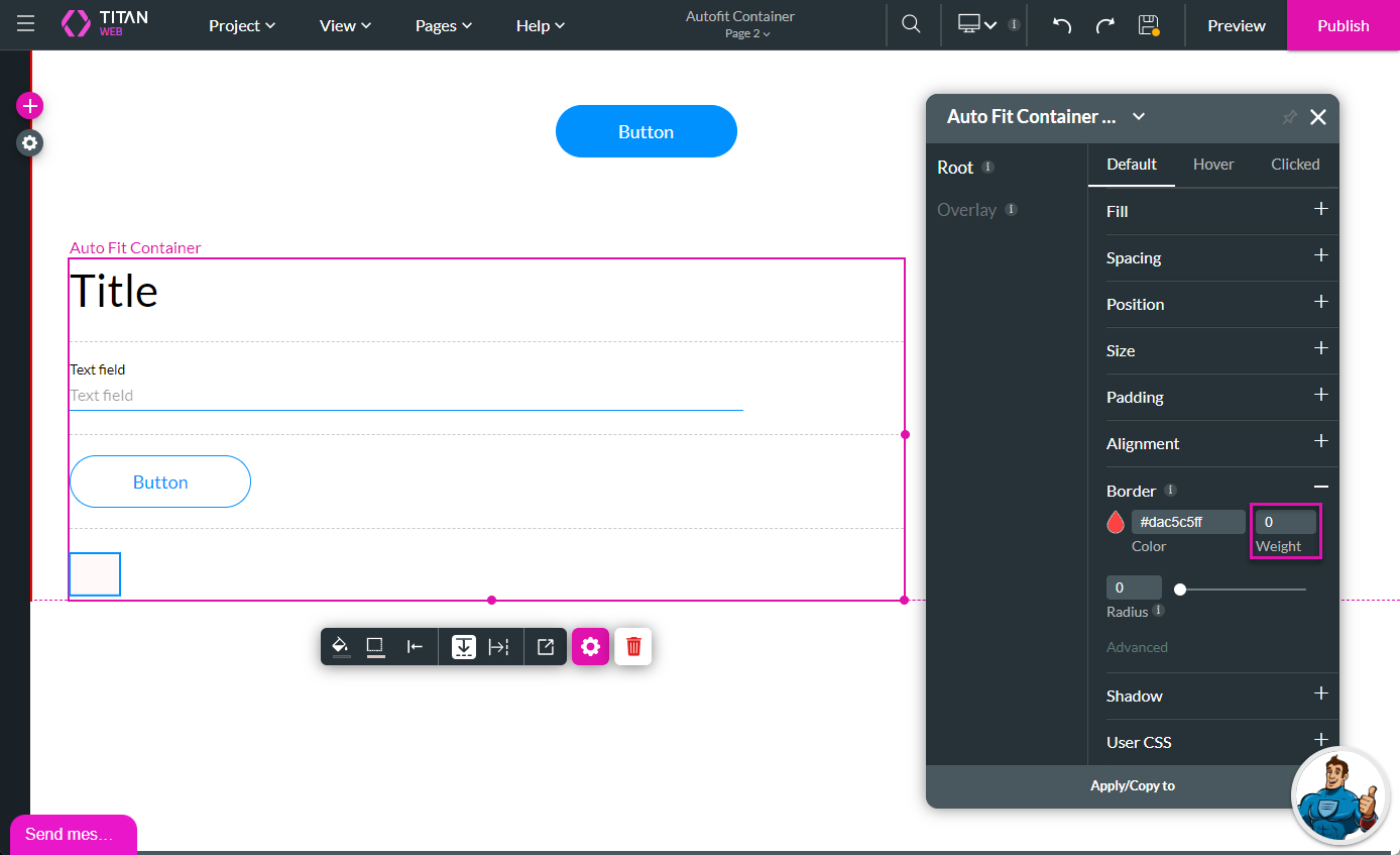
6. Save and Preview the project. There is no longer a border around the autofit container.
1. Select the autofit container and click the border icon. The color palette opens.
2. Change the color to white (top left corner of the color palette) or clear the code from the color field to remove any color.
3. Alternatively, select the autofit container and click the Styling icon.
4. Click the Border option.
5. Set the border weight to zero.
6. Save and Preview the project. There is no longer a border around the autofit container.
09 Change the Element Vertical Position
The elements have vertical arrows to move them up or down in the autofit container.
1. Select an element. There are vertical arrows on the side of the element.
2. Click the up or down arrow to move the element.
1. Select an element. There are vertical arrows on the side of the element.
2. Click the up or down arrow to move the element.
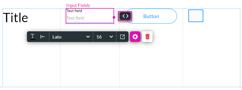
10 Change the Element Horizontal Position
1. Click the horizontal icon.
2. The elements are moved and are horizontally in line. Note: You may have to drag the elements smaller (narrower) to fit horizontally.
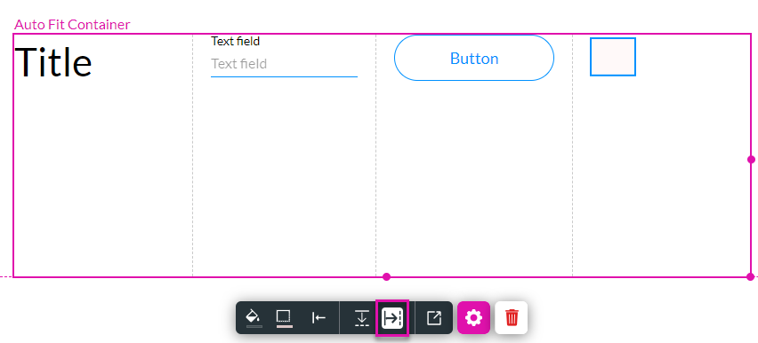
3. Select an element and use the horizontal arrows to move it.
All the actions configured with the autofit container in the vertical position are still valid for the horizontal position; for instance, the remaining elements automatically move to the left if any element is hidden.
2. The elements are moved and are horizontally in line. Note: You may have to drag the elements smaller (narrower) to fit horizontally.
3. Select an element and use the horizontal arrows to move it.
All the actions configured with the autofit container in the vertical position are still valid for the horizontal position; for instance, the remaining elements automatically move to the left if any element is hidden.
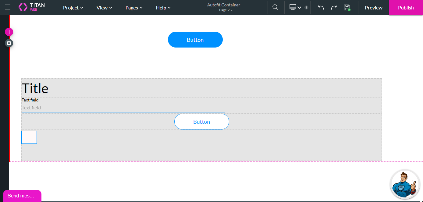
11 Auto-resize the Autofit Container
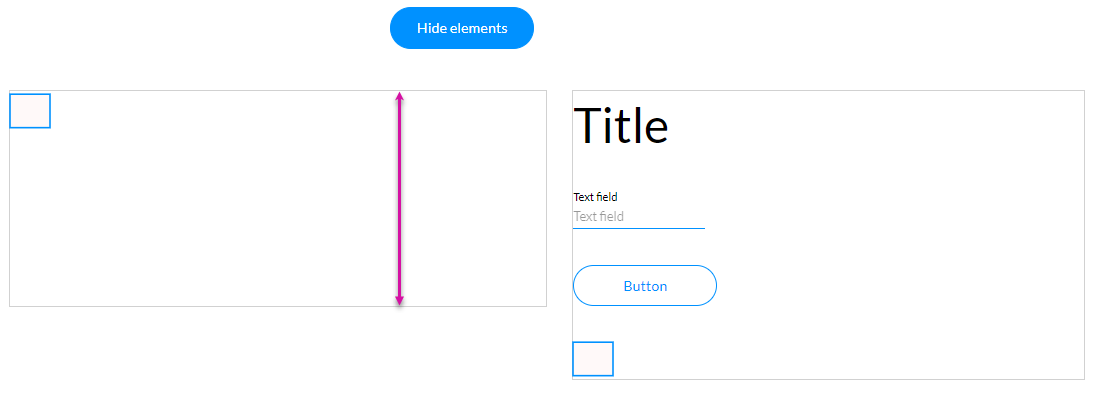
We switched off the Salesforce Get and added a button to the canvas (outside the autofit container). We also added an Affected Element node that hides several elements when the button is clicked.
When elements are hidden in the container on the left, it retains some height:
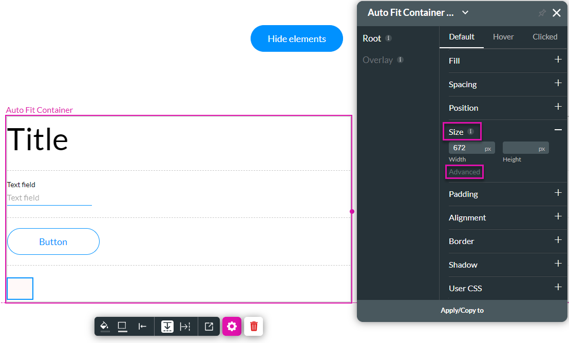
To make sure that the autofit container resizes based on the contents, do the following:
1. Select the autofit container and click the Styling icon.
2. Click the Size option.
3. Click the Advanced option.
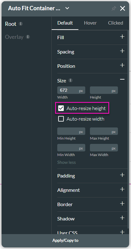
4. Click the Auto-resize height checkbox. The height of the autofit container will automatically resize to fit the contents of the container.
5. Save and Preview the project.
6. Click the Hide Elements button.
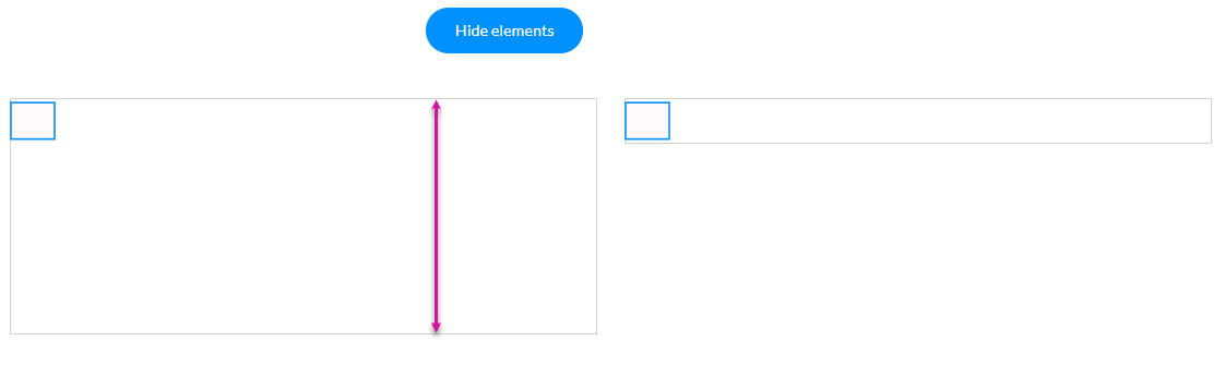
The autofit container resizes to fit the element, as seen in the comparison on the right.
When elements are hidden in the container on the left, it retains some height:
To make sure that the autofit container resizes based on the contents, do the following:
1. Select the autofit container and click the Styling icon.
2. Click the Size option.
3. Click the Advanced option.
4. Click the Auto-resize height checkbox. The height of the autofit container will automatically resize to fit the contents of the container.
5. Save and Preview the project.
6. Click the Hide Elements button.
The autofit container resizes to fit the element, as seen in the comparison on the right.