Types (3 min)
Completion requirements
01 Getting Started
This tutorial covers charts and graphs, including the different types and which ones to use for specific use cases.
02 Adding a Chart or Graph
To add a chart or graph to your project:
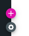
1. Click the + icon to open the element menu.
2. Select the Charts tab.
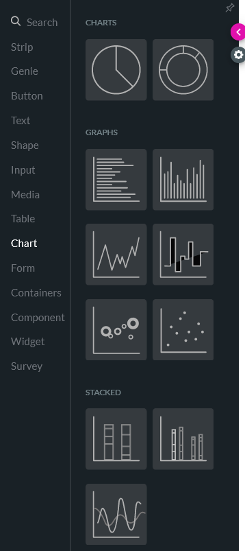
There are several chart and graph types for you to choose from.
Each different chart type will be used to represent your data for a specific purpose:
1. Click the + icon to open the element menu.
2. Select the Charts tab.
There are several chart and graph types for you to choose from.
Each different chart type will be used to represent your data for a specific purpose:
- Pie chart - Show the relationship of parts to the whole or highlight proportions.
- Doughnut - Doughnut charts are the same as pie charts but have a hole in the center.
- Bar - Show groups of related data.
- Line - Show trends over time.
- Scatter - Show the relationship between two measures.
- Bubble - Show the relationships between three measures.
- Stacked - Show an immediate visual comparison of categories.