Stacked Charts (7 min)
Completion requirements
01 Getting Started
This tutorial covers stacked charts. A stacked chart is used to specify a further breakdown of information per chart element.
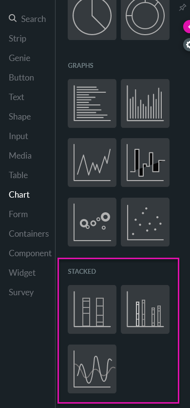
02 Stacked Charts
There are a variety of stacked charts for you to choose from. You can select the best graph to suit the values you are trying to portray.
03 Configuration
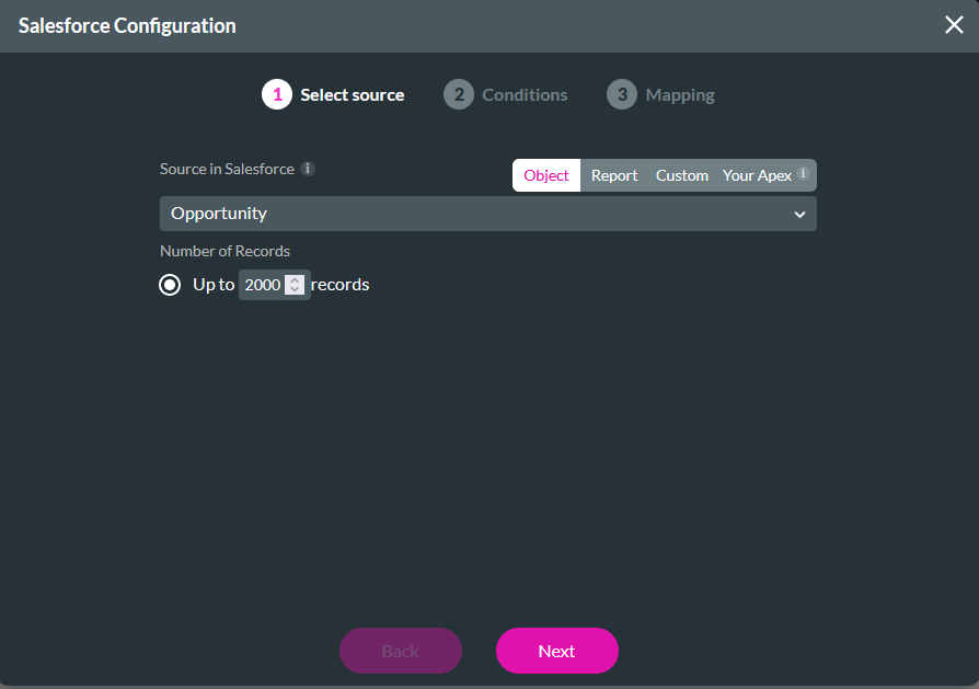
1. Drag and drop your selected stacked chart onto the canvas. The Stacked Configuration window opens.
2. Use the dropdown to select your source in Salesforce and click Next.
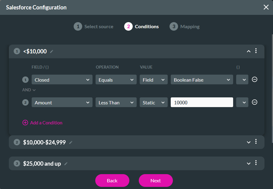
3. In the Conditions tab, you can configure the split of your stacks. Using conditions, you can divide your stacks into as many segments as you need. Click Next.
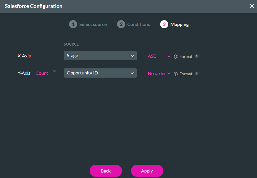
4. Map your X and Y axis values and click Apply.
2. Use the dropdown to select your source in Salesforce and click Next.
3. In the Conditions tab, you can configure the split of your stacks. Using conditions, you can divide your stacks into as many segments as you need. Click Next.
4. Map your X and Y axis values and click Apply.
04 Interactivity
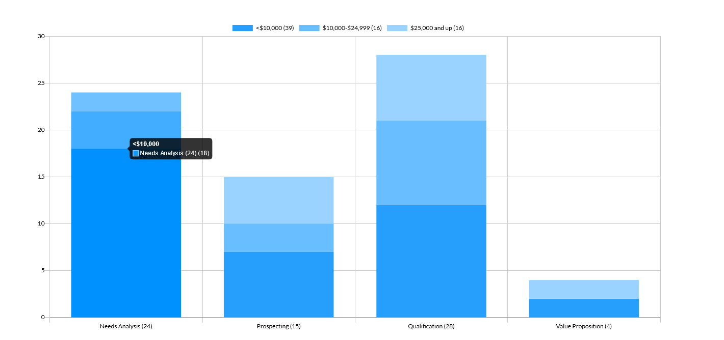
You can display the total value of your stacked chart.
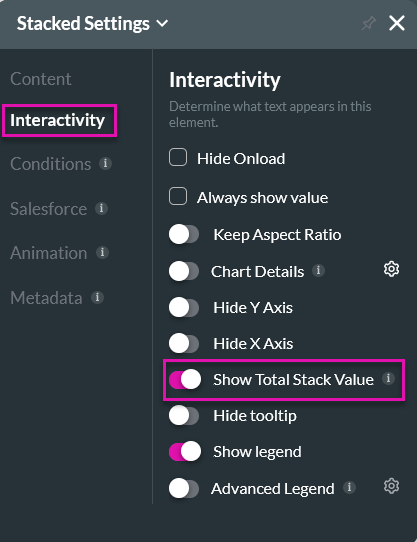
1. Click on the stacked chart gear icon. The Stack settings menu opens.
2. Select the Interactivity tab and enable Show Total Stack Value.
1. Click on the stacked chart gear icon. The Stack settings menu opens.
2. Select the Interactivity tab and enable Show Total Stack Value.
05 Preview
Your chart will display the total stack value on the X-axis. Each bar stack is broken up into the configured segments.