Source (14 min)
Completion requirements
01 Getting Started
This video covers the data source options for your charts and graphs.
02 Object Source
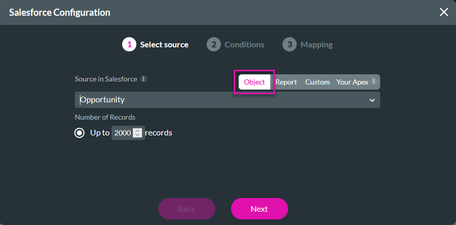
1. Insert a chart into your project. The Salesforce Configuration window opens.

2. Select Object as the source, use the dropdown to choose your Salesforce object, and configure the number of records to pull. You can return up to 2000 items. Click Next.
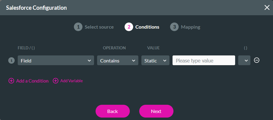
3. Configure any conditions or filters you require and click Next.
4. Configure the mapping for your X and Y axes. You can choose to format how the data displays for each axis. Click Apply.
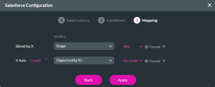
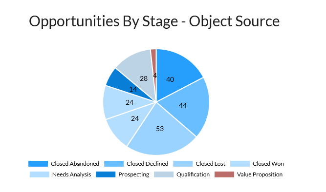
The configured chart will display each opportunity stage and the number of opportunities in each stage.
2. Select Object as the source, use the dropdown to choose your Salesforce object, and configure the number of records to pull. You can return up to 2000 items. Click Next.
3. Configure any conditions or filters you require and click Next.
4. Configure the mapping for your X and Y axes. You can choose to format how the data displays for each axis. Click Apply.
The configured chart will display each opportunity stage and the number of opportunities in each stage.
03 Report Source
1. Insert a chart into your project. The Salesforce Configuration window opens.

2. Select Report as the source, use the dropdown to select the Report in Salesforce, and set the number of records to pull. When using a report as your source, it must be in your recently viewed list. You can do this by logging into your Salesforce account and opening the Report you want to use. Click Next.
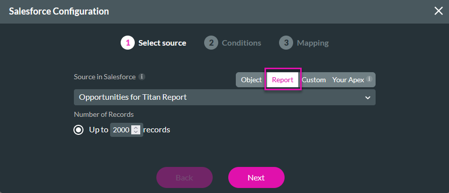
3. You do not need to set conditions when using a Report as your source; these filters are set on your Report in Salesforce. If you require additional filters, add them in the Conditions step. Click Next.

4. Configure the mapping for your X and Y axes. You can choose to format how the data displays for each axis. Click Apply.
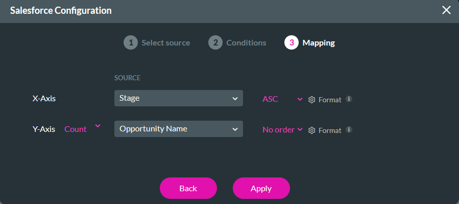
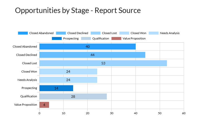
The configured chart will display each opportunity stage and its name. Remember to use a simple report as a chart source.
2. Select Report as the source, use the dropdown to select the Report in Salesforce, and set the number of records to pull. When using a report as your source, it must be in your recently viewed list. You can do this by logging into your Salesforce account and opening the Report you want to use. Click Next.
3. You do not need to set conditions when using a Report as your source; these filters are set on your Report in Salesforce. If you require additional filters, add them in the Conditions step. Click Next.
4. Configure the mapping for your X and Y axes. You can choose to format how the data displays for each axis. Click Apply.
The configured chart will display each opportunity stage and its name. Remember to use a simple report as a chart source.
04 Custom Source
The custom source will display summary data without creating a Salesforce report.
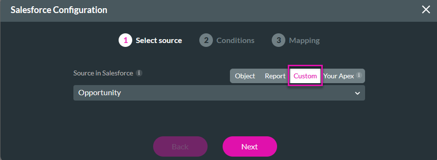
1. Insert a chart into your project. The Salesforce Configuration window opens.
2. Select Custom as the source, and use the dropdown to select the object in Salesforce. Click Next.
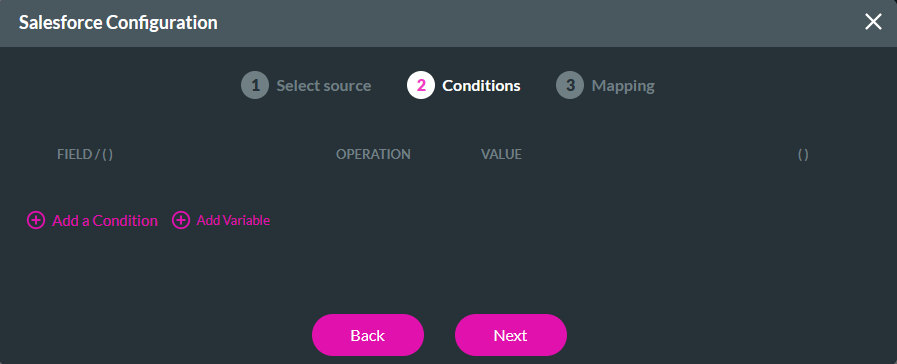
3. Configure any conditions or filters you require and click Next.
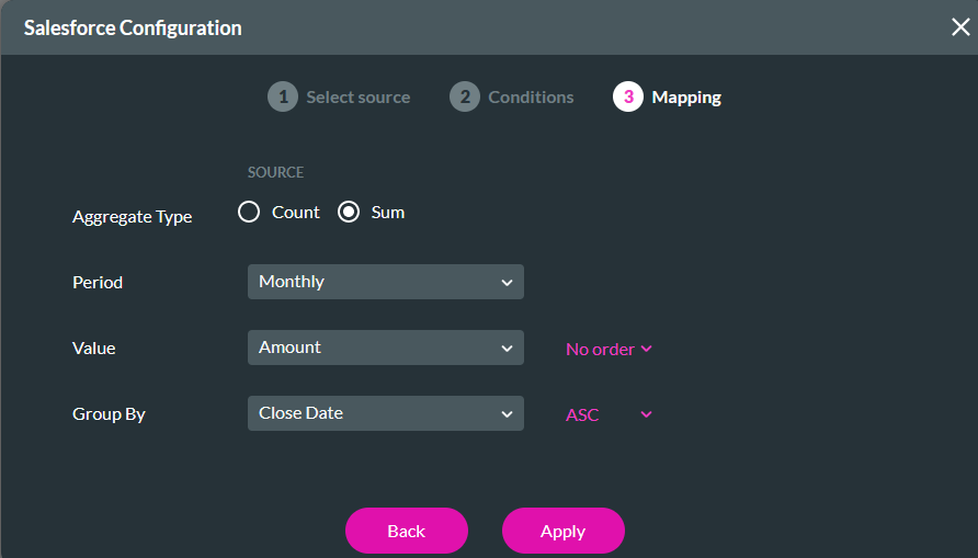
4. Configure your mapping options. You can choose between count and sum aggregate types. Use the dropdowns to configure the Period, Amount, and Group By options, and click Apply.
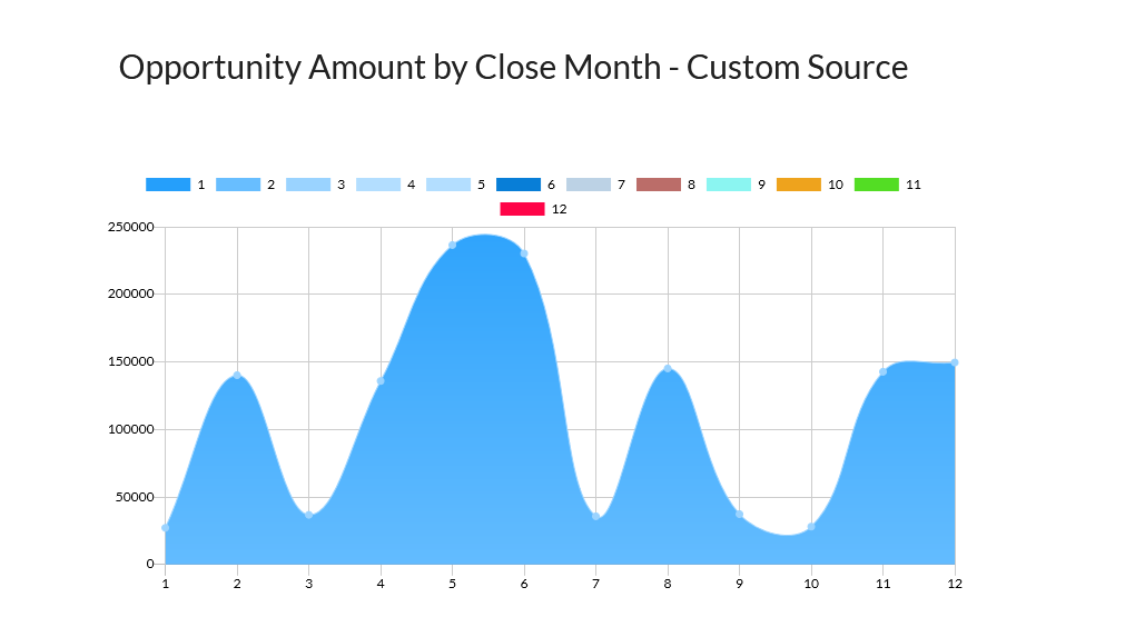
The chart configured will display the opportunity amount for the current month.
1. Insert a chart into your project. The Salesforce Configuration window opens.
2. Select Custom as the source, and use the dropdown to select the object in Salesforce. Click Next.
3. Configure any conditions or filters you require and click Next.
4. Configure your mapping options. You can choose between count and sum aggregate types. Use the dropdowns to configure the Period, Amount, and Group By options, and click Apply.
The chart configured will display the opportunity amount for the current month.
05 Apex Class Source
The Apex Class source is helpful if you have a complex query that Titan or Salesforce Reports do not support. Click here to add an Apex Class in Salesforce.
1. Insert a chart into your project. The Salesforce Configuration window opens.

2. Select your Apex as the source, enter the name of your ApexClass, and choose the number of records to pull. Click Next.
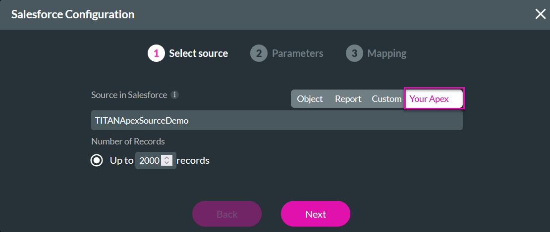
A simple ApexClass is used for this example.
@RestResource(urlMapping='/TITANordAddinDemoRest')
global without sharing class TITANNordAddinDemoRest {
@httpPost
global static List<Opportunity> handle post(){
String reqdata = RestContext.request.requestBody.toString();
FRequest ftreq = (FRequest) JSON.deserialize(reqdata, FTRequest.class);
System.debug('ftreq >>>>> ' ftreq);
if(String.isEmpty(ftreq-account_id)) return null;
String account_id = ftreq.account_id;
System.debug('account_id >>>>>> ' + account_id.split('<br>'));
Map<String, Schema.SObjectField> fieldMap = Opportunity.sObjectType.getDescribe().fields.getMap();
Set<String> fieldNames = fieldMap.keySet();
List<String> fldn_lst = new List<String>();
fldn_lst.addAll(fieldNames);
List‹Opportunity> opps = Database.query('SELECT + String.join(fldn_lst, ',') + ' FROM Opportunity WHERE AccountId=:account_id');
System.debug(*opps >>>>+ opps);
return opps;
}
class FRequest{
String account_id;
}
}
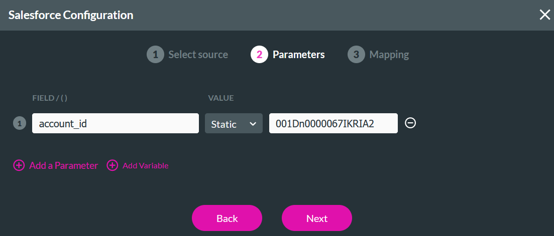
To retrieve the relevant details, navigate to workbench.developerforce.com. For this example, the opportunities for an account will be pulled.
3. Configure the Parameter to filter your results, for example, if you only want specific opportunities associated with an account. Click Next.
4. Configure the mapping according to the fields on the Salesforce object, as implemented in a simple Apex class example.
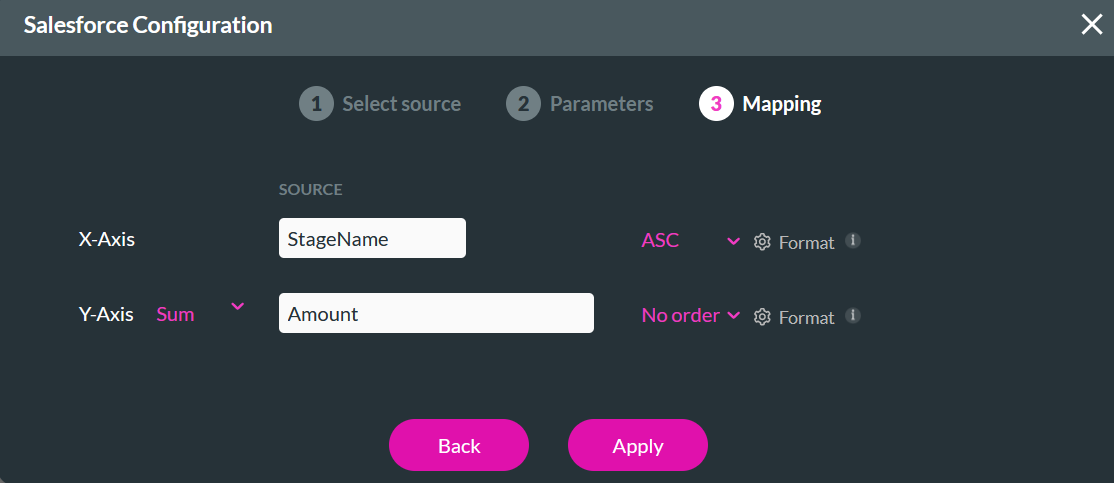
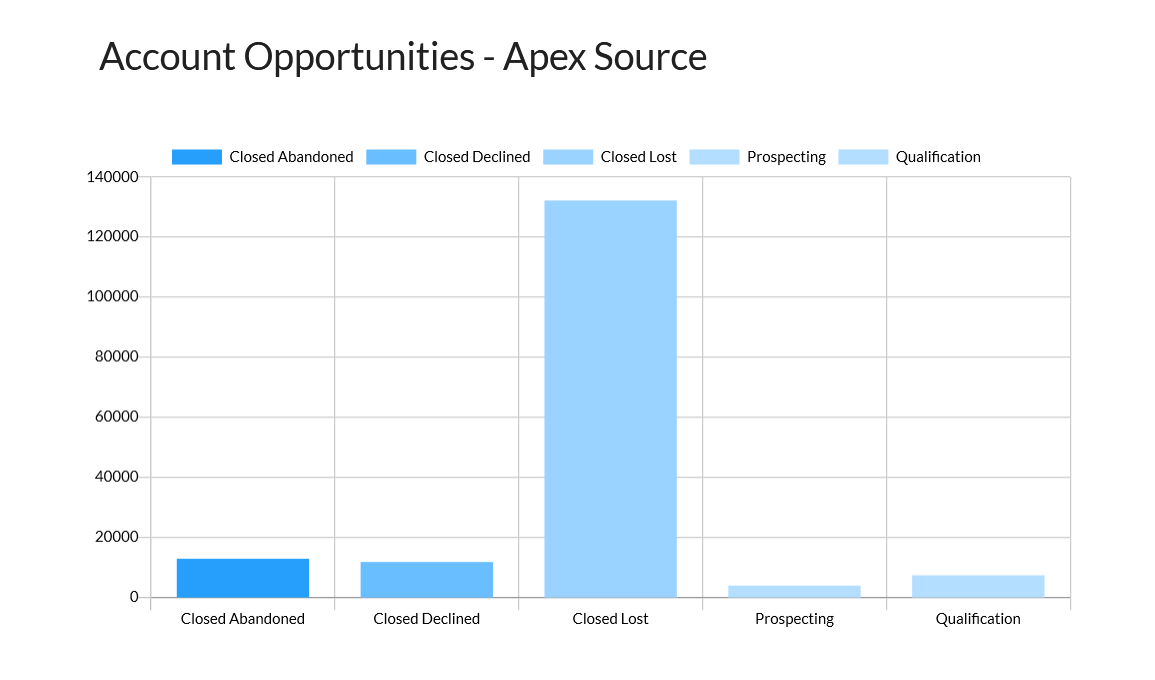
The chart was configured to display the Account opportunities in each stage and the corresponding amount.
1. Insert a chart into your project. The Salesforce Configuration window opens.
2. Select your Apex as the source, enter the name of your ApexClass, and choose the number of records to pull. Click Next.
A simple ApexClass is used for this example.
@RestResource(urlMapping='/TITANordAddinDemoRest')
global without sharing class TITANNordAddinDemoRest {
@httpPost
global static List<Opportunity> handle post(){
String reqdata = RestContext.request.requestBody.toString();
FRequest ftreq = (FRequest) JSON.deserialize(reqdata, FTRequest.class);
System.debug('ftreq >>>>> ' ftreq);
if(String.isEmpty(ftreq-account_id)) return null;
String account_id = ftreq.account_id;
System.debug('account_id >>>>>> ' + account_id.split('<br>'));
Map<String, Schema.SObjectField> fieldMap = Opportunity.sObjectType.getDescribe().fields.getMap();
Set<String> fieldNames = fieldMap.keySet();
List<String> fldn_lst = new List<String>();
fldn_lst.addAll(fieldNames);
List‹Opportunity> opps = Database.query('SELECT + String.join(fldn_lst, ',') + ' FROM Opportunity WHERE AccountId=:account_id');
System.debug(*opps >>>>+ opps);
return opps;
}
class FRequest{
String account_id;
}
}
To retrieve the relevant details, navigate to workbench.developerforce.com. For this example, the opportunities for an account will be pulled.
3. Configure the Parameter to filter your results, for example, if you only want specific opportunities associated with an account. Click Next.
4. Configure the mapping according to the fields on the Salesforce object, as implemented in a simple Apex class example.
The chart was configured to display the Account opportunities in each stage and the corresponding amount.