Configuration (5:30 min)
Completion requirements
01 Getting Started
This tutorial covers the basic configuration of a chart. Charts can be used as part of a portal or embedded in an experience cloud site.
02 Configuration
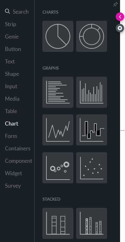
1. Insert a chart into your project. The Salesforce Configuration window opens.
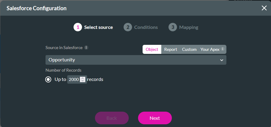
2. Choose your Source, select the Object in Salesforce, and set the number of records to pull. Click Next.
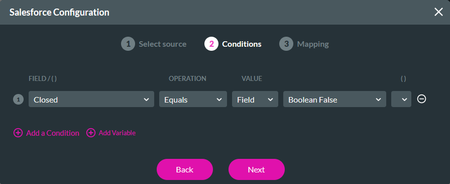
3. Configure Conditions to filter your results. This is a significant step if you have selected an Object as the source. Click Next.
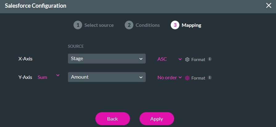
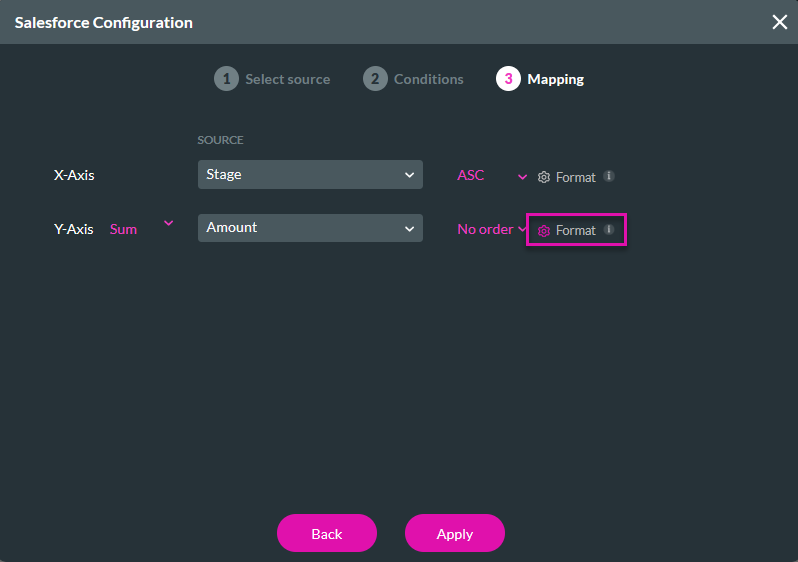
4. In the mapping step, configure the X and Y axes. You can choose the format in which this content is displayed. Click Apply.
To format the Amount value on the Y axis:
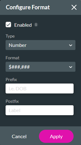
1. Click the Format gear icon.
2. The Configure Format window allows you to choose how your data is displayed. You can select the type, format, prefix, and postfix. Click Apply.
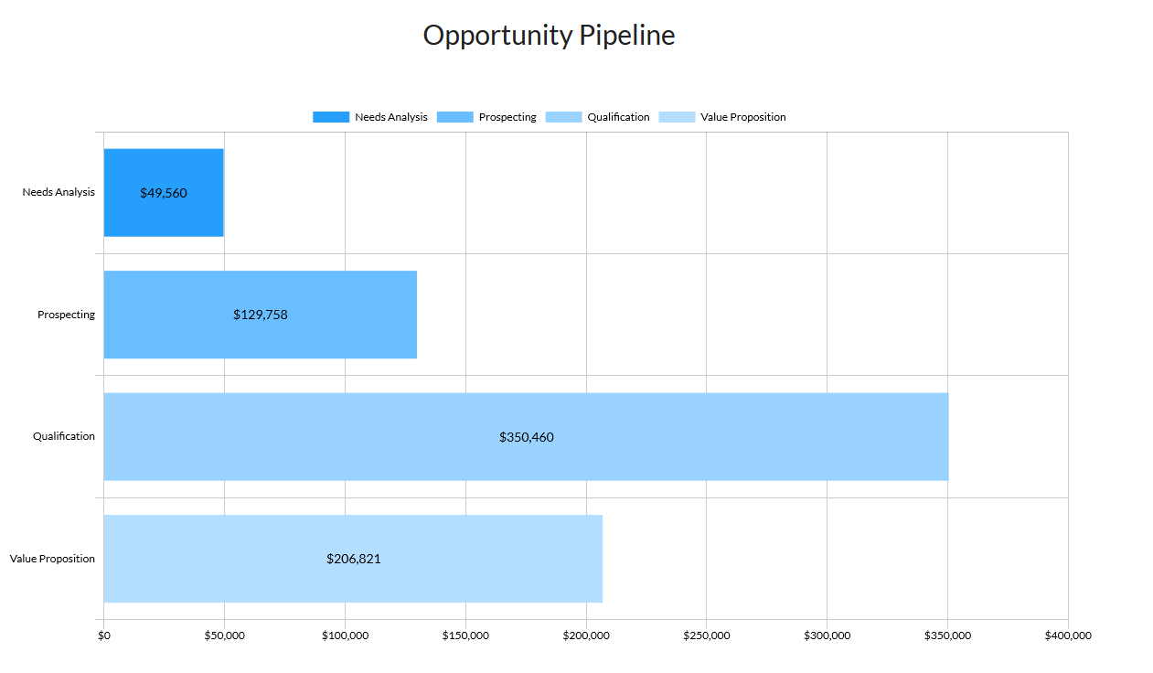
Your chart will pull data directly from your Salesforce and display it in your selected format.
2. Choose your Source, select the Object in Salesforce, and set the number of records to pull. Click Next.
3. Configure Conditions to filter your results. This is a significant step if you have selected an Object as the source. Click Next.
4. In the mapping step, configure the X and Y axes. You can choose the format in which this content is displayed. Click Apply.
To format the Amount value on the Y axis:
1. Click the Format gear icon.
2. The Configure Format window allows you to choose how your data is displayed. You can select the type, format, prefix, and postfix. Click Apply.
Your chart will pull data directly from your Salesforce and display it in your selected format.