Native Modal (8 min)
Completion requirements
01 Getting Started
In this tutorial, we explore the essentials of Native Modals.
02 How to Add a Modal
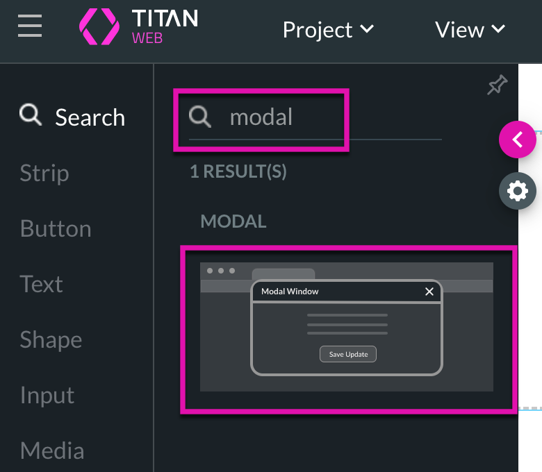
1. Search for a modal in the element list and drag it into your web project.
2. Alternatively, you can add a modal from the Pages tab in the Menu. Click on the Manage Menus Gear icon and navigate to the Modal option.
3. Click the Add Modal button to add a modal to your project.
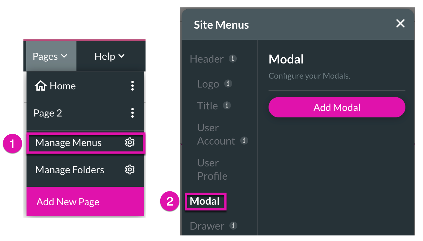

2. Alternatively, you can add a modal from the Pages tab in the Menu. Click on the Manage Menus Gear icon and navigate to the Modal option.
3. Click the Add Modal button to add a modal to your project.

03 Modal Visibility
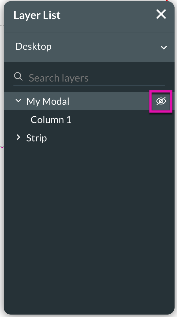
1. Ensure that your Layer List is active to quickly hide/show your modals whilst working on your web projects with the eye icon.

04 When to Use Modals?
Modals are great for when you want to show extra information popping up in a container.
05 Take a Closer Look at Native Modals
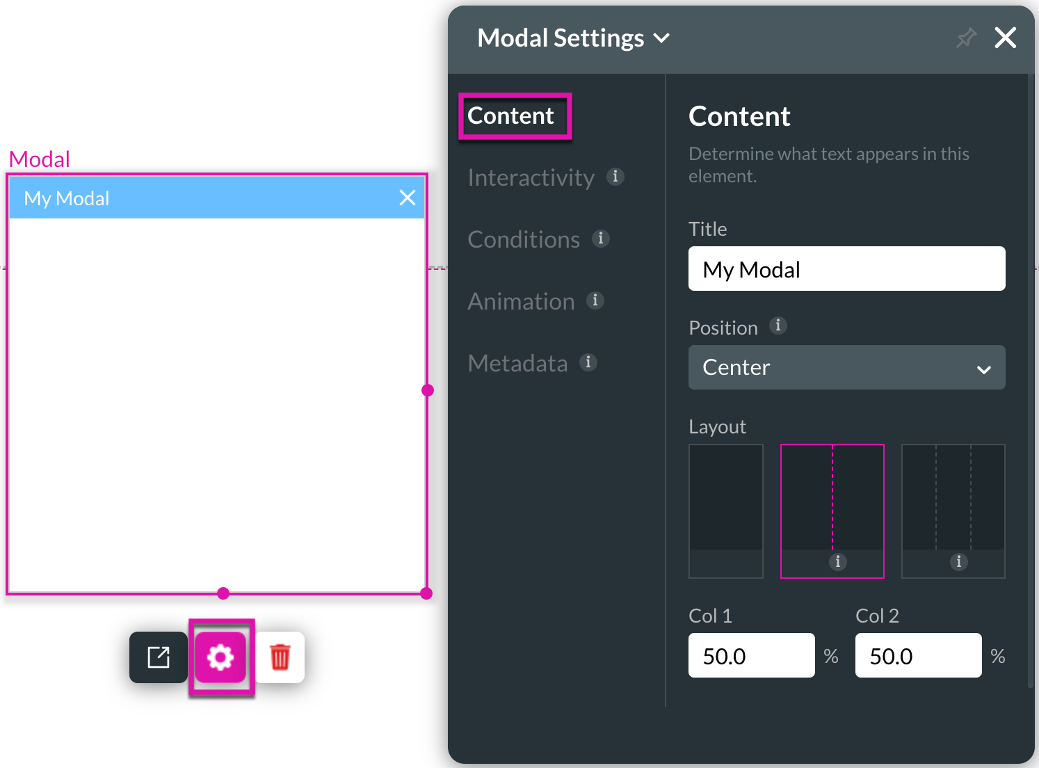
Under Modal Settings, you can choose a title or change the position and layout of a modal’s content.
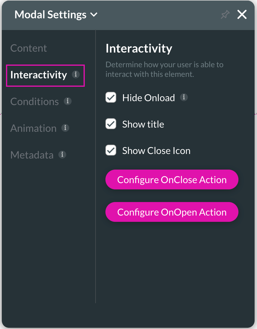
For modal interactivity, you can hide the on-load action, choose to show or hide the title and close the icon.
1. The Hide Onload checkbox ensures your modal is hidden when you load a webpage unless a button calls it.
2. Selecting the Show Title checkbox will ensure the title of your modal is visible.
3. Use the Configure OnClose Action button to set up an action that runs whenever the modal is closed.
4. Use the Configure OnOpen Action button to set up an action that runs whenever the modal is triggered.
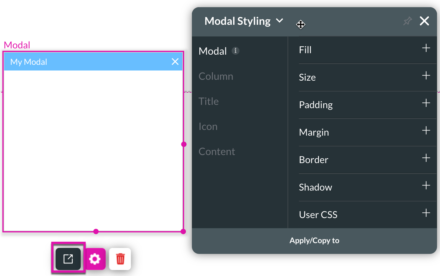
You can control every style aspect for modals with Titan through the Modal Styling panel.
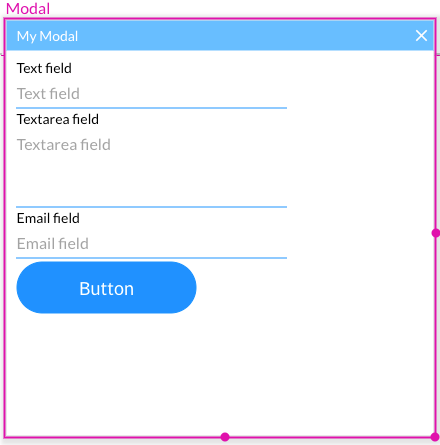
You can also place multiple elements into a modal. The below modal has text, textarea, and email fields with a button.

For modal interactivity, you can hide the on-load action, choose to show or hide the title and close the icon.
1. The Hide Onload checkbox ensures your modal is hidden when you load a webpage unless a button calls it.
2. Selecting the Show Title checkbox will ensure the title of your modal is visible.
3. Use the Configure OnClose Action button to set up an action that runs whenever the modal is closed.
4. Use the Configure OnOpen Action button to set up an action that runs whenever the modal is triggered.

You can control every style aspect for modals with Titan through the Modal Styling panel.

You can also place multiple elements into a modal. The below modal has text, textarea, and email fields with a button.

06 To Show your Modal
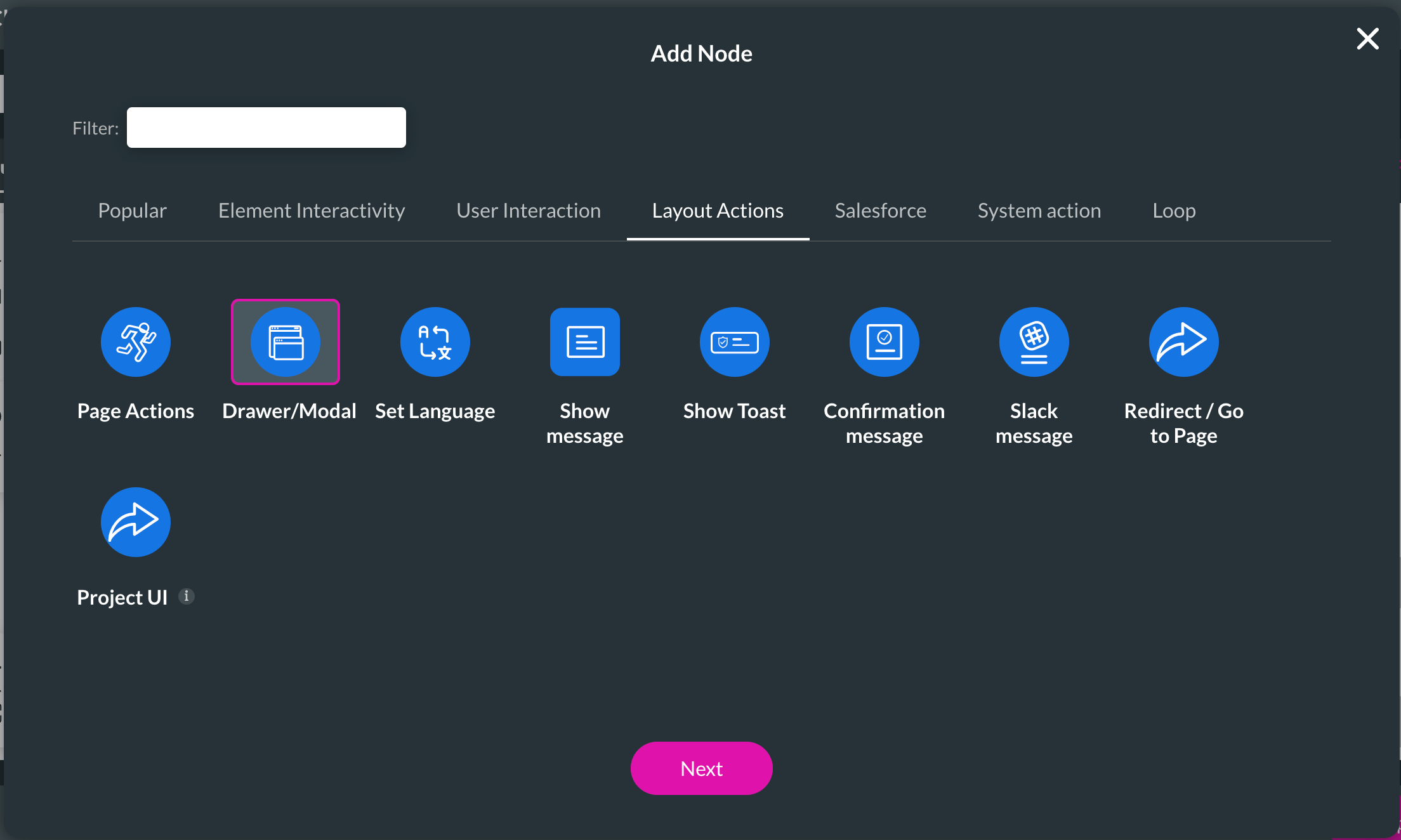
1. Add an On Click Action to a button of your choice by selecting the Drawer/Modal interactivity.

2. Choose the Modal option from the side menu and ensure the Enable toggle switch is on.
3. Select your modal and choose the Show radio button. Save and preview your project. When you click your button, your modal should appear.
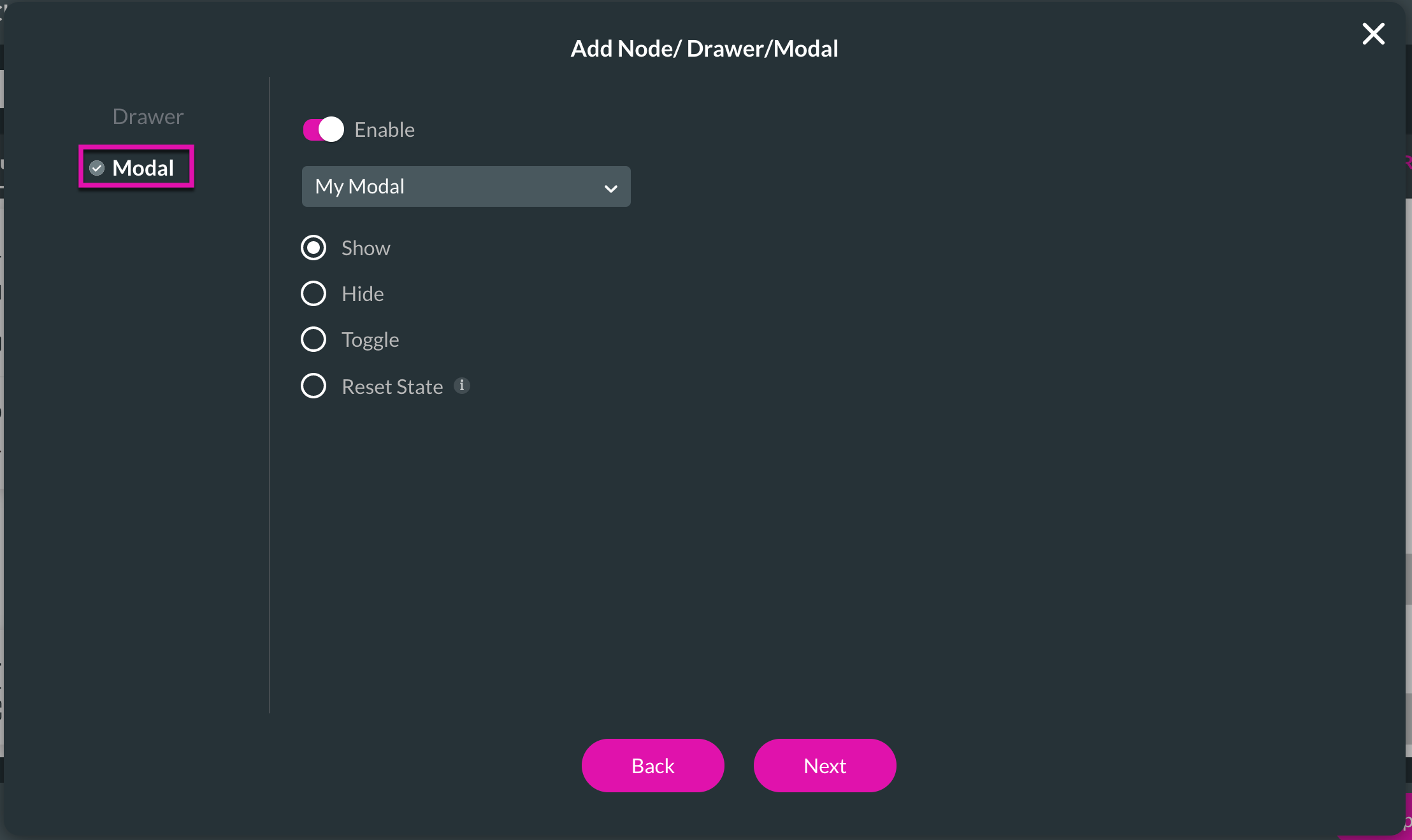

2. Choose the Modal option from the side menu and ensure the Enable toggle switch is on.
3. Select your modal and choose the Show radio button. Save and preview your project. When you click your button, your modal should appear.

07 To Reset your Modal
1. Add an On Click Action to a button of your choice by selecting the Drawer/Modal interactivity.
2. Choose the Modal option from the side menu and ensure the Enable toggle switch is on.
3. Select your modal and choose the Reset State radio button. Save and preview your project. When you click your button, your modal should reset its state.
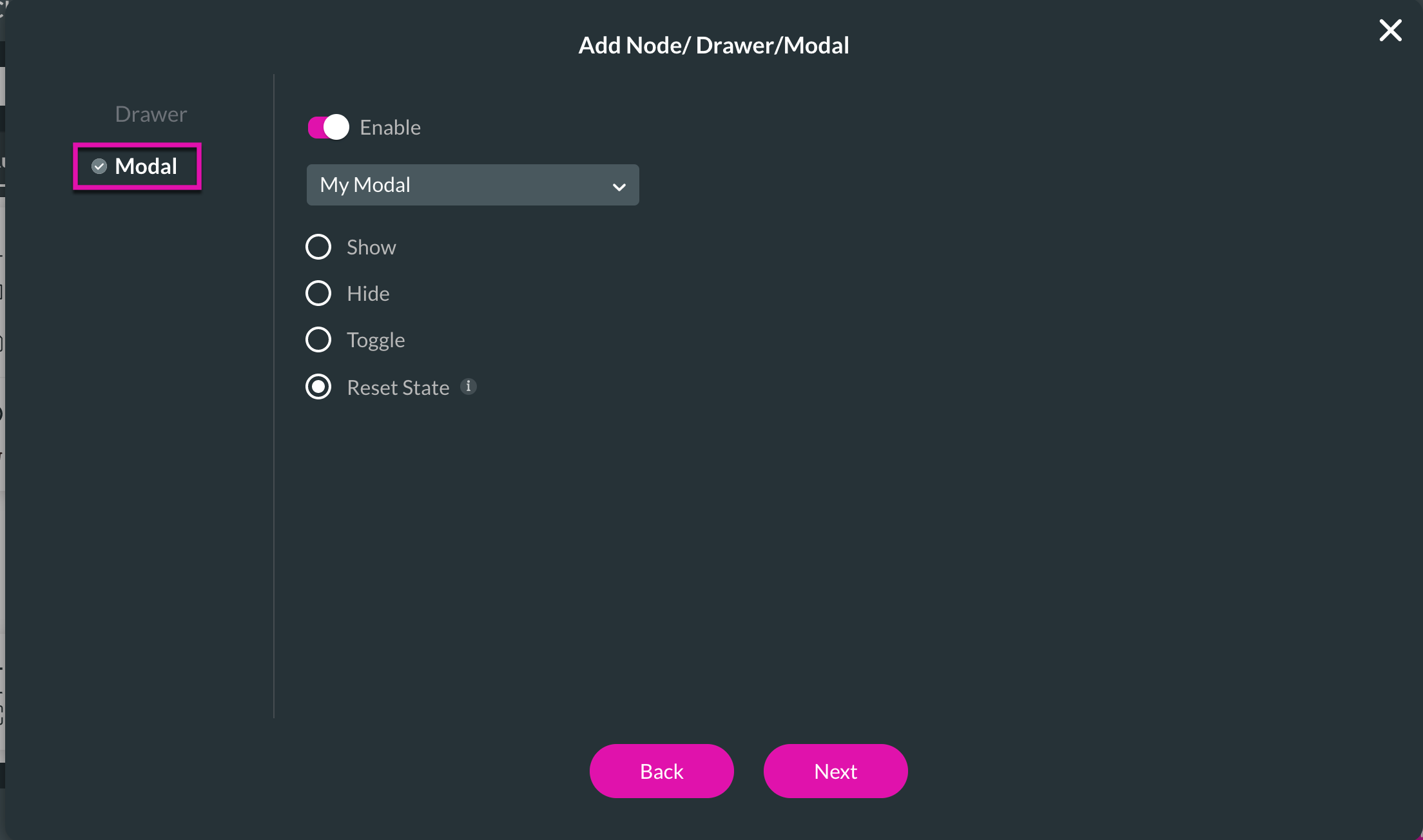

2. Choose the Modal option from the side menu and ensure the Enable toggle switch is on.
3. Select your modal and choose the Reset State radio button. Save and preview your project. When you click your button, your modal should reset its state.

08 To Close your Modal
1. Add an On Click Action to a button of your choice by selecting the Drawer/Modal interactivity.

2. Choose the Modal option from the side menu and ensure the Enable toggle switch is on.
3. Select your modal and choose the Hide radio button.
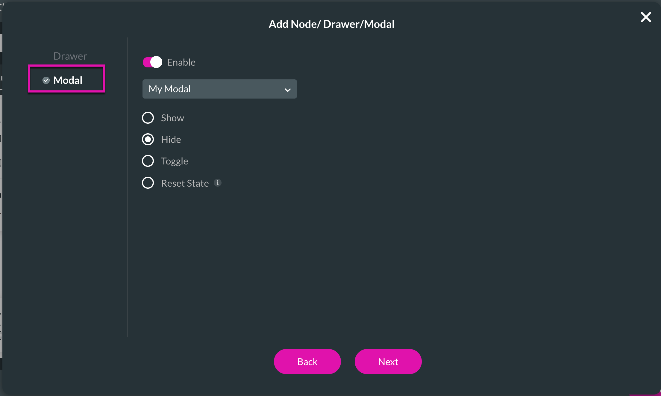
Save and preview your project. When you click your button, your modal should disappear.

2. Choose the Modal option from the side menu and ensure the Enable toggle switch is on.
3. Select your modal and choose the Hide radio button.

Save and preview your project. When you click your button, your modal should disappear.
09 A Note on Actions
Remember that you can run all actions when you close a modal.