Project Style (8 min)
Completion requirements
01 Getting Started
This tutorial covers Project Style, including:
- An overview of project styling.
- Combining project and element styling.
- Finding an element in the panel.
- Styling per type.
- Setting styles for individual elements and element groups.
- Using the project style panel.
02 Project Style Overview
The project style panel holds all of your project's styling properties. This menu can create a unified look and feel for the entire project.
Ensure you use your element and project styling menus to complement one another. While the project styling menu creates a style that will apply across all project elements, you can use the element styling menu to make changes to a specific element.
Ensure you use your element and project styling menus to complement one another. While the project styling menu creates a style that will apply across all project elements, you can use the element styling menu to make changes to a specific element.
03 Finding an Element in the Panel
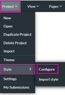
1. Expand the Project dropdown and select Style.
2. Click Configure from the sub-menu.
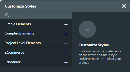
The project styling is divided into five groups:
The simplest way to find an element in the Customize Styles menu is to click on the element you want to edit while the menu is open. The menu will automatically highlight the element category. You can also search for the element type in the search field.
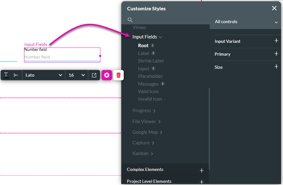
Styling applied in this panel will apply to all elements of the same type across all project pages. This applies to elements you add to the project after configuring the style class.
Please note that some elements belong to a group while others are individual. So if you choose an aspect that belongs to a group, you can set styles for the group as a whole and a specific element in that group. For example, when the Text input field is selected on canvas, the panel will automatically focus on its group (All inputs), allowing you to set common styles that will apply to all of the inputs in this group. If you then wish to use a particular style for a specific type of input, for example, the Text input, you can do that by selecting this element from the dropdown on the right before you set the styles.
2. Click Configure from the sub-menu.
The project styling is divided into five groups:
- Simple elements - for example, a line or an input element.
- Complex elements - for example, a table or gallery carousel.
- Project-level elements - for example, pages, headers, and confirmation modals.
- E-commerce - for example, a catalog or product dialogue.
- Scheduler- this is the styling applied to the scheduler widget.
The simplest way to find an element in the Customize Styles menu is to click on the element you want to edit while the menu is open. The menu will automatically highlight the element category. You can also search for the element type in the search field.
Styling applied in this panel will apply to all elements of the same type across all project pages. This applies to elements you add to the project after configuring the style class.
Please note that some elements belong to a group while others are individual. So if you choose an aspect that belongs to a group, you can set styles for the group as a whole and a specific element in that group. For example, when the Text input field is selected on canvas, the panel will automatically focus on its group (All inputs), allowing you to set common styles that will apply to all of the inputs in this group. If you then wish to use a particular style for a specific type of input, for example, the Text input, you can do that by selecting this element from the dropdown on the right before you set the styles.
04 Styling per Type
Each component of your project is organized into types. You will need to configure the styling for each element type.
For example, all the buttons in the project belong to the same button group, whether primary or secondary options. To style all the buttons simultaneously, use the common tab. To style an individual button, use the button tab.
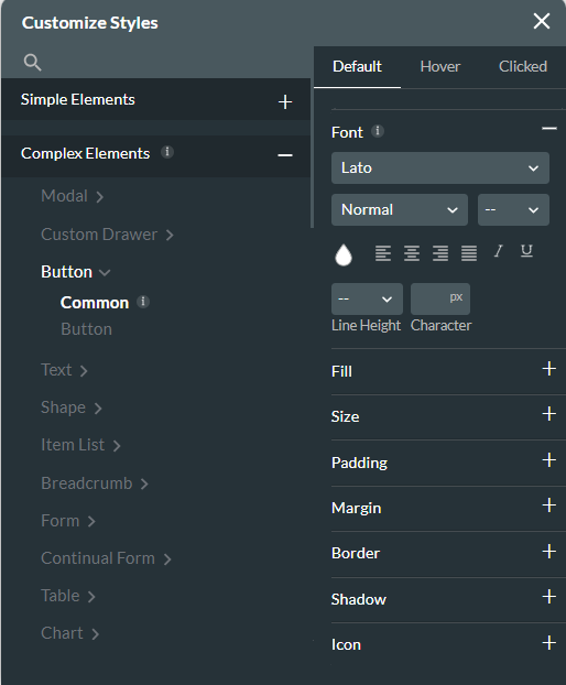
For example, all the buttons in the project belong to the same button group, whether primary or secondary options. To style all the buttons simultaneously, use the common tab. To style an individual button, use the button tab.
05 Using the Project Style Panel
We recommend that you start customizing your projects using Project Styling. This will ensure a uniform look and feel is applied to your whole project, such as setting the font style and color.
Use the element styling menu to make specific elements and fields stand out.
Use the element styling menu to make specific elements and fields stand out.
06 Common Use Cases
There are several common uses for Project styling. These use cases demonstrate that setting certain project-wide styles can give your project greater uniformity in terms of look and feel:
Setting a font family for the entire project and setting the input field group style and setting the text type colors and sizes and setting the general look of a power table (header style, row style, icons style) and setting the style of commonly used modals, such as information or confirmation modals.