User Tips (4:30 min)
Completion requirements
01 Getting Started
This tutorial covers styling user tips, including:
- An overview of user tips.
- User tip components and how to style them.
- Changing the user tip position.
02 User Tip Overview
User tips, also known as tooltips, are text labels displayed when the user hovers over a web element. They can provide additional context to users.
03 User Tip Components
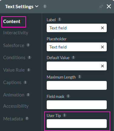
You can insert a user tip text using the element settings content tab.
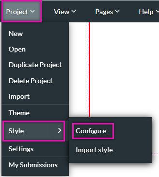
The tooltip style is controlled in the project styling menu. To access this menu:
1. Expand the pages dropdown and select the style option.
2. Click Configure from the submenu. The project styling window opens.
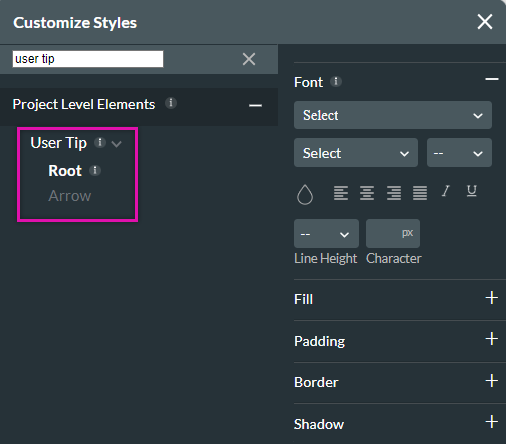
3. Search for User Tip in the search field. The corresponding styling options will be displayed in the right-hand menu.
The root category refers to the content window of the user tip itself. The Arrow contains the styling for the arrowhead.
The tooltip style is controlled in the project styling menu. To access this menu:
1. Expand the pages dropdown and select the style option.
2. Click Configure from the submenu. The project styling window opens.
3. Search for User Tip in the search field. The corresponding styling options will be displayed in the right-hand menu.
The root category refers to the content window of the user tip itself. The Arrow contains the styling for the arrowhead.
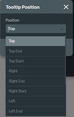
04 Changing the User Tip Position
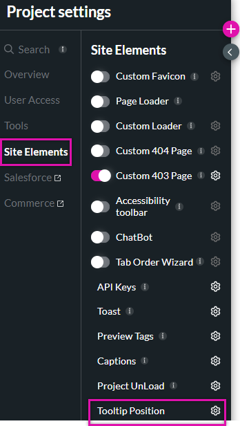
1. Navigate to the Project Settings window and select Site Elements.
2. Click the Tooltip Position gear icon.
3. Use the dropdown to determine how the tooltip is displayed.
2. Click the Tooltip Position gear icon.
3. Use the dropdown to determine how the tooltip is displayed.