Modals (12 min)
Completion requirements
01 Getting Started
This tutorial covers Modals, including:
- The three types of modals.
- The modal element.
- Page and Modal options.
- System modals.
02 Types of Modals
A modal window is a child window that displays on top of the parent content. While the modal is open, the content behind the window is disabled. Titan offers three types of modals that can be used and styled.
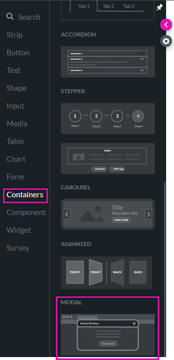
- First, the modal element can be found under the Containers tab.
- Second is the modal frame that can display a project page.
- The third is a system modal that displays information like confirmation or warning messages. The first and second modal types store data. The content design is entirely up to you.
03 The Modal Element
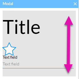
You can insert any element from the element menu. However, the structure of the modal is set. All elements inserted will display in a stack.
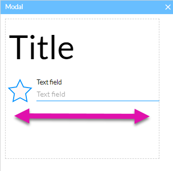
If you need to insert the elements next to each other in a row, insert a container into the modal, allowing you to place your elements in parallel.
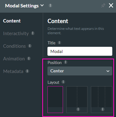
Using the Modal Settings menu, you can choose the position and layout of your modal.
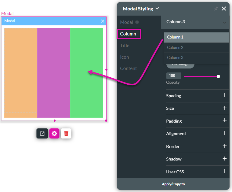
If you divide your modal into different columns, you can use the styling menu to give each column its unique style.
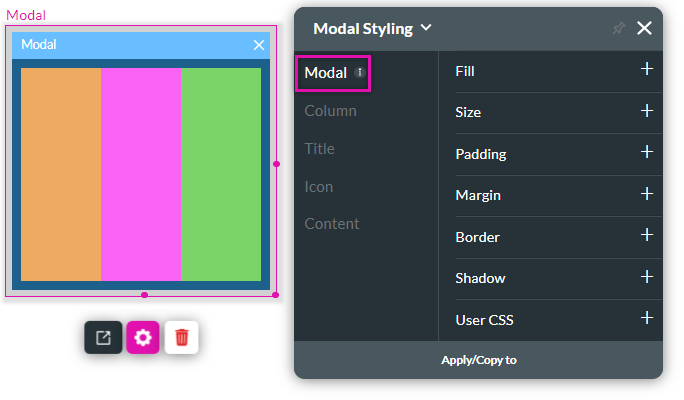
If you want to apply styling to the entire modal, use the modal tab.
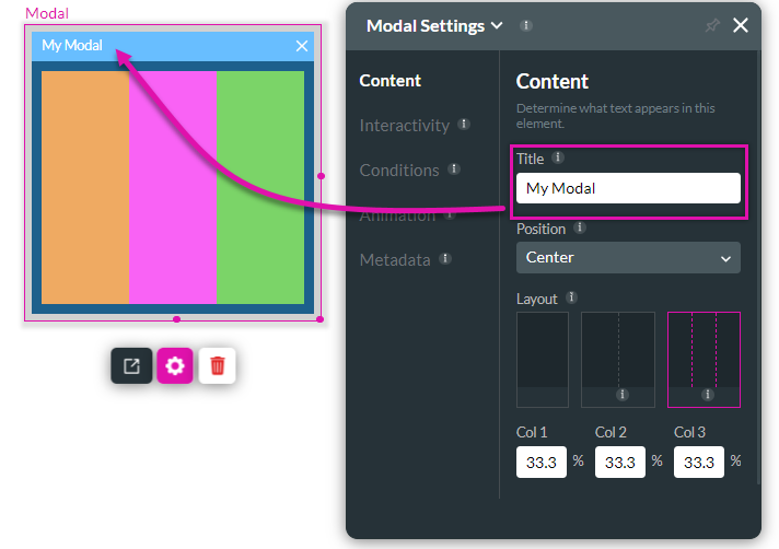
You can set a title for your modal in the element settings menu.
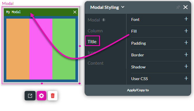
Use the title tab to make changes to how the title panel displays.
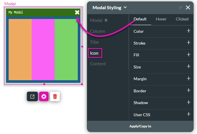
The icon tab controls the X icon used to close the modal.
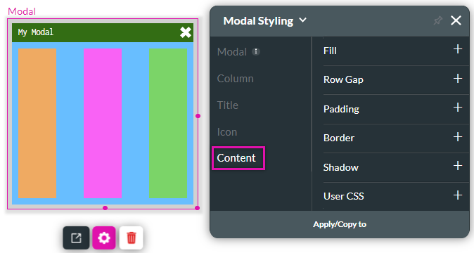
The content tab affects the space below the title bar.
If you need to insert the elements next to each other in a row, insert a container into the modal, allowing you to place your elements in parallel.
Using the Modal Settings menu, you can choose the position and layout of your modal.
If you divide your modal into different columns, you can use the styling menu to give each column its unique style.
If you want to apply styling to the entire modal, use the modal tab.
You can set a title for your modal in the element settings menu.
Use the title tab to make changes to how the title panel displays.
The icon tab controls the X icon used to close the modal.
The content tab affects the space below the title bar.
04 Using a Page as a Modal
You can configure a project page to display as a modal window, which offers the most flexibility when designing your modal window.
Check out this lesson on working with modals to learn how to display an internal page as a modal.
Pay attention to your modal size to ensure it displays correctly across various devices. This page lists the size of each device.
Check out this lesson on working with modals to learn how to display an internal page as a modal.
Pay attention to your modal size to ensure it displays correctly across various devices. This page lists the size of each device.
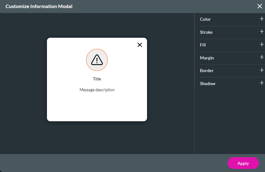
05 System Modals
These are fixed structure modals that are ready to use as is. You can make changes to the text. You can make changes to the modal text in the project styling menu.
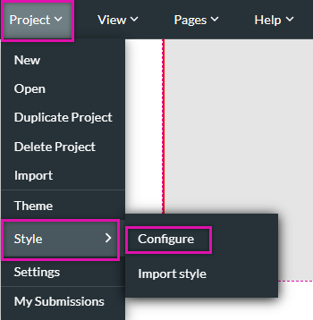
To navigate to this menu:
1. Expand the Project dropdown and click Style.
2. Select Configure from the submenu.
Use the search field to find the modal. The system modals are in the Project Level Elements category.
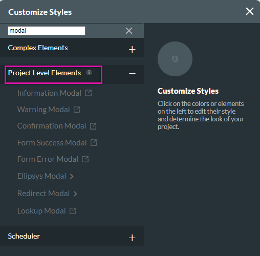
Click on the modal you want to edit. The modal window opens. To change the modal elements, click on the element you want to change and use the available styling options.
To navigate to this menu:
1. Expand the Project dropdown and click Style.
2. Select Configure from the submenu.
Use the search field to find the modal. The system modals are in the Project Level Elements category.
Click on the modal you want to edit. The modal window opens. To change the modal elements, click on the element you want to change and use the available styling options.