Drawer (8 min)
Completion requirements
01 Getting Started
This tutorial covers the custom drawers, including:
- An overview of the drawer.
- The structure of the drawer.
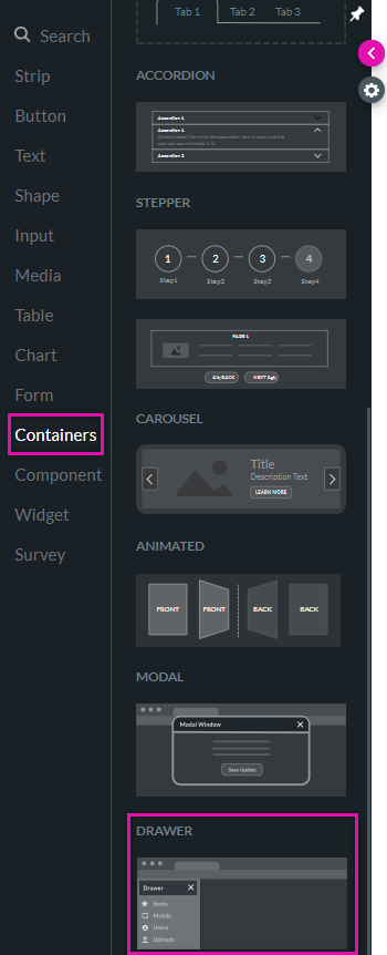
02 Drawer Overview
The drawer is a panel that slides out from the side of the screen to reveal content like navigation or filters. It is located under the Containers tab.
Click the styling menu icon to access the styling menu.
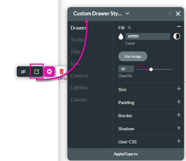
Click the styling menu icon to access the styling menu.
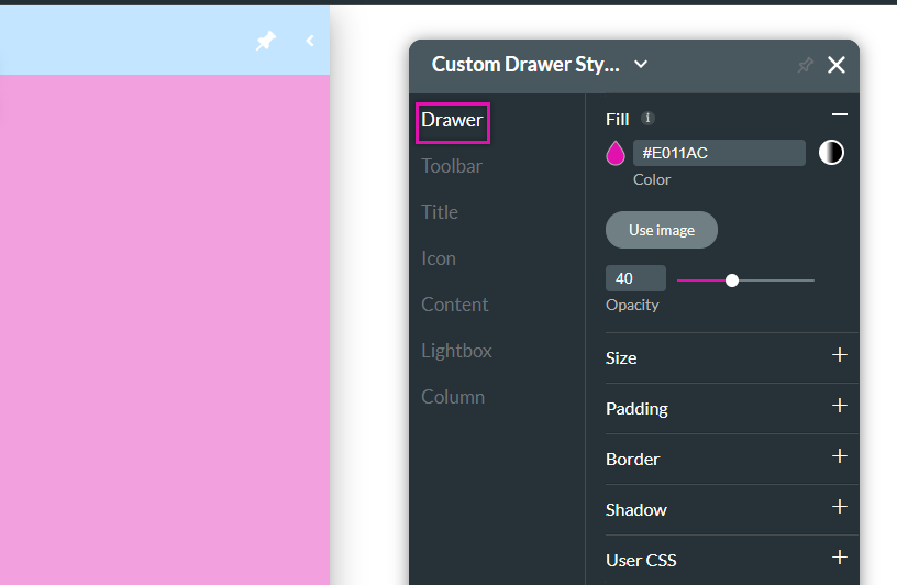
03 Drawer Tab
This chooses the styling for the main body of the container.
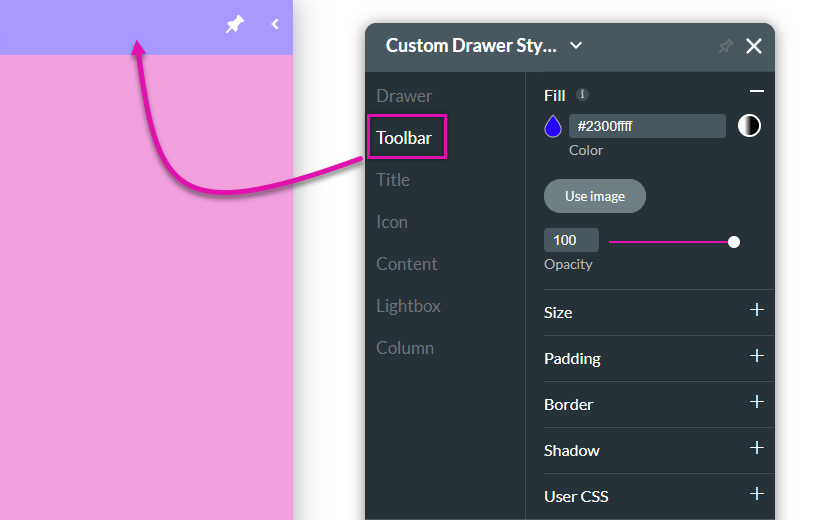
04 Toolbar Tab
The Toolbar tab controls how the top bar of the drawer is displayed.
05 Title Tab
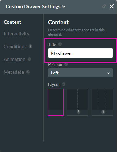
Use the element settings menu to create a heading for your drawer.
To make styling changes, use the title tab.
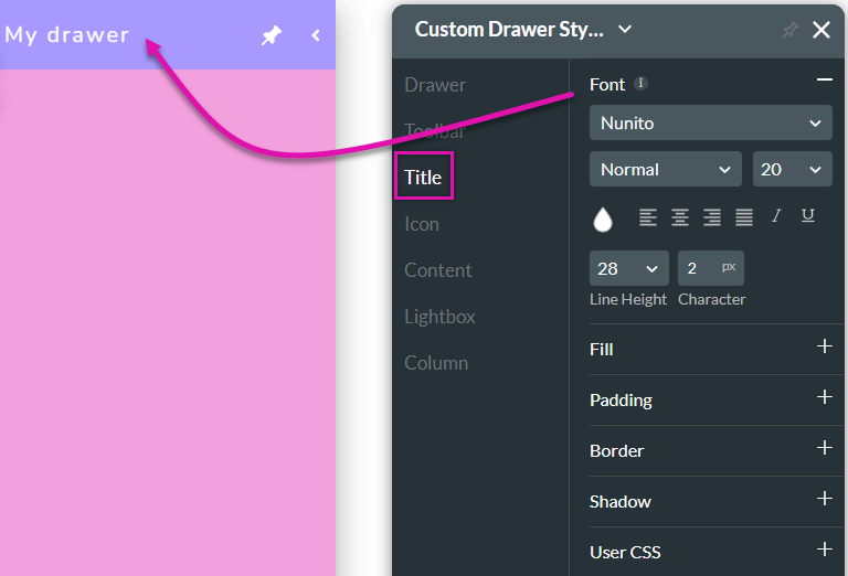
To make styling changes, use the title tab.
06 Icons Tab
Two icons—close and pin icons—are always added to your drawers. These icons are fixed and cannot be moved.

Any style changes you make using the Icon tab will be applied to both icons.
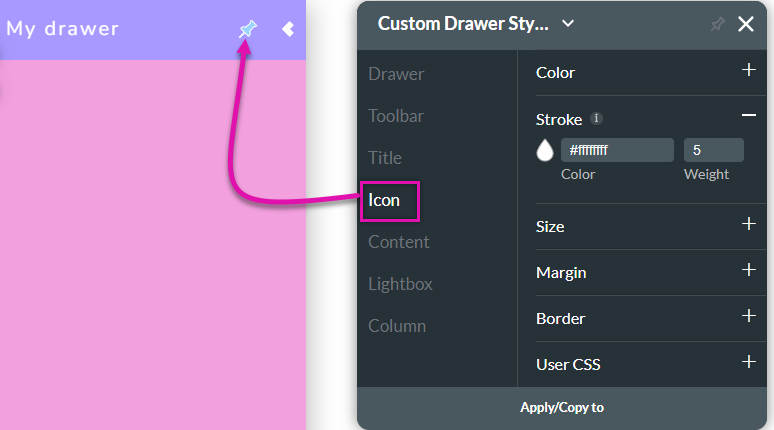
Any style changes you make using the Icon tab will be applied to both icons.
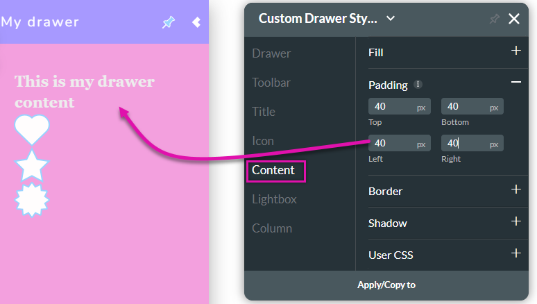
07 Content Tab
The main body of the drawer can contain any elements you require. The content tab allows you to make styling changes to these elements. Setting padding will give your drawer a uniform look.
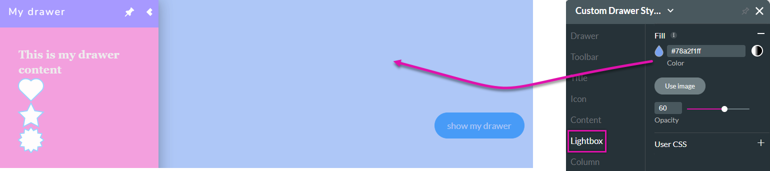
08 Lightbox Tab
When the drawer is open, the lightbox displays a shadow over the main content. The default color is grey. The lightbox tab allows you to change the color or set an image.
Note: You can only check your lightbox color in preview mode.
Note: You can only check your lightbox color in preview mode.
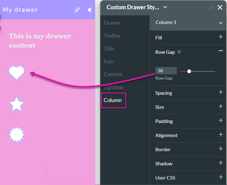
09 Column Tab
You can apply styling per each styling drawer.
The row gap sets the spacing between each element.
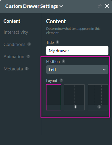
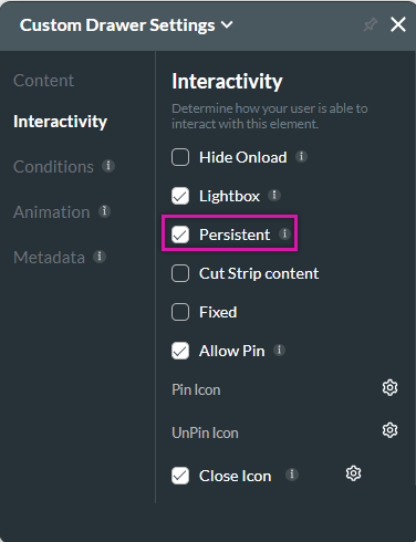
10 Element Settings
You can make some style changes using the element menu.
Under the Content tab, you can choose the position of the drawer and the number of columns.
The Interactivity tab offers a persistent option, enabling this function so the drawer is always displayed.
Under the Content tab, you can choose the position of the drawer and the number of columns.
The Interactivity tab offers a persistent option, enabling this function so the drawer is always displayed.