Responsive Design (22 min)
Completion requirements
01 Getting Started
This tutorial covers responsive design, including:
- Two approaches for responsive design.
- Creating a fully automatic layout.
- Independent device versions.
- Device dropdown structure and options.
- Best practices.
- Ways to set up your device versions with auto and manual layouts.
- General principles.
- Turning off the responsive AI toggle.
02 Responsive Design
Creating a responsive layout ensures your content displays correctly across various devices. There are two options when creating a responsive layout:
- Fully automatic with no devices set up.
- Setting up separate devices.
03 Fully Automatic Layout
Responsive AI ensures your content will be displayed according to the user’s device. When using this feature, dividing your strips into columns is best practice. This ensures that your content can easily be organized when automatic adjustments are made.
1. Expand the device dropdown.
2. Enable the Responsive AI toggle switch.
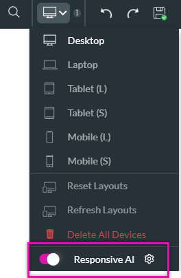
1. Expand the device dropdown.
2. Enable the Responsive AI toggle switch.
04 Setting Up Different Devices
This means you can set up different content for each device type. After configuring your devices, any changes to the project will require configuration in the device dropdown.
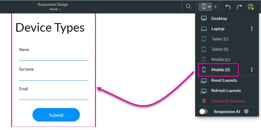
1. Expand the device dropdown.
The dropdown lists the devices from the widest to the narrowest screen types. The desktop layout will be automatically selected when you start designing your project. Once you have created your content, you can begin configuring how the content will look on each device. Each device will inherit the design and style choices from the device above.
2. Select the device from the dropdown to start designing on a different device. Your strip perimeters will automatically adjust to match the device you selected.
When designing for a specific device, all changes will apply to that device only. This means you can hide images on smaller devices or even change the look and feel of your content.
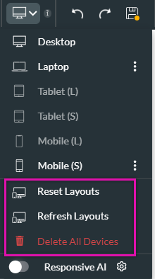
05 Device Options
Each enabled device displays a kebab menu. Select the kebab menu to delete the version you have created and reset or refresh the device. Resetting and deleting a device differ in that resetting the device will refresh the current design settings, while deleting a device will remove them completely.
The Reset Warning option is used when you change the desktop content after configuring your devices. Each affected device displays an orange dot. To remove this warning, select the reset warning option.
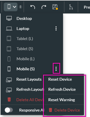
You can reset all your devices' layouts or refresh, which will reload all the configured layouts without making any design structure updates. You can also choose to delete all configured devices.
The Reset Warning option is used when you change the desktop content after configuring your devices. Each affected device displays an orange dot. To remove this warning, select the reset warning option.
You can reset all your devices' layouts or refresh, which will reload all the configured layouts without making any design structure updates. You can also choose to delete all configured devices.
06 Device Versions
After you have completed the configuration for your desktop versions, navigate to the other devices you need to configure and make any adjustments required.
07 Best Practice
Before you start configuring the layout of your different devices, ensure you are happy with your desktop design.
Ensure you have completed your changes for each device in descending order, as the devices inherit the styles from the previous one.
If you need to make changes to the desktop design, after all the devices have been configured, use the refresh device option to ensure the changes are reflected in your other devices.
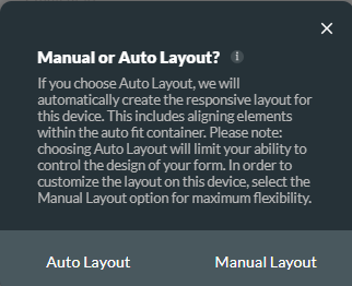
08 Manual vs. Auto Layout
When configuring devices from a Tablet (S), an automatic pop-up is displayed. You can choose the auto layout for Titan to structure your content to display in a single column automatically. The manual layout option allows you to place your content within the strip.
09 General Principles
You need to keep in mind that each device inherits its style from the previous one. This means any changes that you make to the previous device will apply to a smaller device. Once you start to make changes to the smaller device, they will apply to that specific device only.
If you make structural changes to the desktop strips, such as adding a column or more elements, this will automatically display on the smaller devices.
If you make structural changes to the desktop strips, such as adding a column or more elements, this will automatically display on the smaller devices.
10 Turning the Responsive AI Off
If you want your content displayed only on your specific device configuration.
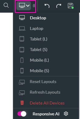
1. Expand the device dropdown.
2. Disable the Responsive AI toggle switch.
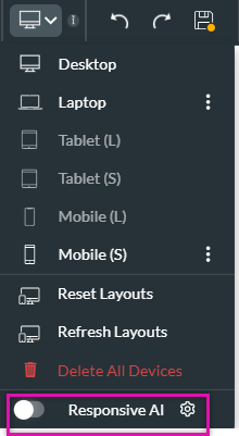
1. Expand the device dropdown.
2. Disable the Responsive AI toggle switch.