Best Practices - Displaying Dynamic Data (9 min)
Completion requirements
01 Getting Started
This tutorial covers best practices for displaying dynamic data. Including:
- Why dynamic data can be problematic.
- The autofit dynamic container.
- The form dynamic container.
- Auto width and auto height size properties.
- Combining dynamic data containers with auto-sizing.
02 Dynamic Data
The Titan platform is integrated seamlessly with Salesforce. You can insert dynamic data into your form fields to ensure the latest Salesforce data is always displayed. Determining the extent of the data you will pull from Salesforce can sometimes be challenging.
03 Autofit Container
The autofit container dynamically resizes depending on the data displayed.
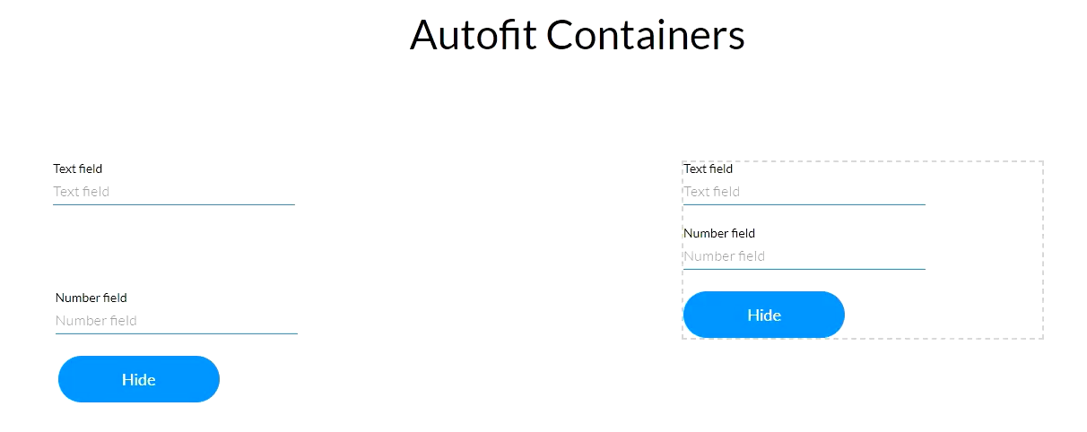
We have created two columns with the same elements to display how autofit containers can be used. One column contains elements that have been inserted freely, while in the other, the elements were inserted into an autofit container. An on-click action was assigned to each of the buttons labeled Hide. When the user clicks the button, the email field will be hidden.
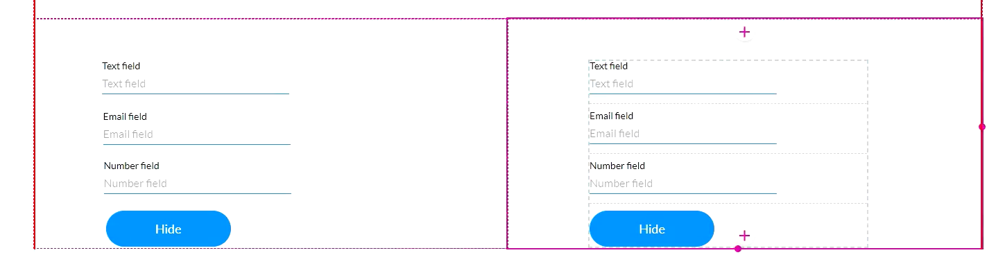
In preview mode, the button was clicked for each column. The side that had the elements freely added displays a space. The autofit container is dynamically adjusted.
We have created two columns with the same elements to display how autofit containers can be used. One column contains elements that have been inserted freely, while in the other, the elements were inserted into an autofit container. An on-click action was assigned to each of the buttons labeled Hide. When the user clicks the button, the email field will be hidden.
In preview mode, the button was clicked for each column. The side that had the elements freely added displays a space. The autofit container is dynamically adjusted.
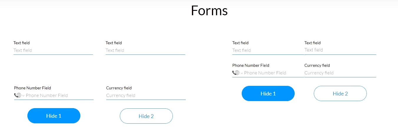
04 Forms
The form is a flexible container that auto-resizes depending on the dynamic data. The form is divided into columns and rows.
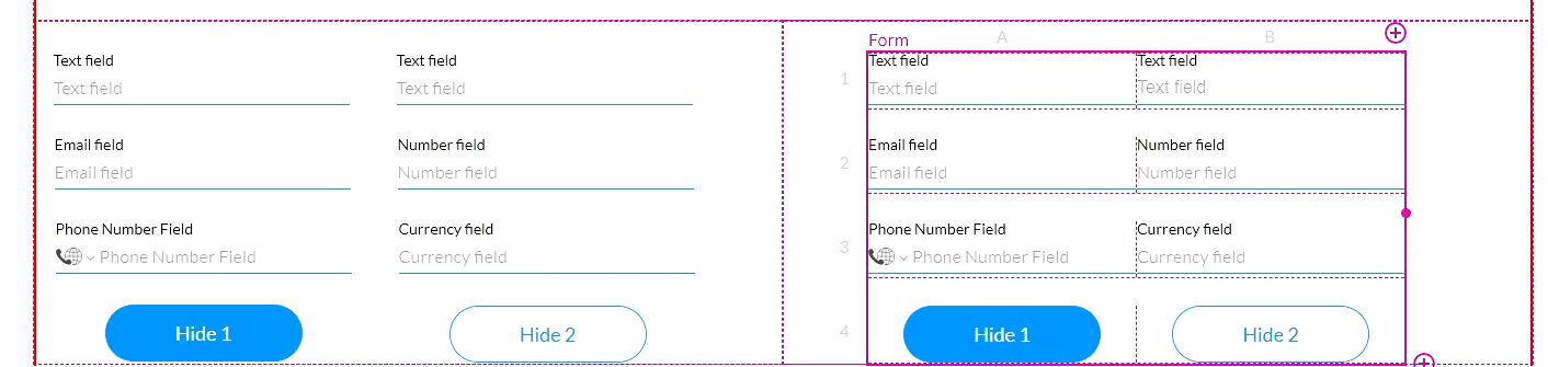
To demonstrate how the form element can assist you in displaying dynamic data, the strip was divided into two columns, and the same elements were inserted into both columns. In one of the columns, the elements were inserted into a form. Two buttons with an on-click action were inserted into each column. The first button hides the email field only, and the second hides both the email and number fields.
The first button was clicked in preview mode to hide the email fields. Both columns look the same. The form row will not contract if it still contains content.
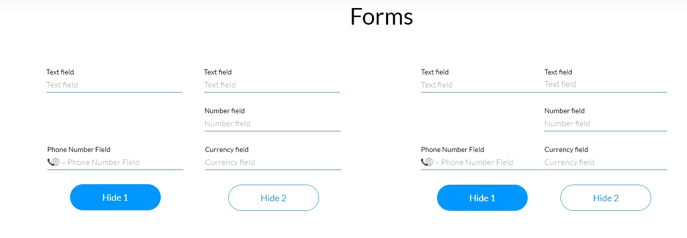
When the second button is clicked, both the email and number fields are hidden. The column without the form element displays white space, but the form auto-contracts that row, and the elements are adjusted.
To demonstrate how the form element can assist you in displaying dynamic data, the strip was divided into two columns, and the same elements were inserted into both columns. In one of the columns, the elements were inserted into a form. Two buttons with an on-click action were inserted into each column. The first button hides the email field only, and the second hides both the email and number fields.
The first button was clicked in preview mode to hide the email fields. Both columns look the same. The form row will not contract if it still contains content.
When the second button is clicked, both the email and number fields are hidden. The column without the form element displays white space, but the form auto-contracts that row, and the elements are adjusted.
05 Auto Width and Auto Height
The styling menu has auto-sizing options under Advanced, such as the auto-width setting.
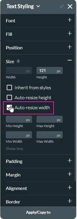
To demonstrate how the auto-resize width feature can assist your content design, the same title element was inserted into two columns. One has a set width applied, and the other has auto-resize applied. The button was assigned an on-click action to retrieve Salesforce data.
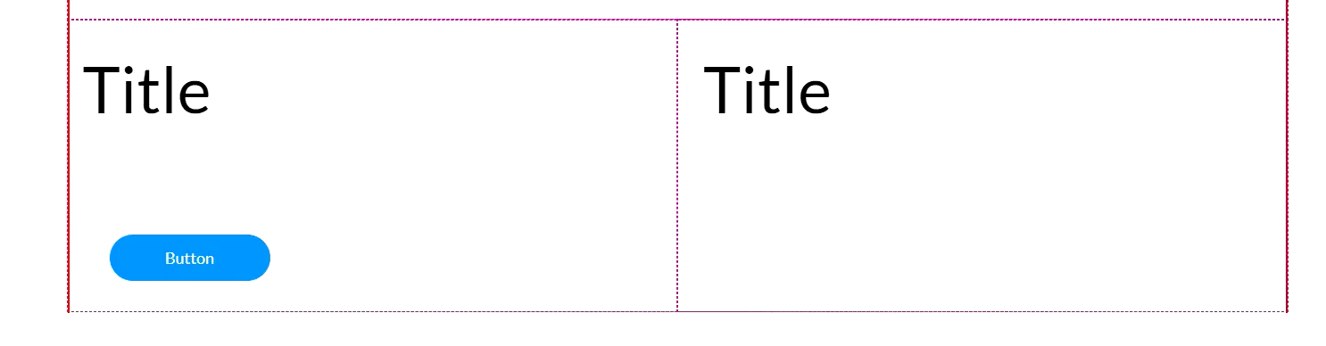
In preview mode, when the button is clicked, it is displayed. On the left side, the content displays over two lines of text as the width is set. The content on the right is auto-adjusted to fit the content on one line.

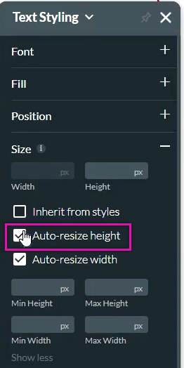
The Auto-resize Height property applies just like the Auto-Width property. This ensures the content will not be cut off or bleed over other elements.
To demonstrate how the auto-resize width feature can assist your content design, the same title element was inserted into two columns. One has a set width applied, and the other has auto-resize applied. The button was assigned an on-click action to retrieve Salesforce data.
In preview mode, when the button is clicked, it is displayed. On the left side, the content displays over two lines of text as the width is set. The content on the right is auto-adjusted to fit the content on one line.
The Auto-resize Height property applies just like the Auto-Width property. This ensures the content will not be cut off or bleed over other elements.
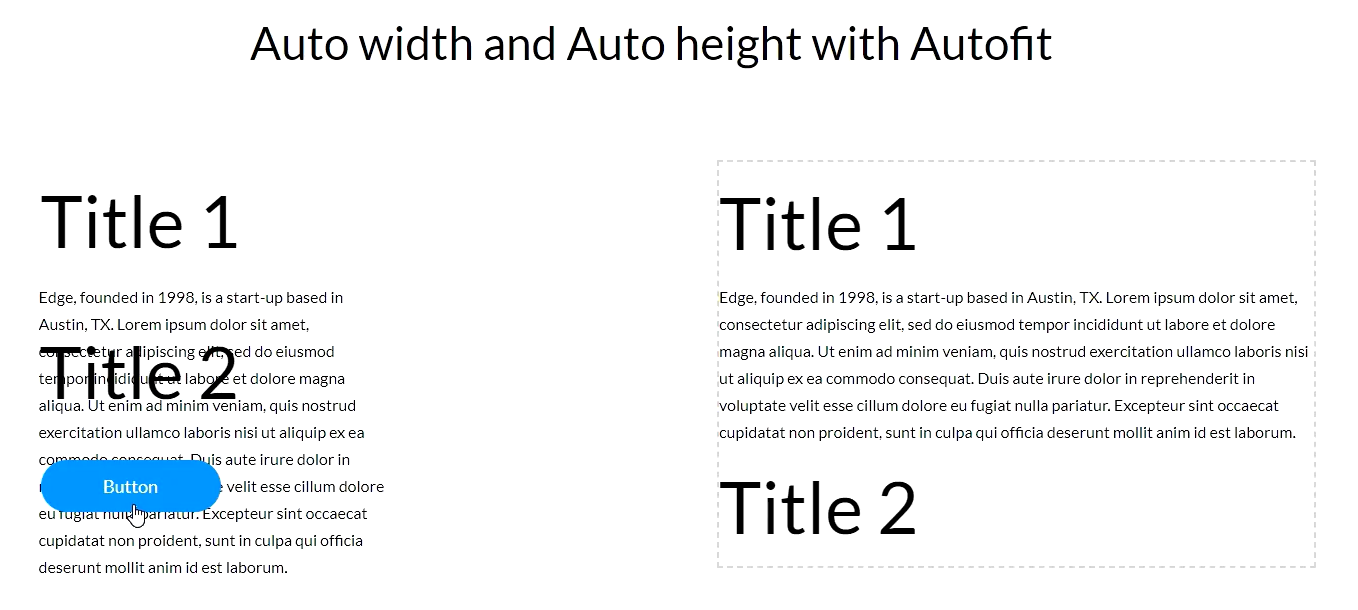
06 Combining Auto Resize with Autofit Containers
These auto-resizing features should always be used in combination with each other.
For demonstrative purposes, the same elements were inserted into two columns. The elements on the right side were freely inserted, and a width was set. The left-hand side elements were inserted into an autofit container, and the auto-resize styles were applied. When the data is retrieved, the column with the auto-resize functionality displays correctly. The content bleeds over other elements in the other column as the width is set.
For demonstrative purposes, the same elements were inserted into two columns. The elements on the right side were freely inserted, and a width was set. The left-hand side elements were inserted into an autofit container, and the auto-resize styles were applied. When the data is retrieved, the column with the auto-resize functionality displays correctly. The content bleeds over other elements in the other column as the width is set.