Container, Autofit Container and Form Differences (9 min)
Completion requirements
01 Getting Started
This tutorial covers the differences between a container, an auto-fit container, and form elements, including:
- Container overview
- Regular containers
- Autofit containers
- Form overview
02 Container Overview
A container is a box into which elements can be inserted. When elements' alignment is changed, it will be relative to the container and not the entire strip. Containers are helpful for creating page sections with a grouping of elements.
You can create styling specific to that container and use elements that create visual interest for your users, such as a flip container.
There are several containers, but this tutorial will cover only regular, autofit, and form.
You can create styling specific to that container and use elements that create visual interest for your users, such as a flip container.
There are several containers, but this tutorial will cover only regular, autofit, and form.
03 Where to Find Containers
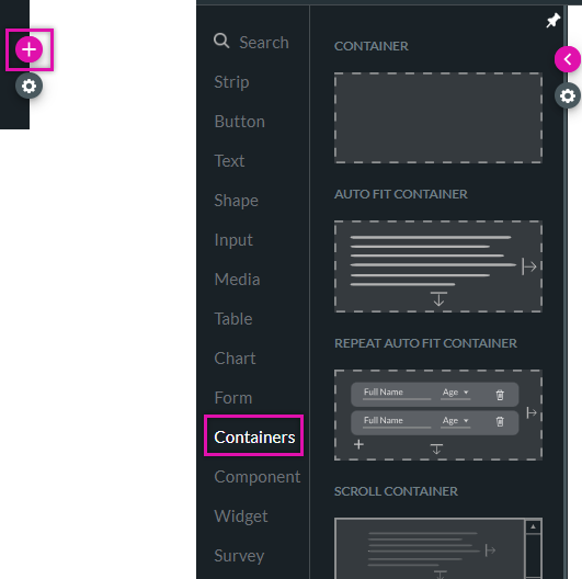
1. Click the + icon to open the element menu.
2. Click the Containers tab.
2. Click the Containers tab.
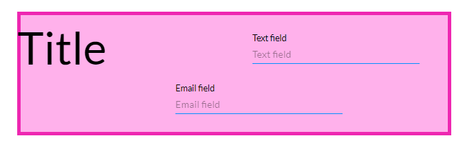
04 Regular Container
You can freely place elements inside the regular container. This means that you will need to use the alignment and spacing tools to ensure your element spacing is consistent. Using the styling menu, you can create a custom style to make the container display as a distinct section of the web page.
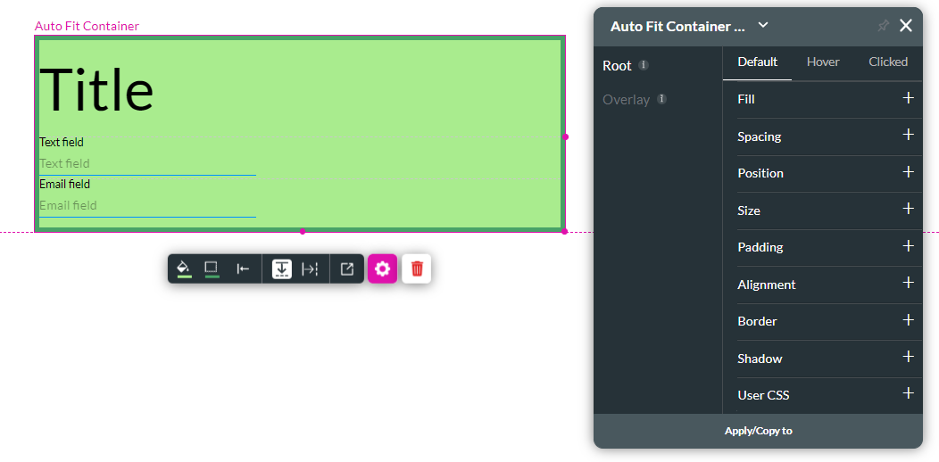
05 Autofit Container
The autofit container automatically stacks any elements inside of it. You can choose between a vertical or horizontal stack. Each time a new element is added, a new row is added. Only one element is inserted per row. The container will automatically adjust according to the data displayed.
The elements must first be inserted into a regular container to insert more than one element per row. The regular container is then inserted into the autofit container.
The autofit container is useful when you require a simple layout for your web page. You can insert set spacing between each element using the element styling menu.
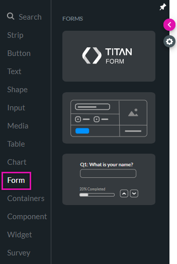
06 Form
The form element is found under the Form tab. These structured forms enable you to add input or text fields to cells in a few clicks. You can design the form, add conditional logic, or merge cells in a row to suit your requirements. Ensure you read this informative article about the Form element to gain more in-depth knowledge.
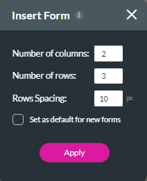
When you first add a form to your project, a pop-up displays for you to configure its dimensions. Once your form is inserted, you can make changes to these dimensions.
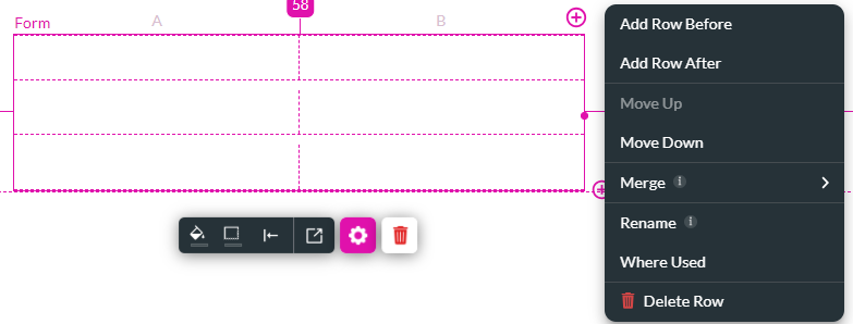
To change your form, use the + icons to add columns and rows. Click the kebab menu to make custom changes.
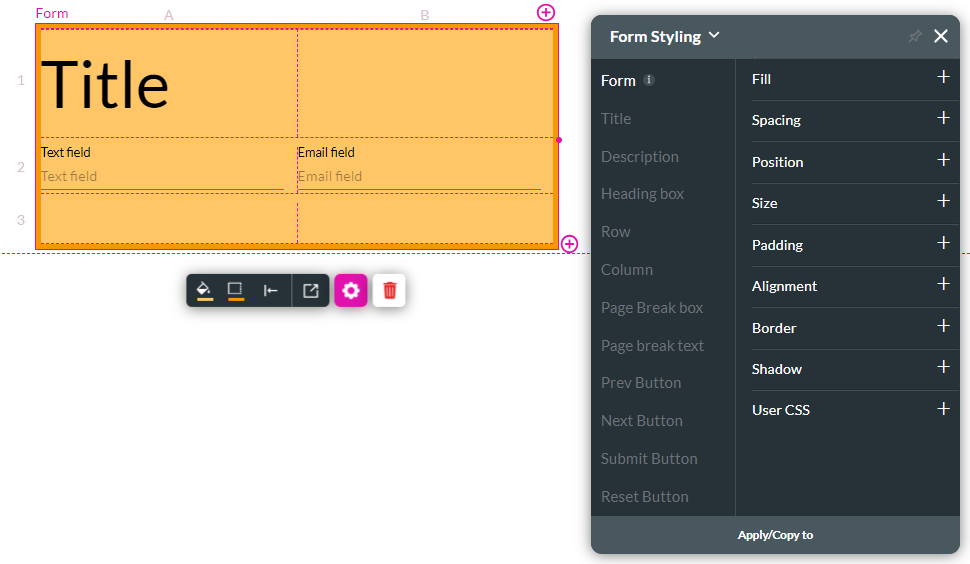
Elements will be organized into the form cells for a uniform appearance. The form will automatically resize depending on the amount of data displayed. This is useful when displaying dynamic data.
Using the element styling menu, you can customize how the form displays.
When you first add a form to your project, a pop-up displays for you to configure its dimensions. Once your form is inserted, you can make changes to these dimensions.
To change your form, use the + icons to add columns and rows. Click the kebab menu to make custom changes.
Elements will be organized into the form cells for a uniform appearance. The form will automatically resize depending on the amount of data displayed. This is useful when displaying dynamic data.
Using the element styling menu, you can customize how the form displays.