Adding and Styling Header Elements (5 min)
Completion requirements
01 Getting Started
This tutorial covers how to add elements to the header and style them, including:
- Header components
- Using the style panel
- Styling properties
02 Configuring a Header
To enable the header:
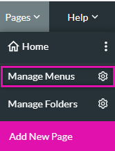
1. Expand the Pages dropdown and select Manage Menus.
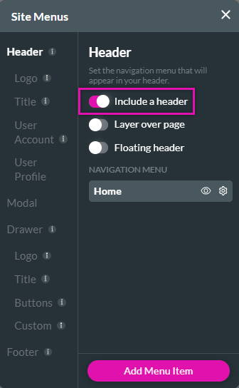
2. Enable the Include a Header toggle switch.
Each page in your project is automatically included in the Navigation Menu.
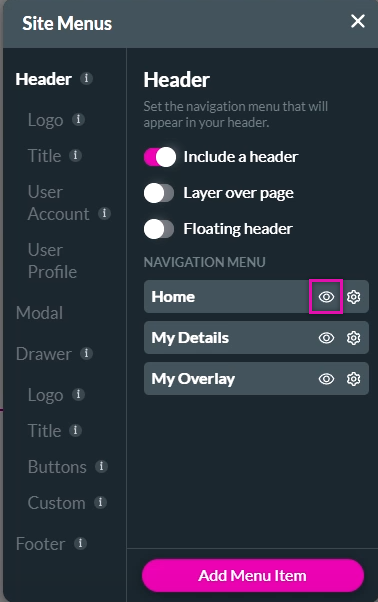
To show or hide a specific page from the menu:
1. Select the eye icon.
1. Expand the Pages dropdown and select Manage Menus.
2. Enable the Include a Header toggle switch.
Each page in your project is automatically included in the Navigation Menu.
To show or hide a specific page from the menu:
1. Select the eye icon.
03 Including a Logo
To include a logo:
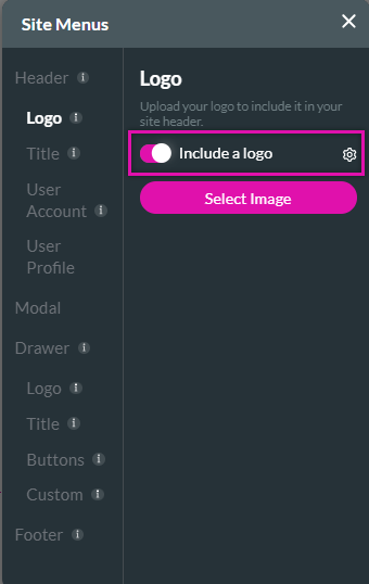
1. Select the logo tab and enable the Include a Logo toggle switch.
You can select a logo image and configure an On Click Action.
1. Select the logo tab and enable the Include a Logo toggle switch.
You can select a logo image and configure an On Click Action.
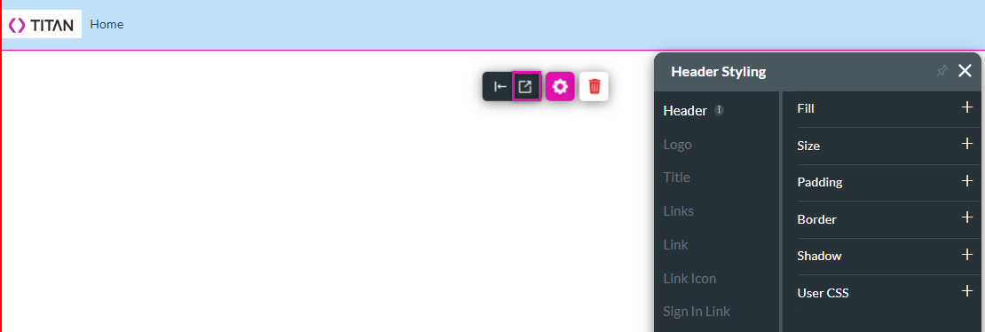
04 Styling the Header
1. Click inside the header area and select the styling icon. The styling menu opens.
Use the styling dropdowns to configure the appearance of the header.
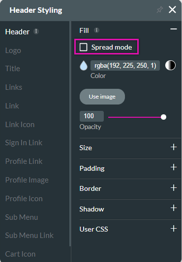
Spread mode is enabled by default, meaning the header styling bleeds over the strip perimeter.
To only display the header styling within the strip:
1. Expand the fill dropdown.
2. Disable Spread Mode.
Use the styling dropdowns to configure the appearance of the header.
Spread mode is enabled by default, meaning the header styling bleeds over the strip perimeter.
To only display the header styling within the strip:
1. Expand the fill dropdown.
2. Disable Spread Mode.
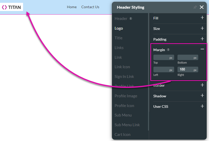
05 Spacing and Sizing Header Elements
To create spacing between the header elements and choose the layout:
1. Expand the Margin dropdown and configure margin spacing.
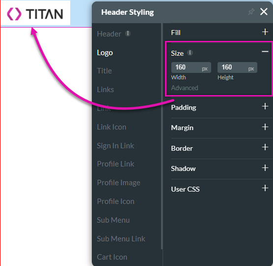
To change the size of the header elements:
1. Click on the element to resize from the menu.
2. Expand the size dropdown and configure the size of the element.
1. Expand the Margin dropdown and configure margin spacing.
To change the size of the header elements:
1. Click on the element to resize from the menu.
2. Expand the size dropdown and configure the size of the element.
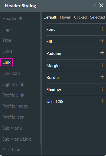
06 Styling Links
You can style the header links.
1. Click the Link tab.
You can configure the look and feel for each link state:
1. Click the Link tab.
You can configure the look and feel for each link state:
- Default - The Default option refers to the basic state of a Link element. This state is when it is not hovered on or clicked on, but simply visible.
- Hover - This option refers to the state of the Link once the user hovers over it with the mouse.
- Clicked - This refers to the state of the Link when the user clicks it.
- Selected - This refers to the state of the Link when the user is on the current page.
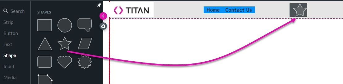
07 Adding Elements to the Menu
You can insert various elements into the header, such as a shape.
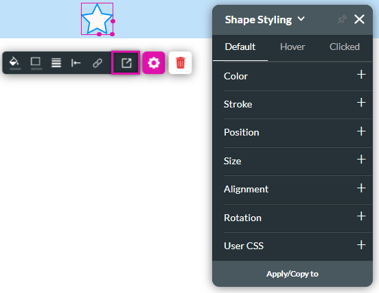
To style the element:
1. Click on the element and select the style icon.
2. Use the styling menu to make changes.
To style the element:
1. Click on the element and select the style icon.
2. Use the styling menu to make changes.