Element States: Default, Hover, Clicked, Selected (3:30 min)
Completion requirements
01 Getting Started
This tutorial covers configuring element activity styles, including:
- Interactive element styles.
- Best practices when styling different states.
02 States
Interactive elements consist of different states; you can create various styles for each.
- Default refers to the essential state of an element when it is visible on the page.
- Hover refers to the state of an element when a user hovers over it with their cursor.
- Clicked refers to the state when the user clicks it.
- Selected shows the user has made a selection. This applies to elements that provide choice options to users.
03 Best Practise
Your states should not be vastly different, but use a similar look and feel with a few differences to give your projects a cohesive look and feel.
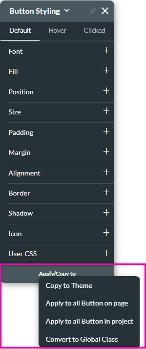
When creating a style for the default state, use the Apply/Copy To button to apply the styling to other elements in your project. This can save you time as you will not need to style each item individually.
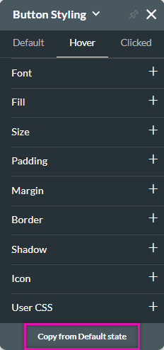
If you are styling the other states, use the Copy from Default State button to copy the style across. This makes it easier for you to make minor changes to the styling without having to configure the style from scratch.
When creating a style for the default state, use the Apply/Copy To button to apply the styling to other elements in your project. This can save you time as you will not need to style each item individually.
If you are styling the other states, use the Copy from Default State button to copy the style across. This makes it easier for you to make minor changes to the styling without having to configure the style from scratch.