Input Fields (13 min)
Completion requirements
01 Getting Started
This tutorial covers styling the input fields, including:
- Using the styling panel.
- Root properties, variants, primary colors, and sizes.
- Use of label and shrink label.
- Input style properties for main text, prefix, and suffix.
- Placeholder and message styles.
02 Using the Styling Panel
To navigate to the project styling panel:
1. Expand the Project dropdown and select Style.
2. Click Configure from the submenu. The Customize Styles window opens.
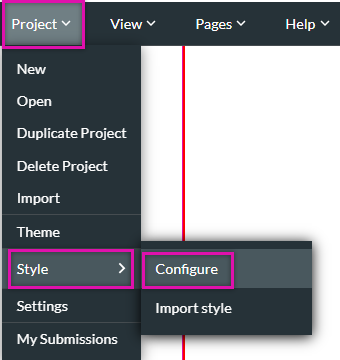
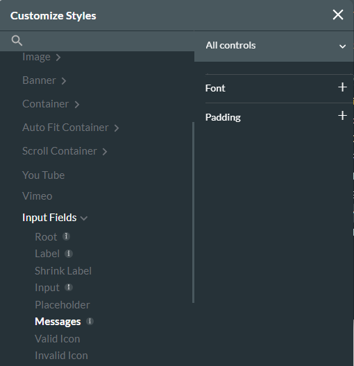
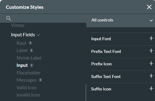
3. Navigate to the Input elements to start styling them. To jump to the input elements section, click on an input element in your project.
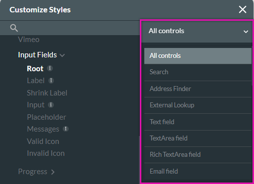
The All Controls dropdown lets you choose which element grouping you want to style. If you select the All Controls option and change the Placeholder styling, all the elements that contain a placeholder option will be affected.
1. Expand the Project dropdown and select Style.
2. Click Configure from the submenu. The Customize Styles window opens.
3. Navigate to the Input elements to start styling them. To jump to the input elements section, click on an input element in your project.
The All Controls dropdown lets you choose which element grouping you want to style. If you select the All Controls option and change the Placeholder styling, all the elements that contain a placeholder option will be affected.
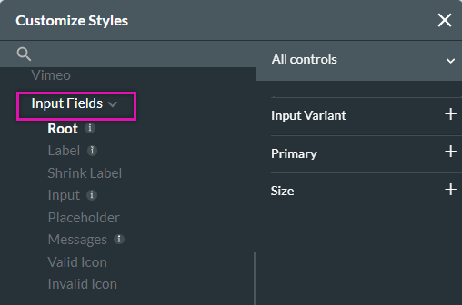
03 Root
The element variant offers different looks for your input field. Variants are only available for specific elements.
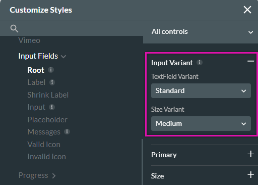
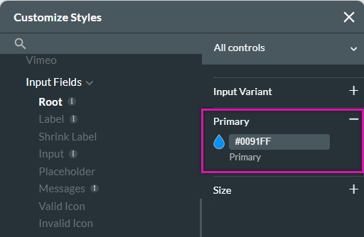
Primary selects the main color for your element. In some elements, the primary will affect the input fill, the border, or the checkbox.
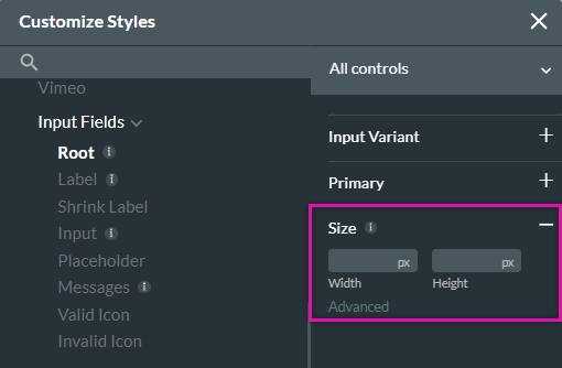
You can set a uniform size for your input element.
Primary selects the main color for your element. In some elements, the primary will affect the input fill, the border, or the checkbox.
You can set a uniform size for your input element.
04 Label and Shrink Label
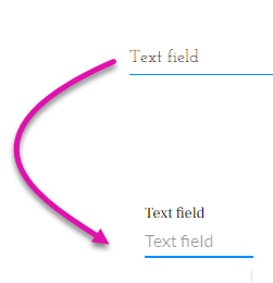
Label is the description text above the input box.
The shrink label is the text that is displayed in the input box. Usually, the default mode for the shrink labels is set permanently to shrink. This ensures the label is always shown to the user.
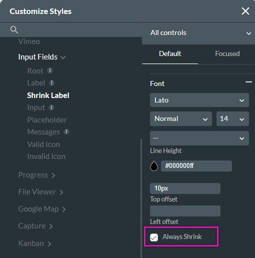
If you turn off the Always Shrink option, the label will display in the input box; when the user clicks on the input element, the label floats above the input field, and the shrink label displays.
The shrink label is the text that is displayed in the input box. Usually, the default mode for the shrink labels is set permanently to shrink. This ensures the label is always shown to the user.
If you turn off the Always Shrink option, the label will display in the input box; when the user clicks on the input element, the label floats above the input field, and the shrink label displays.
05 Input
This is the main component of the field where the user will provide the information. Your input fields can consist of prefix and suffix text and icons.
To enable a prefix or suffix, navigate to the element settings menu and select the interactivity tab. Here, you can allow the prefix and suffix options:
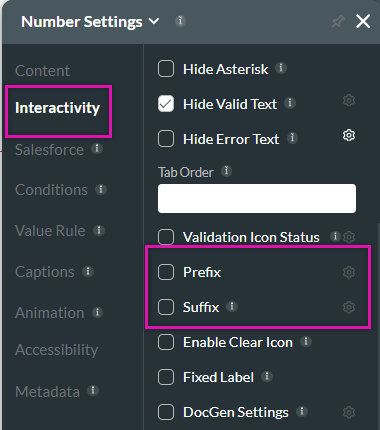
To enable a prefix or suffix, navigate to the element settings menu and select the interactivity tab. Here, you can allow the prefix and suffix options:
06 Messages
Messages display information to users based on their input. The message text itself is configured in the element settings menu, but the styling of that text is configured in the project styling menu.