File Uploader (6:30 min)
Completion requirements
01 Getting Started
This tutorial covers styling the file upload element, including:
- An overview of the file uploader.
- Variant options and styling.
02 Overview
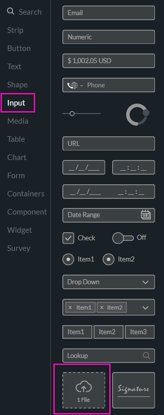
The file uploader allows users to upload supporting documents and images. This element can be found under the input tab.
03 Variants
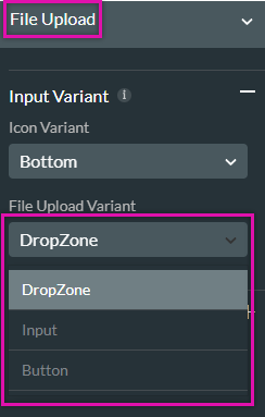
The file upload input element has three variant style options, which are available in the project styling panel.
1. Choose the file input option from the dropdown.
Using the File Upload Variant dropdown, you can choose from 3 variants. The styling options available will depend on the selected variant.
1. Choose the file input option from the dropdown.
Using the File Upload Variant dropdown, you can choose from 3 variants. The styling options available will depend on the selected variant.
04 Styling the Variants
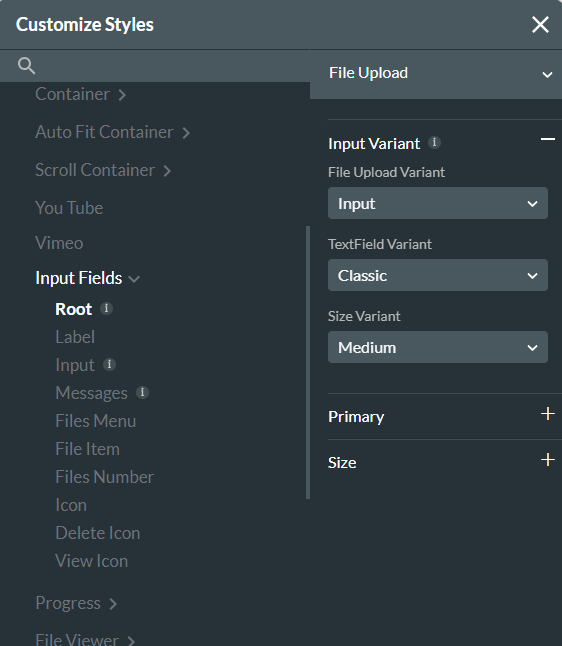
Using the styling options, you can change the icon position and the input area's look and choose a size.
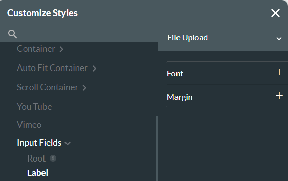
To change the 'Choose Files' text, click the label tab and use the available styling options.
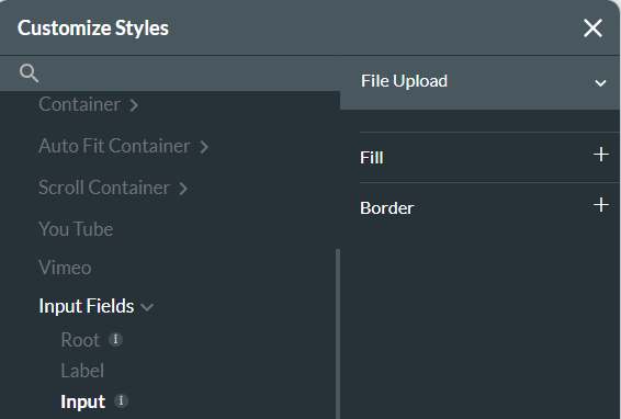
The input option provides styling options for the file upload input area.
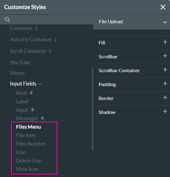
When the user uploads the file, the file uploader field will reflect a list of uploaded documents. Styling options can be found in the files menu, files item, files number, icon, delete icon, and view icon.
To change the 'Choose Files' text, click the label tab and use the available styling options.
The input option provides styling options for the file upload input area.
When the user uploads the file, the file uploader field will reflect a list of uploaded documents. Styling options can be found in the files menu, files item, files number, icon, delete icon, and view icon.