Button (4 min)
Completion requirements
01 Getting Started
This tutorial covers styling a button, including:
- The different button states.
- Best practices for styling a button.
02 Button States
The button element is an interactive graphic element that allows users to trigger an action. Titan offers primary and secondary buttons for you to use and style.
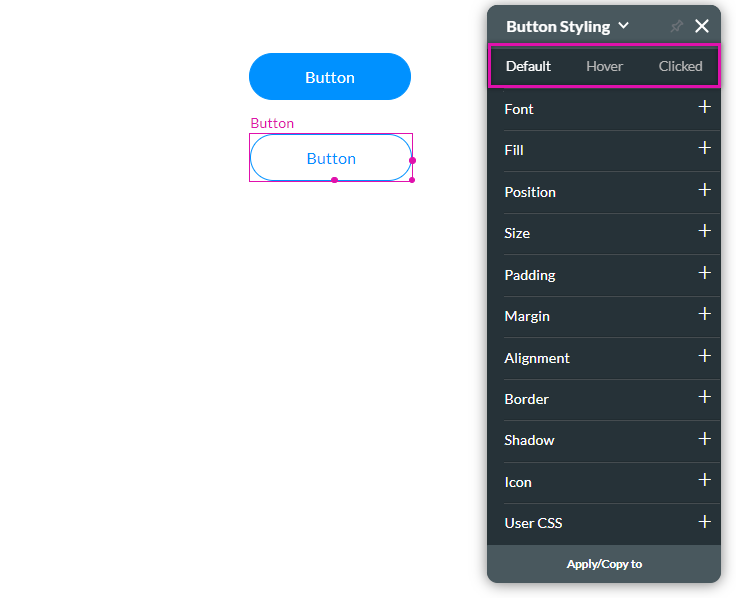
You can style the button to indicate when the user is hovering over it and when it is clicked.

You can style the button to indicate when the user is hovering over it and when it is clicked.

03 Best Practice for Configuring States
While you can style each button state to look completely different from the other, Titan recommends that you make your buttons' state styles look similar to ensure a consistent look and feel.
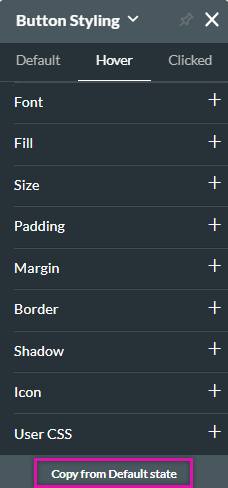
To ensure your buttons feel consistent, create the default style first. The default style defines how your button will display to users when they are not interacting with it. Click on the next button state you want to configure and select Copy from Default State, ensuring the exact styling is carried across. You can then make changes to the button states to make them different from one another.

To ensure your buttons feel consistent, create the default style first. The default style defines how your button will display to users when they are not interacting with it. Click on the next button state you want to configure and select Copy from Default State, ensuring the exact styling is carried across. You can then make changes to the button states to make them different from one another.
