Containers (15 min)
Completion requirements
01 Getting Started
This tutorial covers containers available for Forms 2.0. This lesson provides a brief overview of some of the containers. For more information, check out our other courses.
02 Container
The container element is found under the Containers tab.
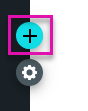
1. Click on the + icon to open the element menu and click the Containers tab.
2. Drag the Container element onto your canvas.
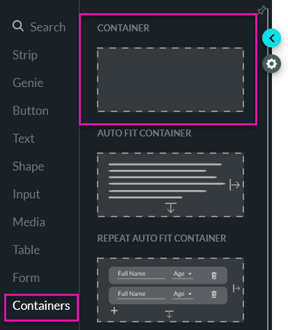
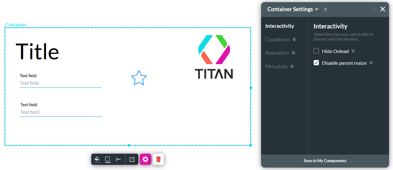
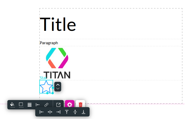
Containers can be used to hold a variety of other elements. You can freely place your elements in the container. These elements will automatically move as you move the container in your project. You can save containers as components, which means you can use the same component multiple times without having to design it from scratch.
1. Click on the + icon to open the element menu and click the Containers tab.
2. Drag the Container element onto your canvas.
Containers can be used to hold a variety of other elements. You can freely place your elements in the container. These elements will automatically move as you move the container in your project. You can save containers as components, which means you can use the same component multiple times without having to design it from scratch.
03 Autofit Container
Suppose you have dynamic fields that change size according to the contents, or you must hide elements in certain circumstances, or you need to present your contents on different device sizes. In that case, an autofit container is a convenient element to use.
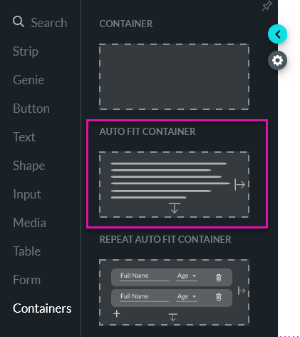
When inserting elements into your autofit container, they will automatically align and cannot be freely placed in the container. To change the alignment of the element, you will need to use the element menu.
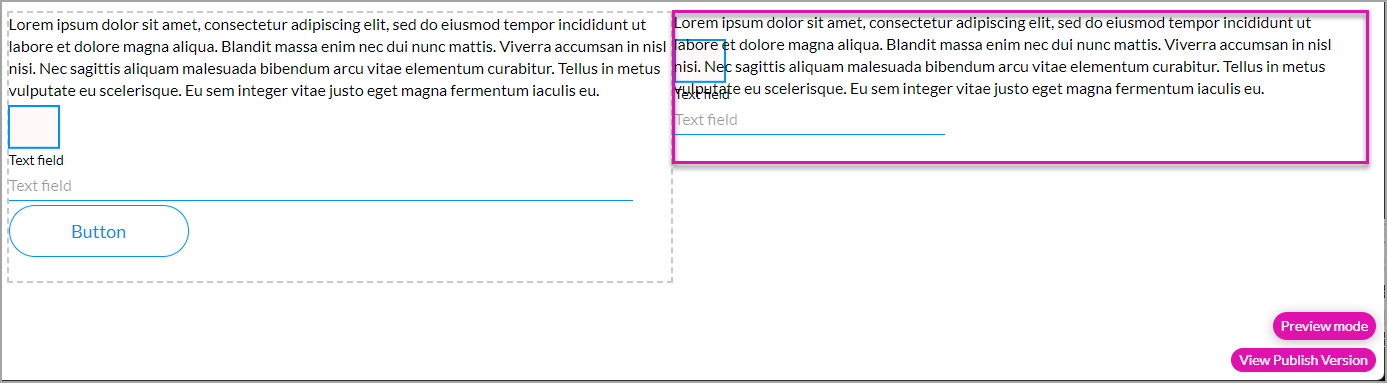
For example, you want to display a contact description in your project. The contact description can vary in length but generally contains a large amount of text. If you choose to display the description in a normal container, the text will be displayed over other elements as they will not move. The elements in the autofit container move to accommodate the dynamic description in the title element.
On the right (not an autofit container), you can see that the dynamic content covers the shape and part of the text field element. In contrast, the elements in the autofit container moved (on the left), and the dynamic contact description is visible, regardless of the length of the content.
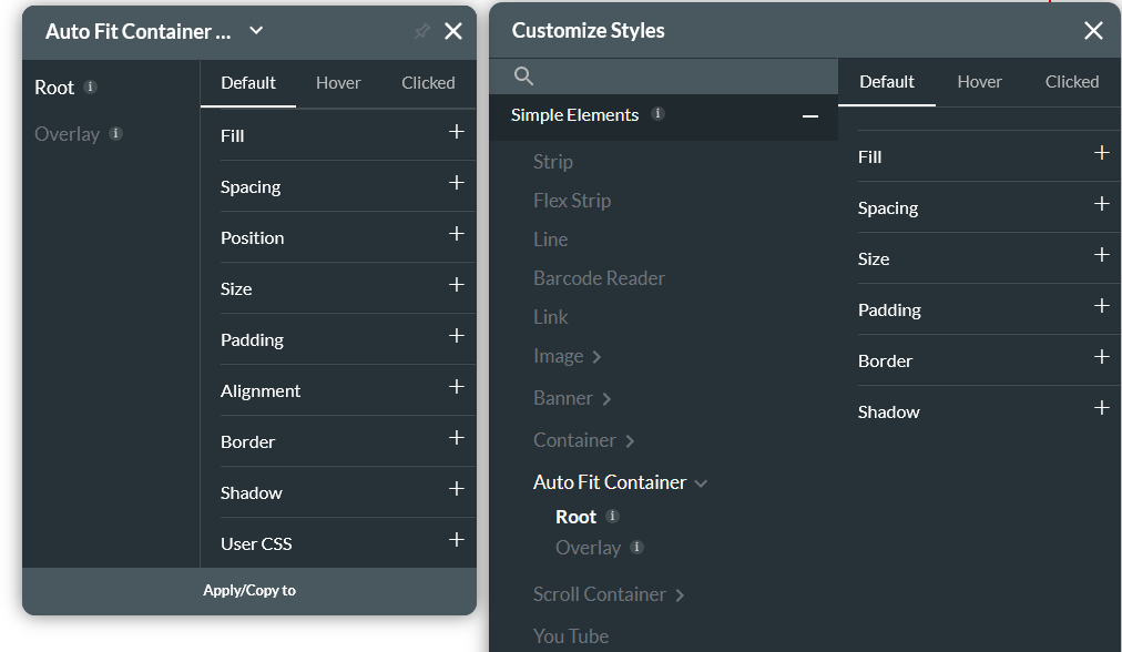
You can style your autofit container using the element and project styling menus.
When inserting elements into your autofit container, they will automatically align and cannot be freely placed in the container. To change the alignment of the element, you will need to use the element menu.
For example, you want to display a contact description in your project. The contact description can vary in length but generally contains a large amount of text. If you choose to display the description in a normal container, the text will be displayed over other elements as they will not move. The elements in the autofit container move to accommodate the dynamic description in the title element.
On the right (not an autofit container), you can see that the dynamic content covers the shape and part of the text field element. In contrast, the elements in the autofit container moved (on the left), and the dynamic contact description is visible, regardless of the length of the content.
You can style your autofit container using the element and project styling menus.
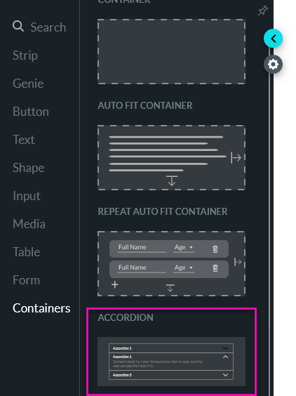
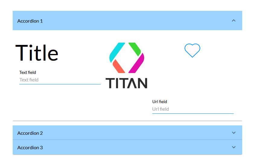
04 Accordion
An accordion container displays information that can be expanded and collapsed.
You can choose to set static values to display in your container or sync dynamic data from Salesforce.
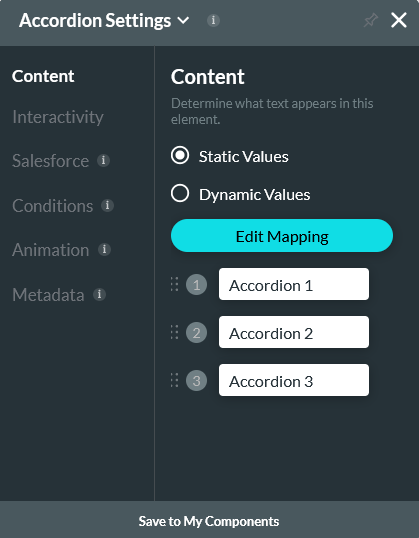
You can freely place elements within the container.
You can choose to set static values to display in your container or sync dynamic data from Salesforce.
You can freely place elements within the container.
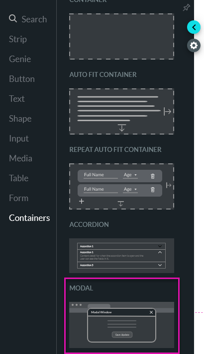
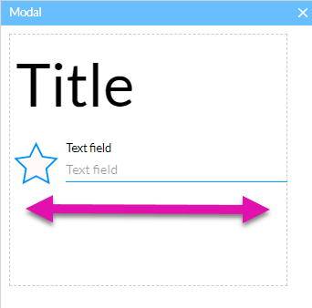
05 Modal
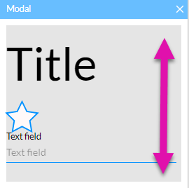
A modal is a popup window that displays information to the user.
You can insert any element from the element menu, however, the structure of the modal is set. All elements inserted will display in a stack.
If you need to insert the elements next to each other in a row, insert a container into the modal, this will allow you to freely place your elements in parallel.
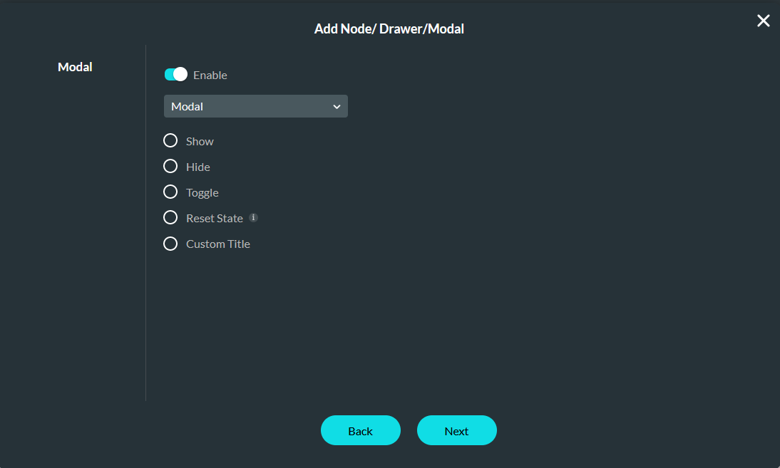
You can set up interactive elements in your modal that push and pull data to Salesforce. When working with modals, you will need to configure interactive elements that will affect your modal.
You can insert any element from the element menu, however, the structure of the modal is set. All elements inserted will display in a stack.
If you need to insert the elements next to each other in a row, insert a container into the modal, this will allow you to freely place your elements in parallel.
You can set up interactive elements in your modal that push and pull data to Salesforce. When working with modals, you will need to configure interactive elements that will affect your modal.